Graphic Design Showcase
Brief: Crooked River Brewing Company
Brief:
Crooked River Brief
Posted on: Tuesday, 14 March 2023 10:08:27 o'clock GMT
A Padlet will be created for this but here's the brief in the meantime:
The River Cocker meanders through the West Cumbrian town of Cockermouth, and the name of Crooked River brewery bases its name on the old Celtic word Kukra meaning ‘Crooked One’. Since the closure of Cockermouth’s only working brewery, Jennings, Crooked River brewery have campaigned to continue the brewing heritage of Cockermouth and aim to write a new chapter in the town’s brewing heritage, eventually moving brewing operations into the town and to open a tap room.
Founders Phil and Alan describe themselves as ‘beer nerds’ and began brewing crafted beer from their garden sheds, before realising that their passion could – should – be upscaled. Both of them have lived and worked in Australia and experienced the thriving, Antipodean craft beer culture and recognised that this is something they could instigate in their own hometown.
Aims
Objective
This year they are releasing 6 limited edition beers of varied beer styles to sell alongside our three core beers they sell all year round. The brief is to design the labels of 3 of these beers ahead of their release.
Design Brief
Currently, the brewery’s design stipulations are as follows:
They want you to work without these “rules” for now and concentrate on producing concepts that can be pattern, illustration, or typography (or a mix) and have unique, eye-catching, shelf appeal.
Phil and Alan want you to consider the following: geography, three, water, community… these are just some of the visual leads you could explore. Be playful and explore as many concepts as possible but aim to have relevancy.
Reference material:
www.crooked-river.co.uk
https://content.shutterstock.com/creative-trends/
https://www.shutterstock.com/blog/trends/color-trends
https://www.trackbrewing.co/collections/buybeer
Assignment incentives
Crooked River Brief
Posted on: Tuesday, 14 March 2023 10:08:27 o'clock GMT
A Padlet will be created for this but here's the brief in the meantime:
The River Cocker meanders through the West Cumbrian town of Cockermouth, and the name of Crooked River brewery bases its name on the old Celtic word Kukra meaning ‘Crooked One’. Since the closure of Cockermouth’s only working brewery, Jennings, Crooked River brewery have campaigned to continue the brewing heritage of Cockermouth and aim to write a new chapter in the town’s brewing heritage, eventually moving brewing operations into the town and to open a tap room.
Founders Phil and Alan describe themselves as ‘beer nerds’ and began brewing crafted beer from their garden sheds, before realising that their passion could – should – be upscaled. Both of them have lived and worked in Australia and experienced the thriving, Antipodean craft beer culture and recognised that this is something they could instigate in their own hometown.
Aims
- To establish a brand identity locally as a small independent producer of modern and trending styles of craft beer.
- To grow a brand reputable for being community driven, innovative in beer styles, exciting and fun.
- To increase sales to business across the county and launch a series of outdoor events in Cockermouth and at annual beer festivals across the region.
- To open a tap room in 2024 and move brewing operations when they have raised enough capital so our focus is very much to become a Cockermouth brand of beer
Objective
This year they are releasing 6 limited edition beers of varied beer styles to sell alongside our three core beers they sell all year round. The brief is to design the labels of 3 of these beers ahead of their release.
Design Brief
Currently, the brewery’s design stipulations are as follows:
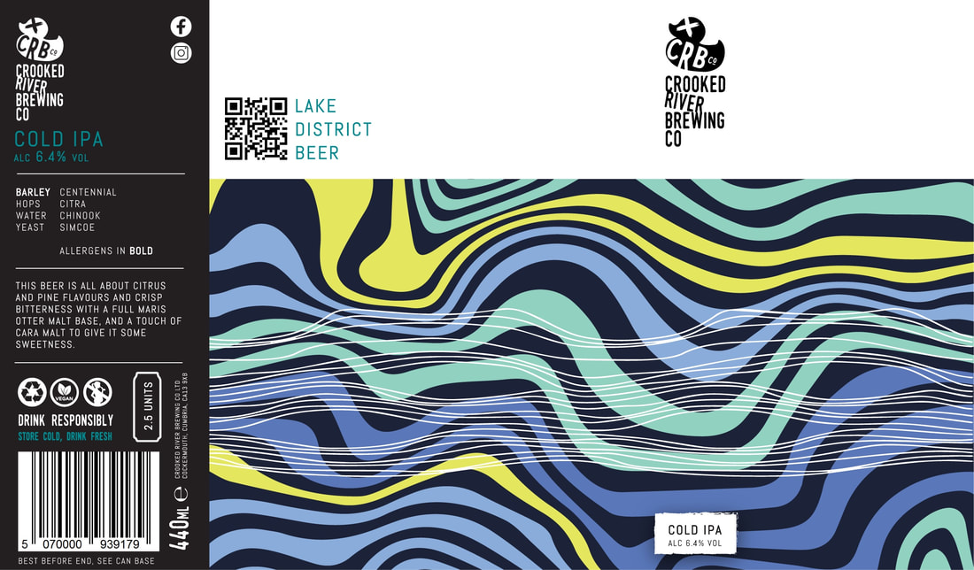
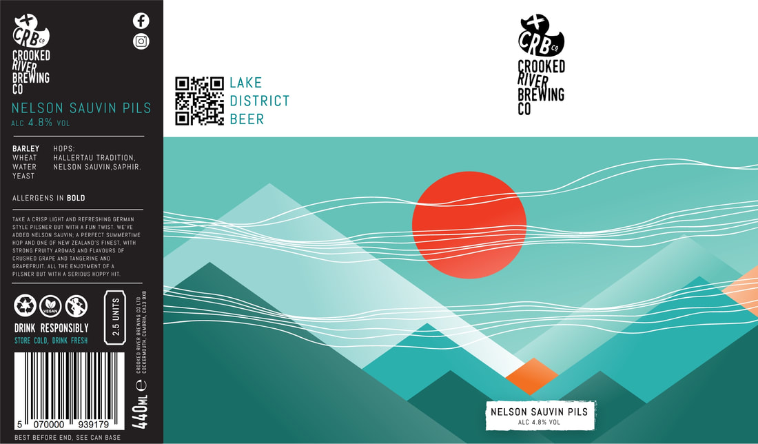
- Top third of the design is occupied with negative space (in white) to allow the brand logo (in black) to dominate the space.
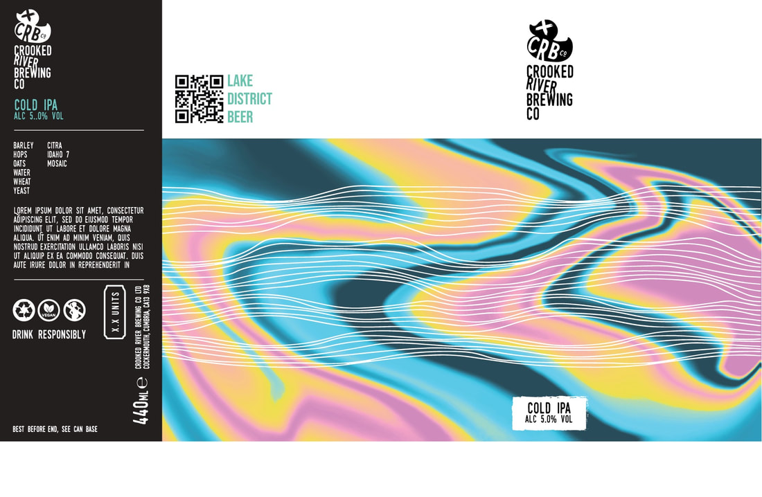
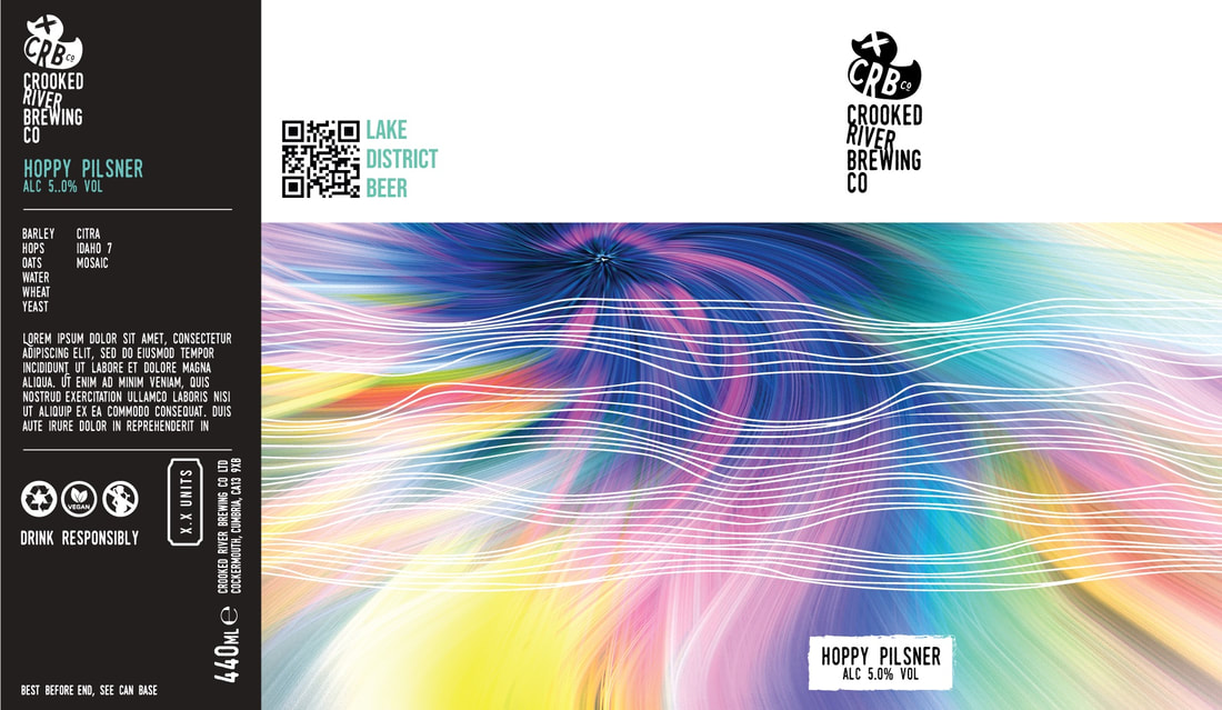
- Bottom two thirds is occupied with a unique illustration. The dimensions match across all three beers
- A signature wave design is placed in a fixed position on all three beers on top of each illustration with colour adjusted to complement the illustration.
- The following are fixed elements with consistent formatting:
- Product information section (black)
- Beer style / abv section (colour can be changed)
- Brand logo (black)
- Signature wave design (colour can be changed)
They want you to work without these “rules” for now and concentrate on producing concepts that can be pattern, illustration, or typography (or a mix) and have unique, eye-catching, shelf appeal.
Phil and Alan want you to consider the following: geography, three, water, community… these are just some of the visual leads you could explore. Be playful and explore as many concepts as possible but aim to have relevancy.
- They want their designs to have a feeling of eccentricity without being too noisy so there has to be a good balance between to both.
- Colour is everything, when colours lack in vibrancy, or appeal due to their lack of adaptability to colour trends, it makes a big difference on buying behaviours.
- A large percentage of customers will pick a beer over visual appeal over price, beer style etc and they will sit in fridges next to other visually appealing beers, so they need to stand out.
- Don't be afraid to apply humour
- They love the creative control of graffiti artists and I’m compelled by their character designs and would love to have something like this in our designs. Look at brands like Gypsy Hill, Beaver Town etc.
- No designer/illustrator should attempt to design our cans without stepping foot in a beer shop like Craft Beer Keswick or Beer Cockermouth and seeing what they are competing against.
- Familiarise yourselves with cask beers – seek out the traditional designs and then see how how craft beers differentiate themselves with more modern designs.
- Remember these are ‘limited edition beers’ so they are a different range than our core beers. They should be identifiably different but still contain something that regular customer could identify as Crooked River.
Reference material:
www.crooked-river.co.uk
https://content.shutterstock.com/creative-trends/
https://www.shutterstock.com/blog/trends/color-trends
https://www.trackbrewing.co/collections/buybeer
Assignment incentives
- Cash incentive TBD
- Crooked River Branded t-shirt
- Crooked River Branded allegra glass
- Case of beer
- Framed artwork
- Gift voucher that can be claimed at one of our 2023 events
- Exhibition and press/public launch at local venue
Notes from website:
The fundamental challenge the students must face is that consumers of craft beer commonly make purchasing decisions based on visual appeal over price or style, this might be because they are not so familiar with craft beer yet, so they have to stand out to have any influence on buying behaviours. I urged the students to go and visit the beer shops in the county and see for themselves just how some of the brands lean on visual appeal vs others.
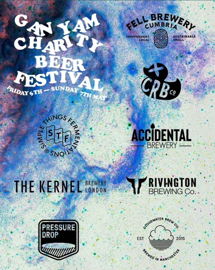
Craft beer is an emerging market in Cumbria compared to other parts of the country. The South Lakes is the first to see a thriving craft beer culture explode thanks to breweries such as Lakes Brew Co, Gan Yam and Fell Brewery. We would be one of the first to bring this culture to the Western Lake District which means breaking through barriers of traditionalism and introduce new styles of beer to what is typically a cask beer market.
I wanted to keep the design brief playful and unrestrictive so they could explore many concepts but also aim to have relevancy and connectivity to our brand and the target market which I broke down into four categories:
Conscious consumers: people who are moving away from mass produced, commercialised brands and instead are seeking out local artisinal products and services they feel are good to the trade and tourism of the community.
Experience seekers: Businesses that with a powerful marketing campaign tend to draw younger generations actively seeking experiences and trends to elevate their social media status.
Craft beer drinkers: Since the staycation boom post Covid, Cumbria has seen a younger generation of tourists visit the Lake District from cities with a matured craft beer market and actively seeking local artisanal products.
Contractors and academics: West Cumbria is also known as the energy coast, it is home to one of the largest employers in the energy sector and draws in contractors and academics from all over the country who tend to commonly visit local beer shops.
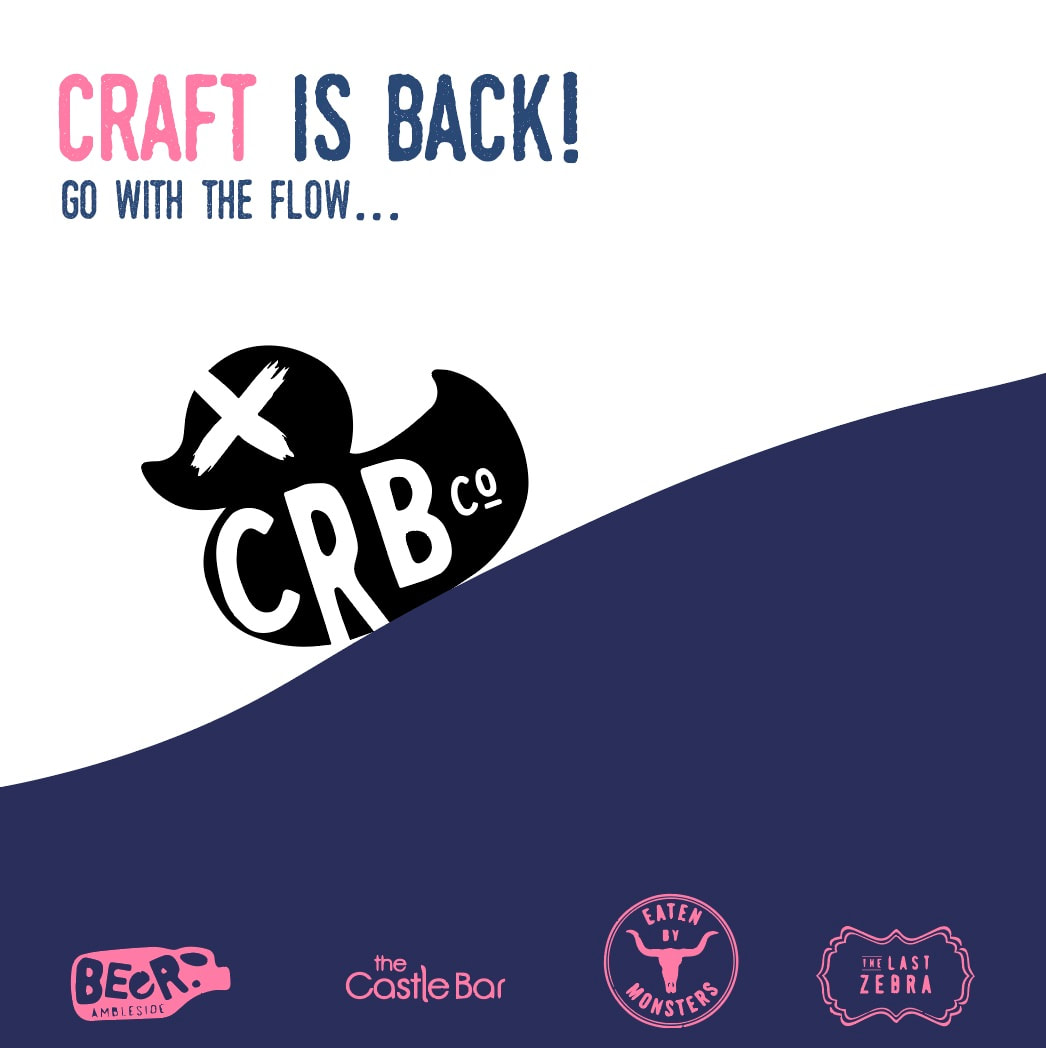
Teaming up with the University has been a great opportunity for us to find a deeper connection with our community of artists and to ensure they get recognition for their work. The University will present the students work an exhibition in May followed by an event hosted by us at a popular Carlisle bar where guests can sample one of the limited edition beers designed by the winning artist with other work published on our cans later in the year.
Personal notes from talk with Crooked River Brewing Company:
- 2 man team
- Based in Cockermouth
- Want to involve local artists/community/free advertising on their products
- Craft beer is an emerging market
- Can supply throughout the county
- Places/vibe of bar for Carlisle would be eaten by monster/yellow jacket/printyard
- Cans and ceggs
- Want to do gluten free, fruit sours, 0.0 alc
- Want label design done 1, cold IPA, 2, mango and passionfruit sour, 3, Hoppy pilsner (but not too hazy)
- Doesn’t have to be county relevant
- More expensive so label needs to attract premium product
Vibe/distillery/brand image/likes:
- Modern
- Abstract
- Reggae
- Soul
- Funk
- 90s
- Modernism
- Surrealism
- Psychedelic
- Not too serious
- Eye catching but not too noisy
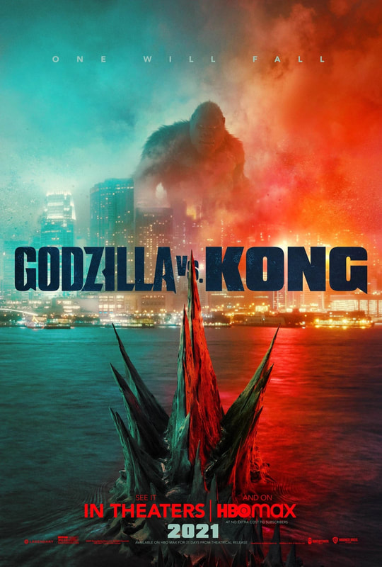
- Australia
- London
- Manchester
- New Zealand
- Rough
- Industrial
- Hang outs
Brand they like:
- Track
- Pollys
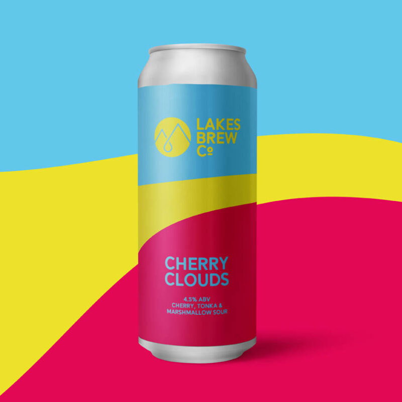
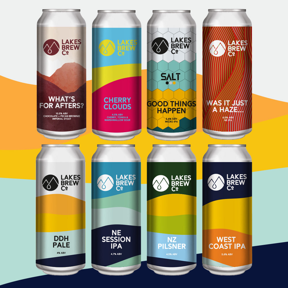
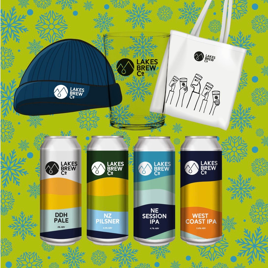
- Lakes brew co
- Balter
Research:
A starting point after bringing together information form the Phil and Crooked River was to look at the brand and how the company currently look and communicate. Phil is a previous graphic designer and I trust with this being his company that he has it looking in a way that he wants the brands style and personality to comes across. There may be opportunities to surprise him if inspiration strikes but right now I currently like his styling and approach to his branding.

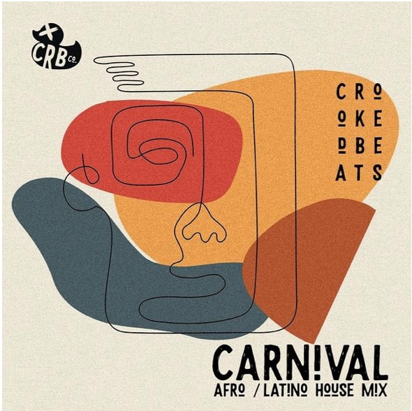

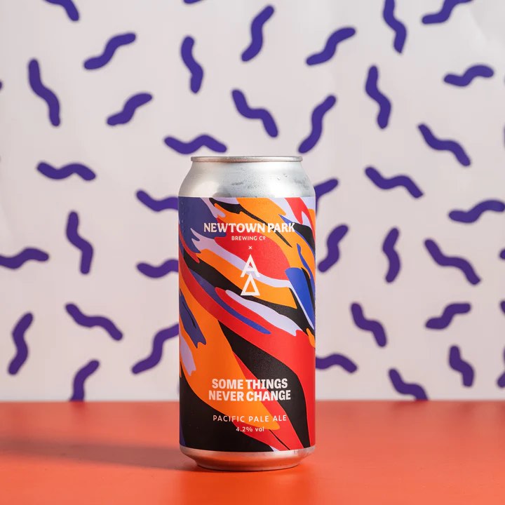
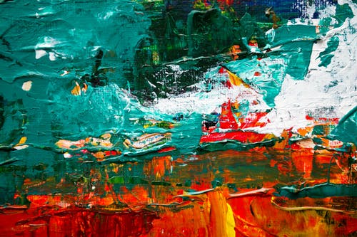
The Crooked River brand comes across simple in some designs and busier in others, There definitely is a strong use of colour and shape which draws the eye. The Carnival poster suggests.a funky vibe, and there are industrial textures used which could be used for further styling to exhibit the drinks later on.
Their inspiration/Likes:
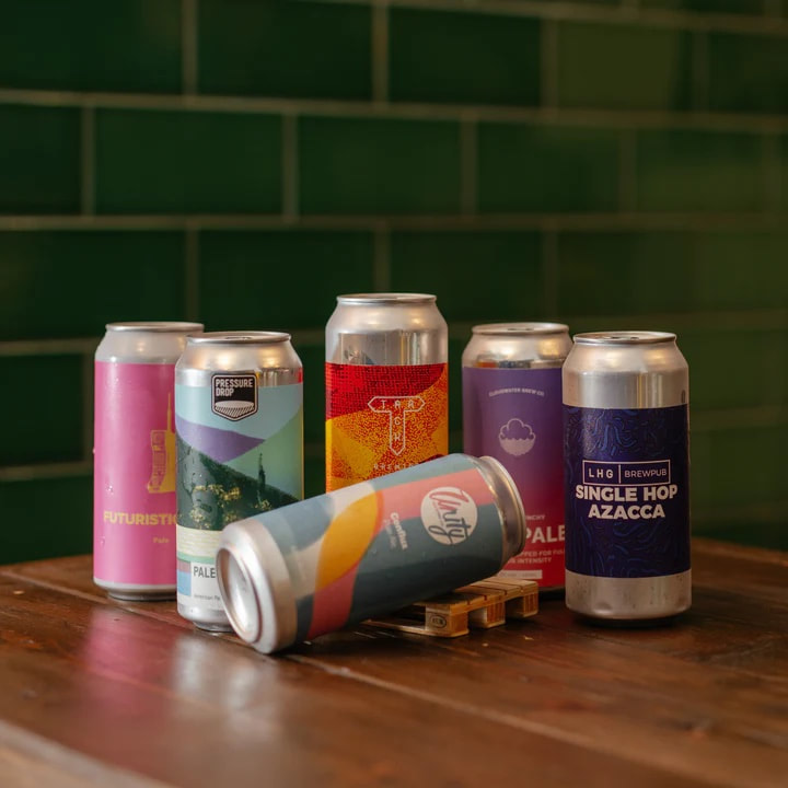
Below are companies that inspire Crooked River. There are mixes of both simple and busy designs and vary from company to company but all are impactful and use strong colours and complimentary combinations of colour palettes. I think his is an area I would like to focus on. This works well for me because I really love working with colours and picking colour palettes that work well together.
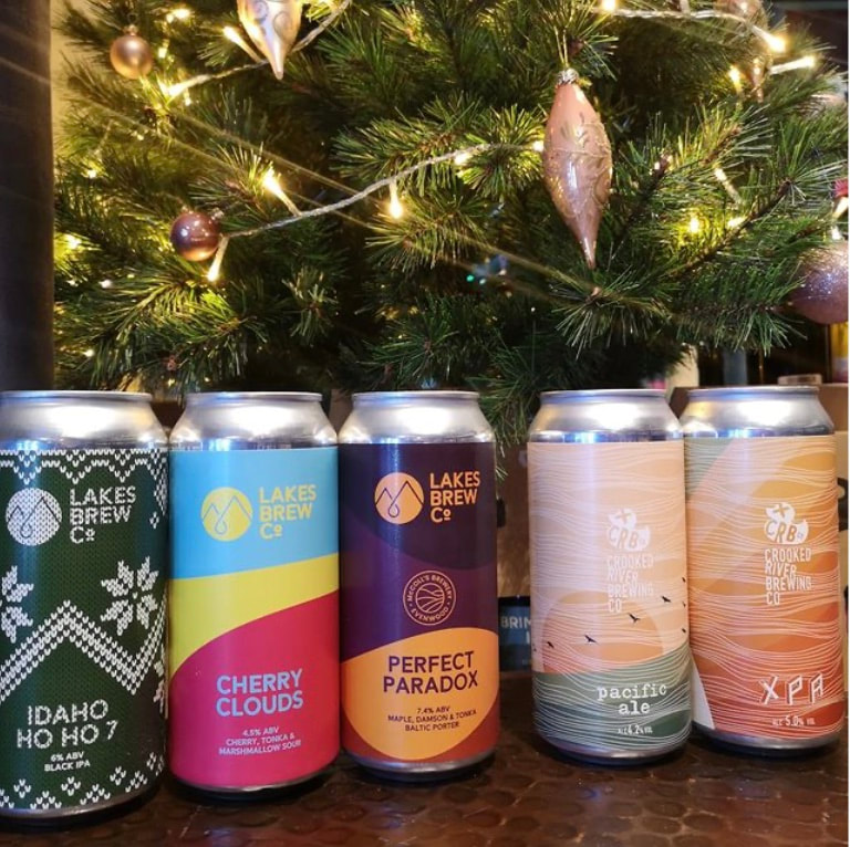
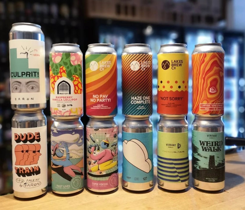
Lakes Brew Co:
Below are companies that inspire Crooked River. There are mixes of both simple and busy designs and vary from company to company but all are impactful and use strong colours and complimentary combinations of colour palettes. I think his is an area I would like to focus on. This works well for me because I really love working with colours and picking colour palettes that work well together.
Lakes Brew Co:
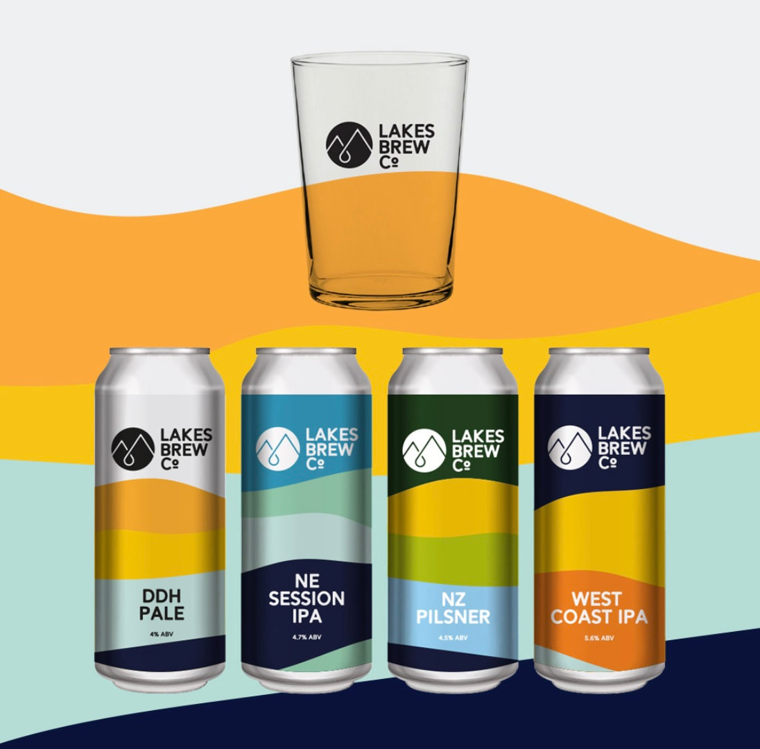
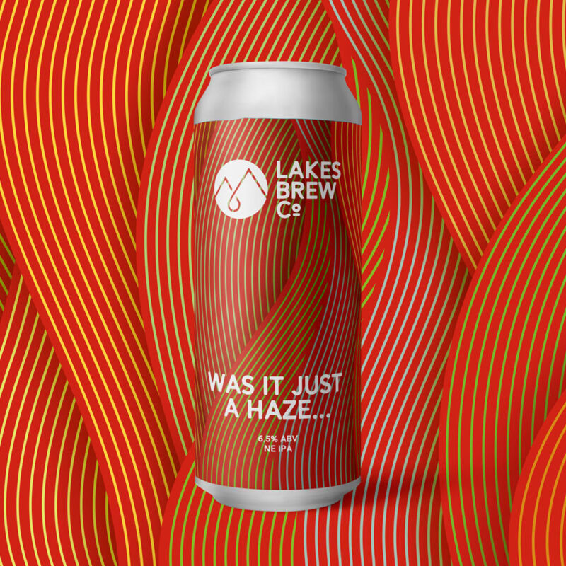
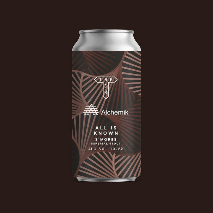
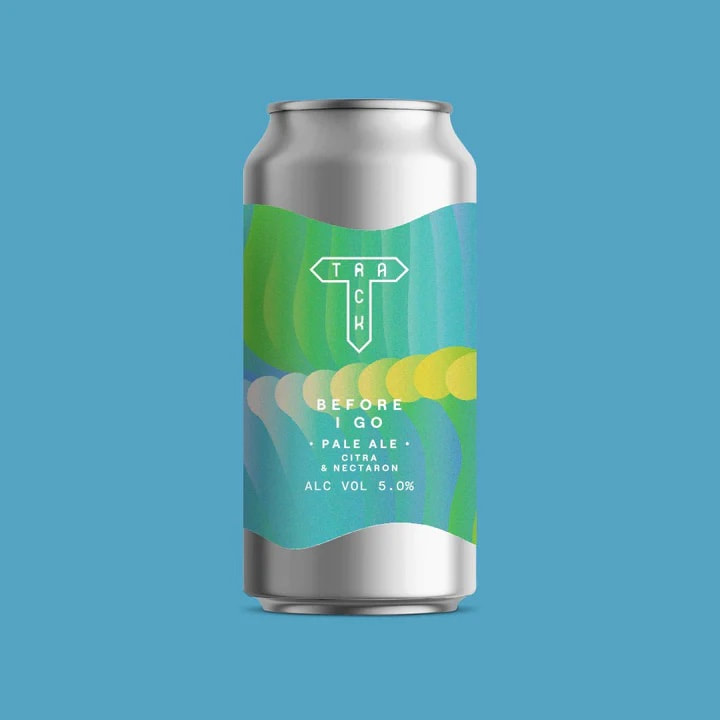
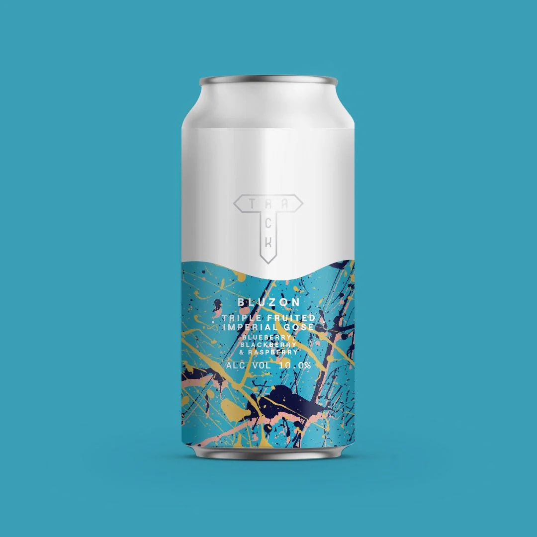
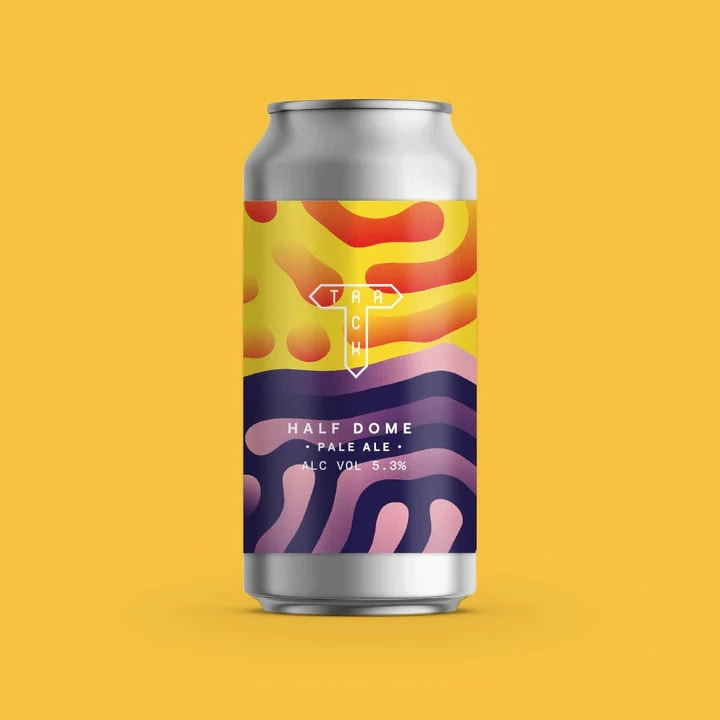
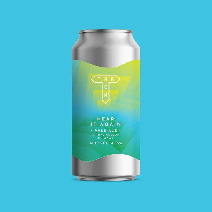
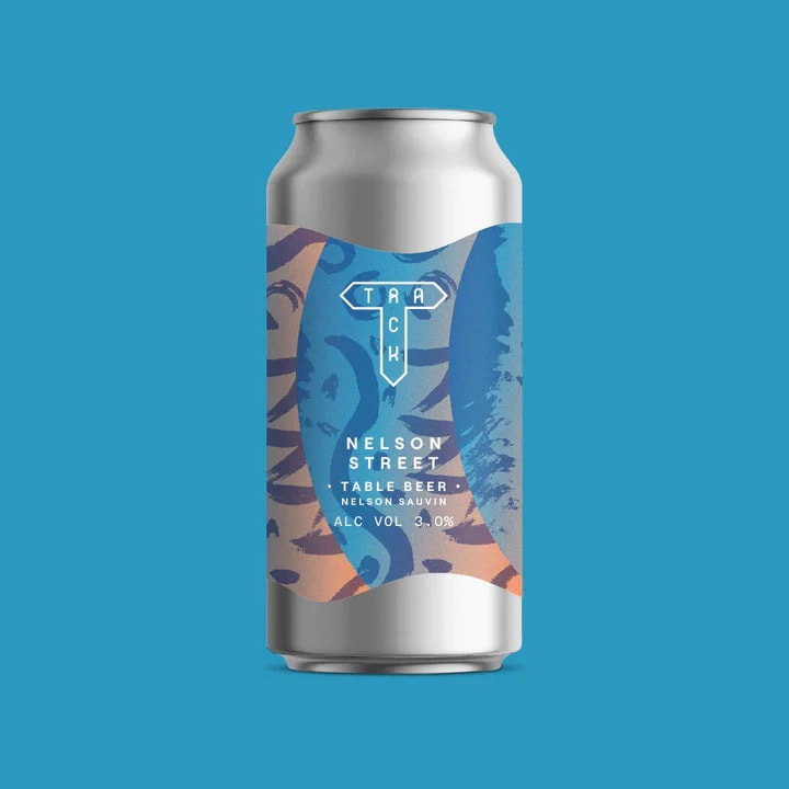
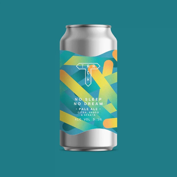
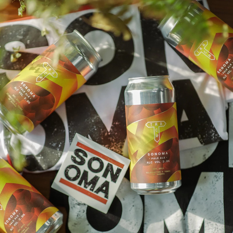
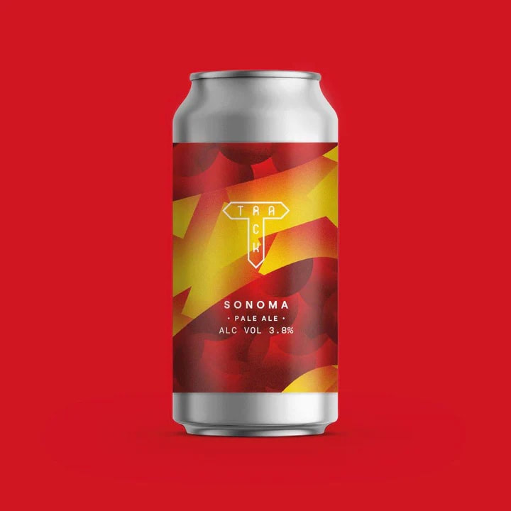
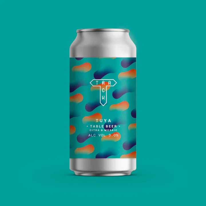
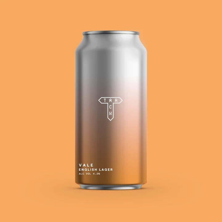
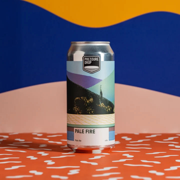
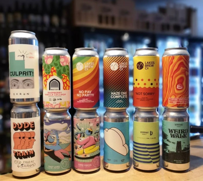
Track:
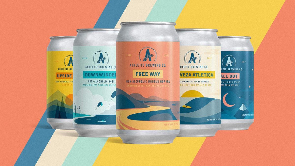
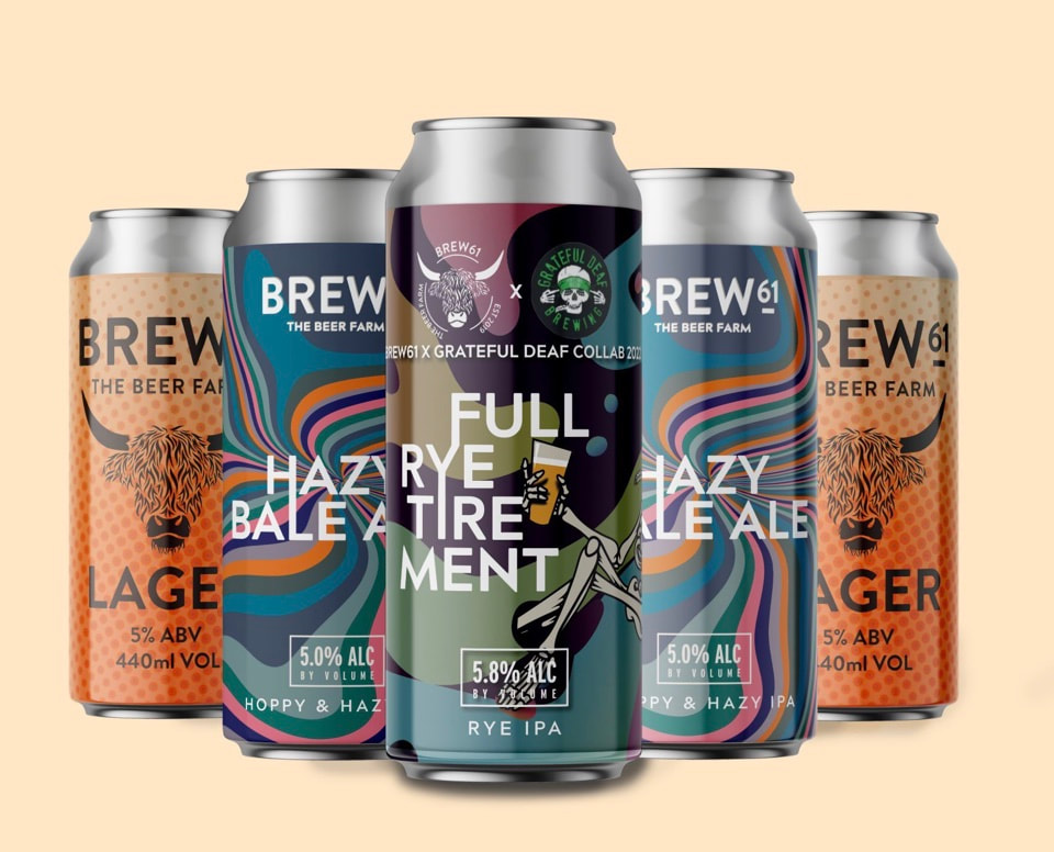
what else is out there?:

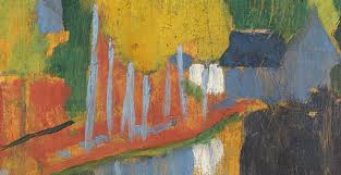
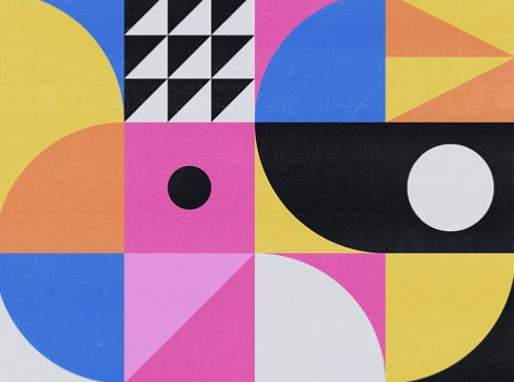
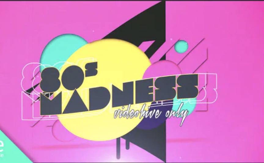
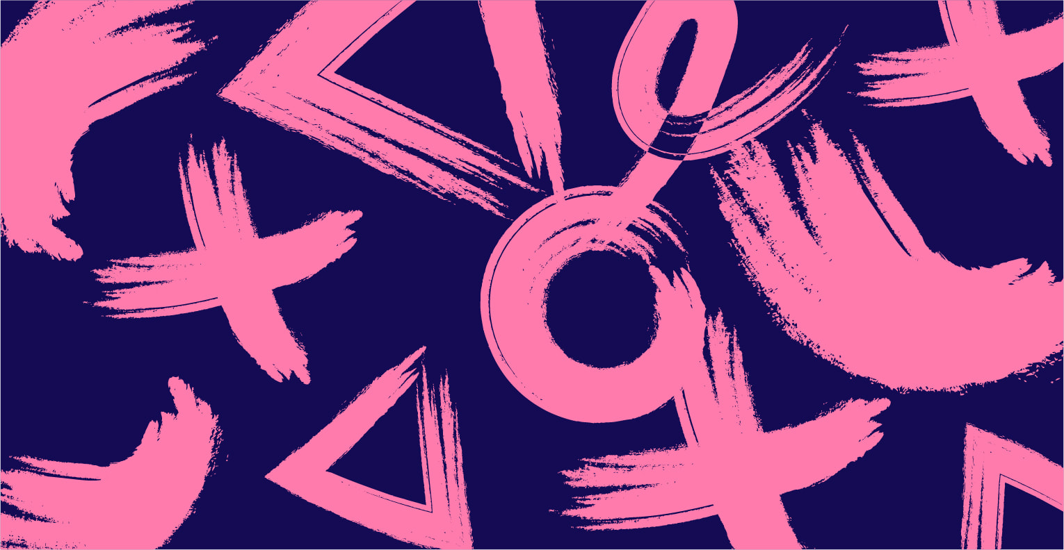
Art inspired by modernism:
I Looked at modernism art to see if they could inspire design concepts for this brand.
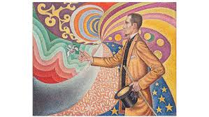
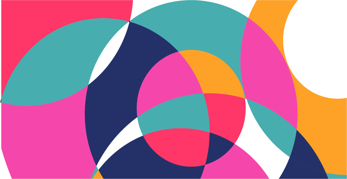
Art inspired by Psychedilics/Surrealism:
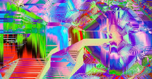
I continued to other areas of the art movement and looked at work from/influenced by the surrealism era. These are busier than other abstract art but I won't have a true idea of whether they will work until I explore this area. This styling can maybe be pulled back to show a subtle nod to this style and the associations drawn from it which may help Crooked River come across in the playful way they want to be seen.

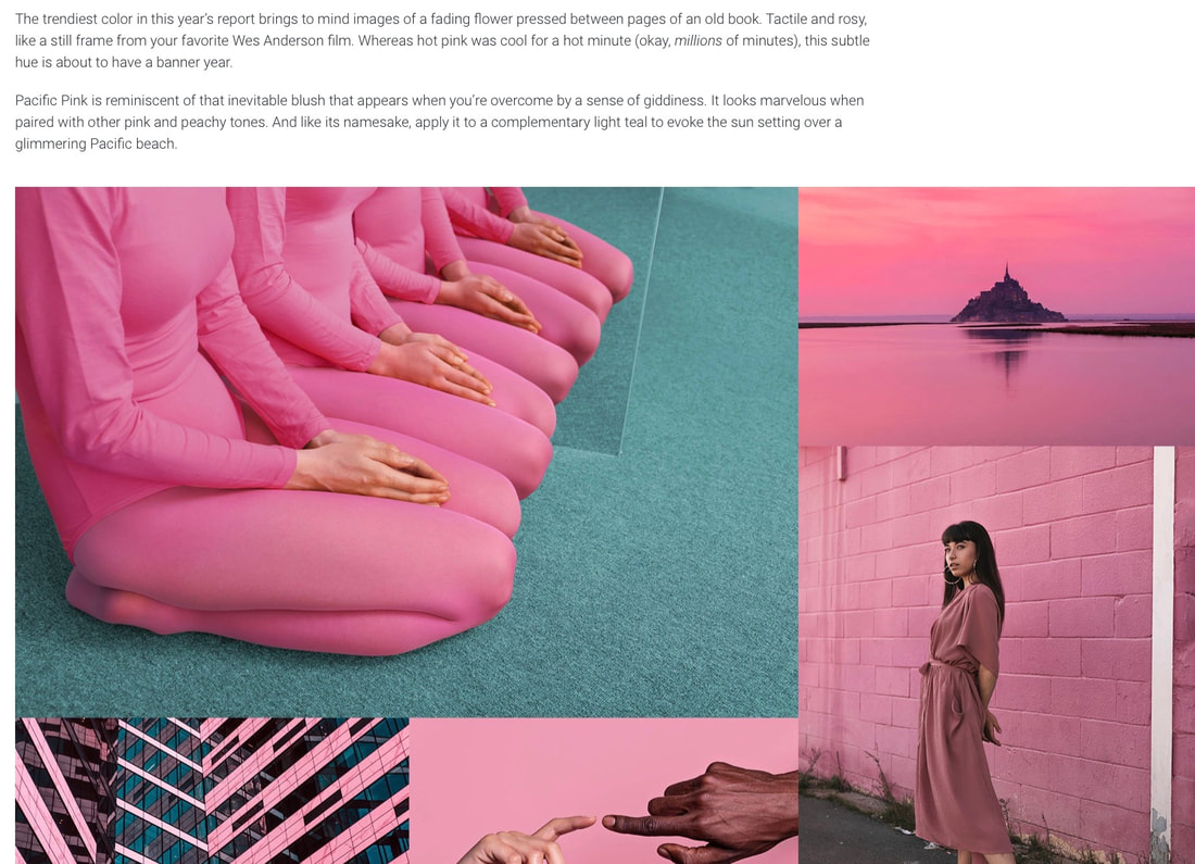
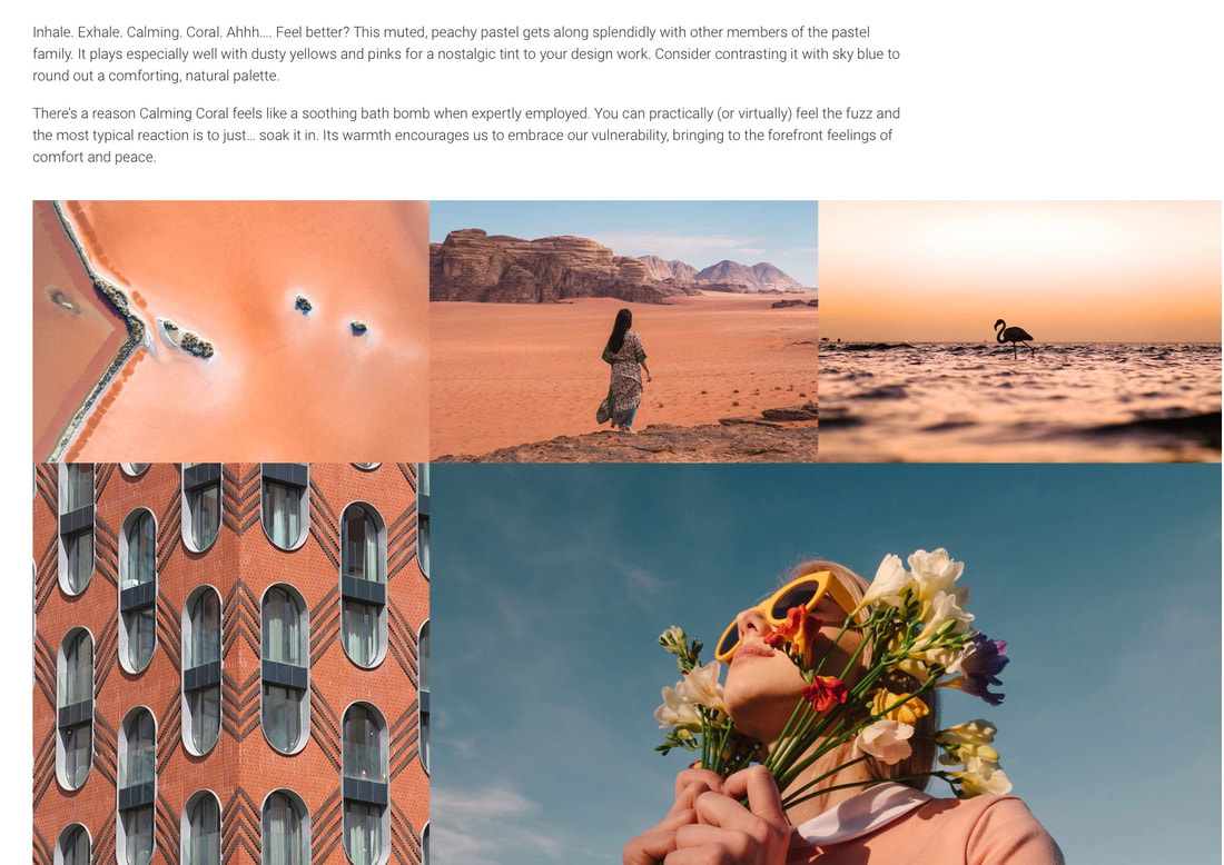
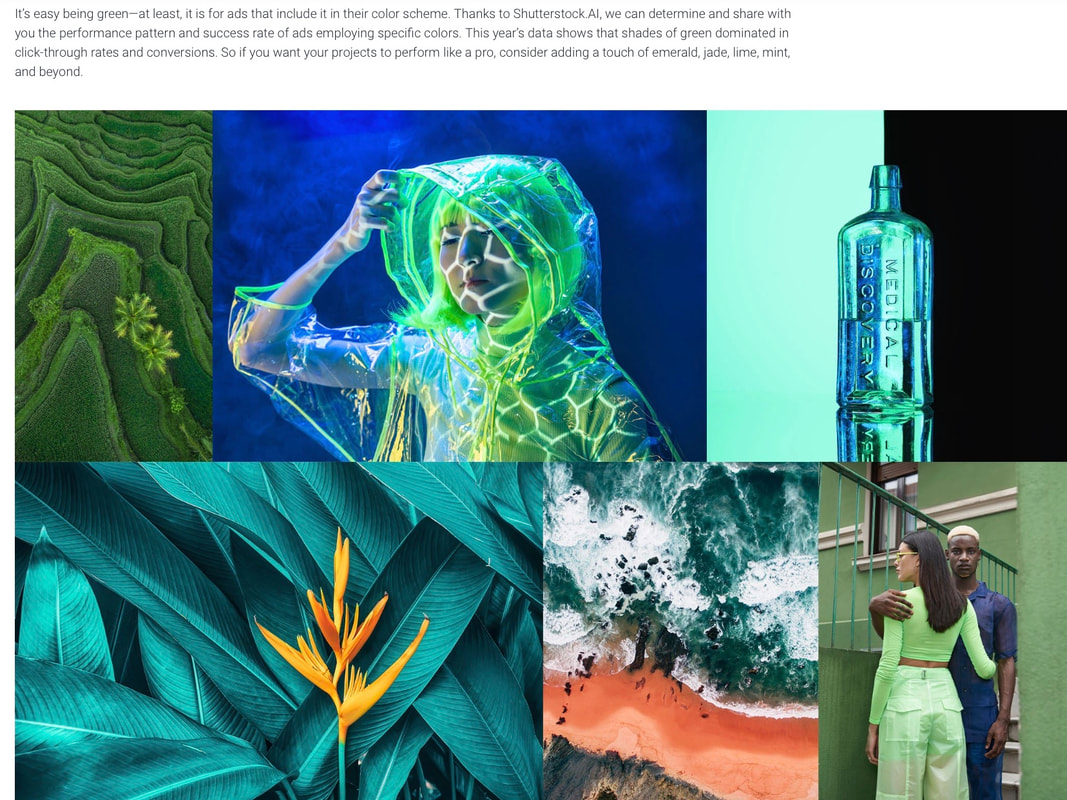
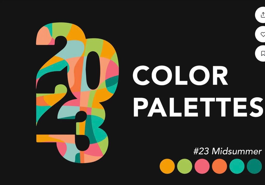
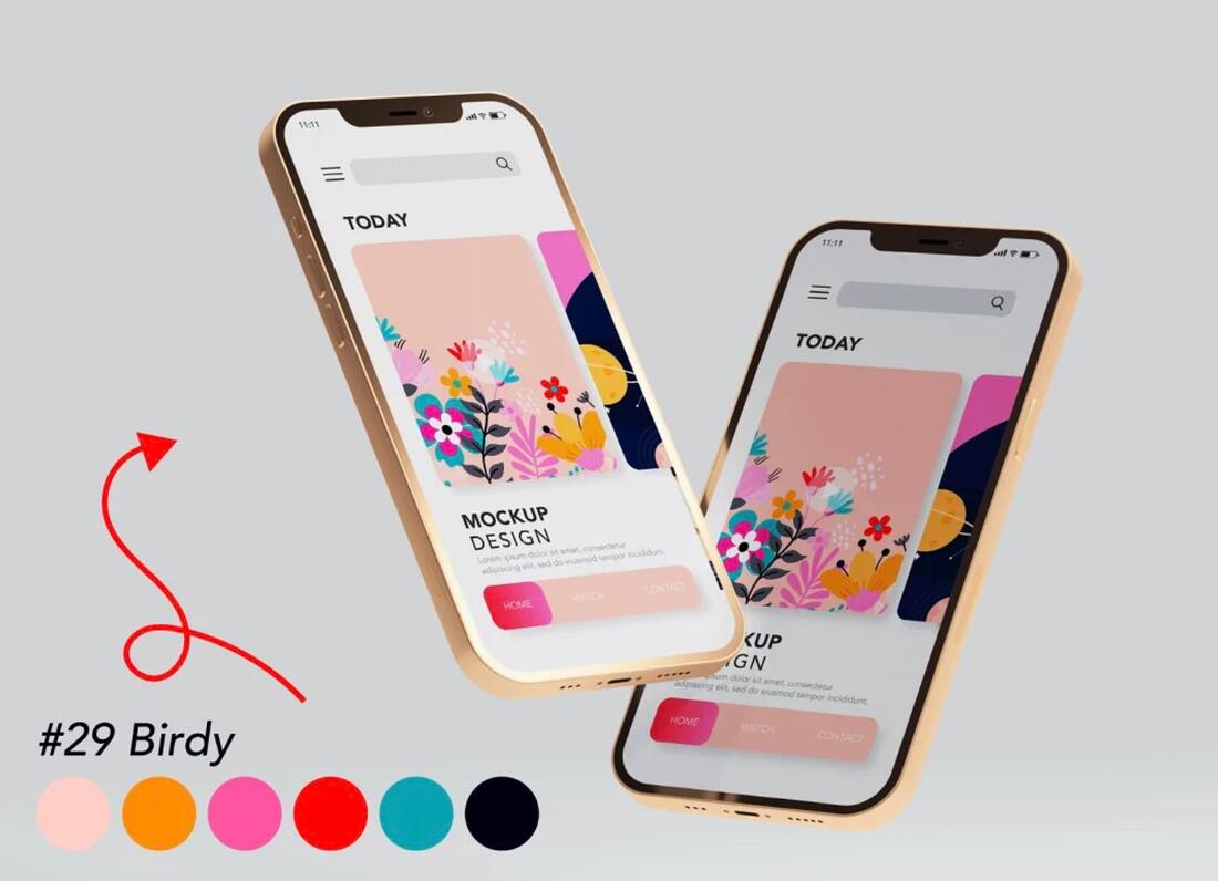
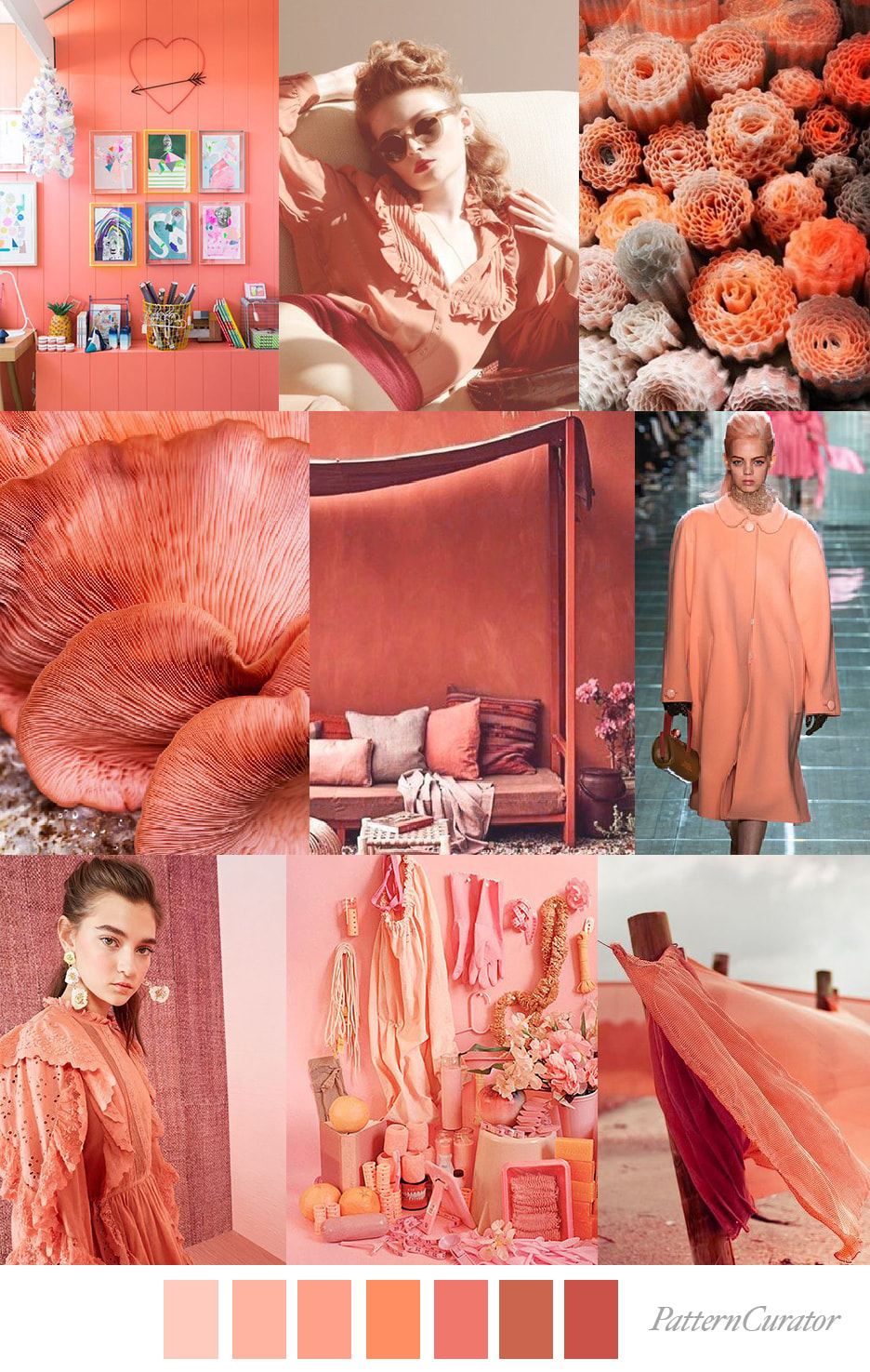
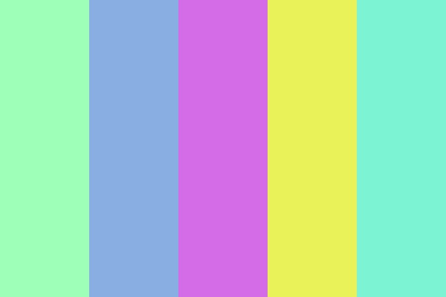
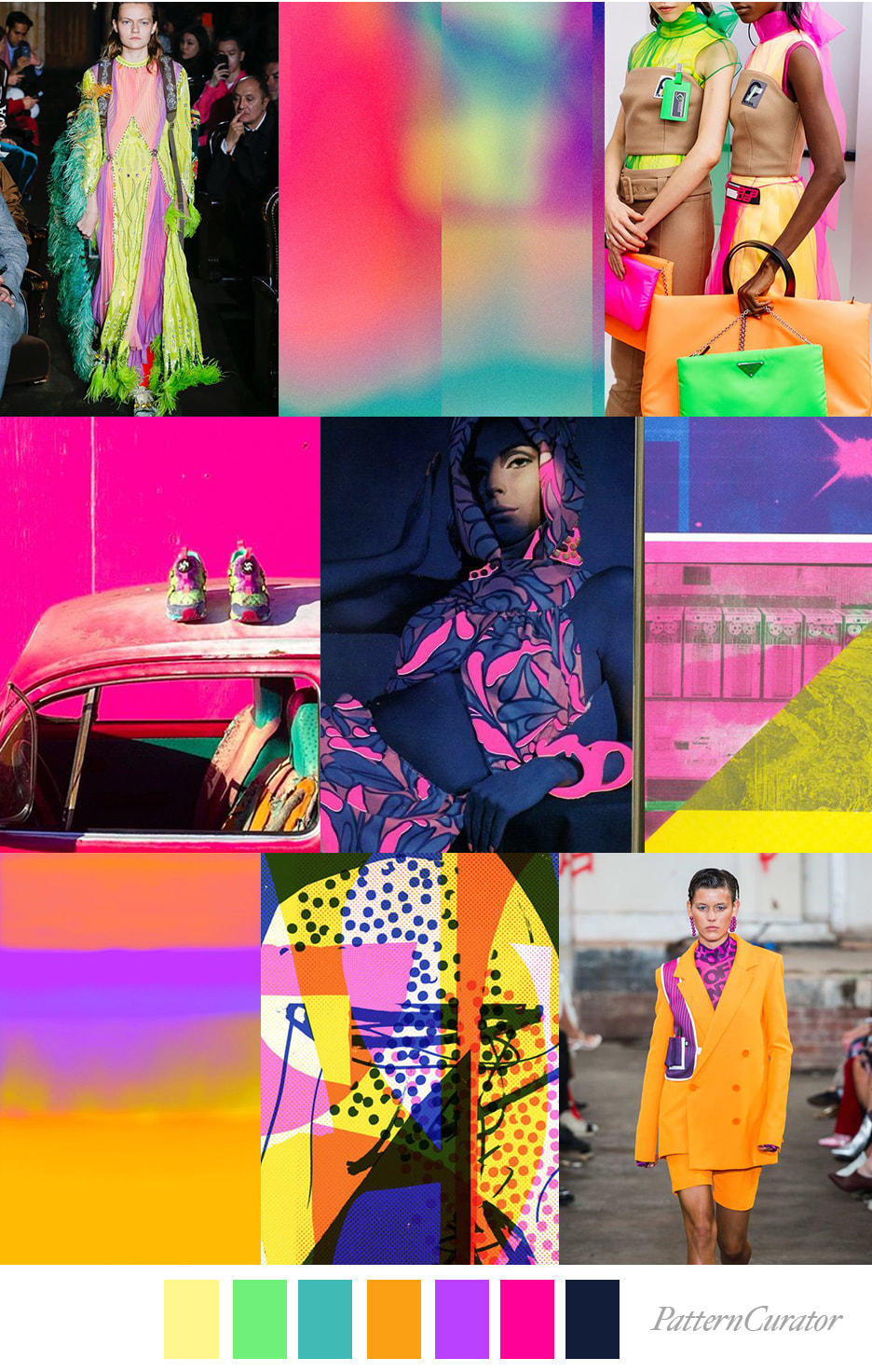
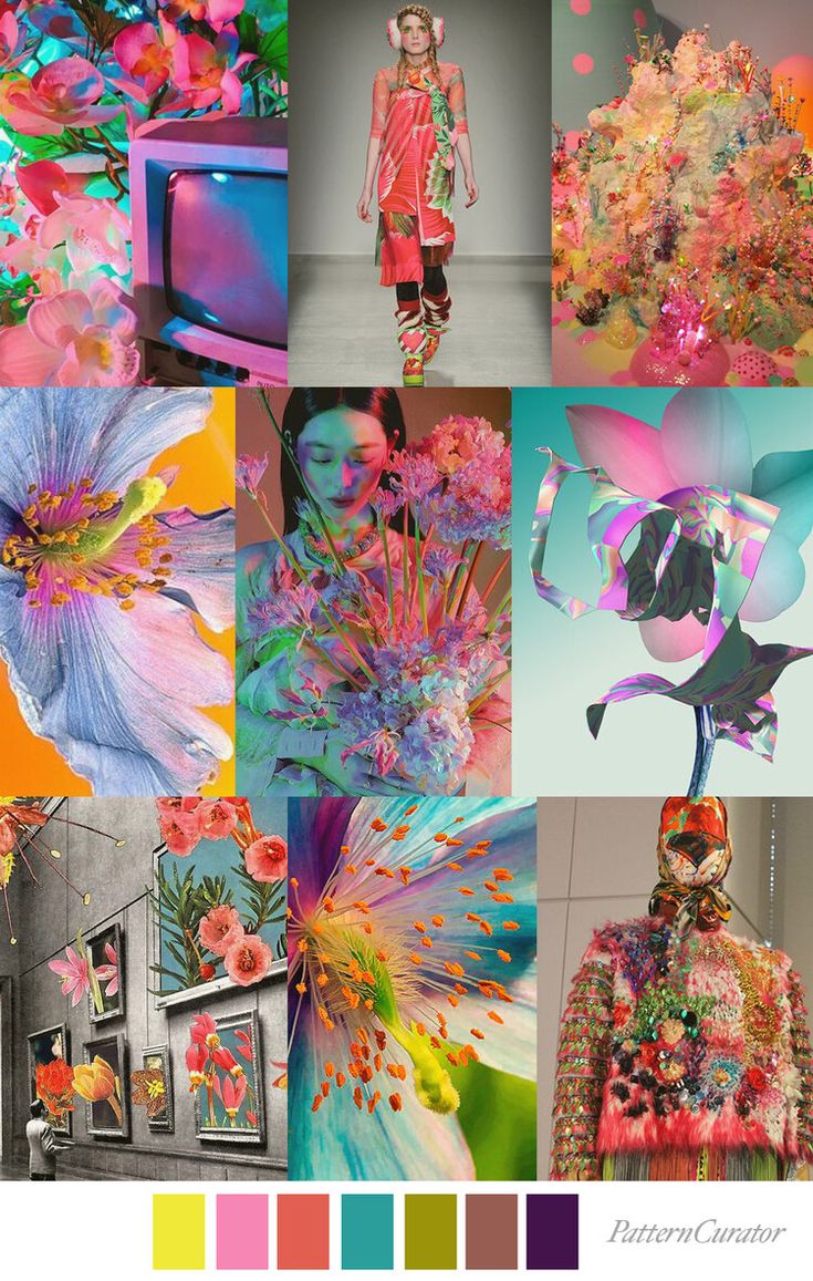
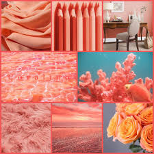
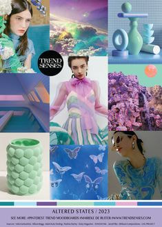
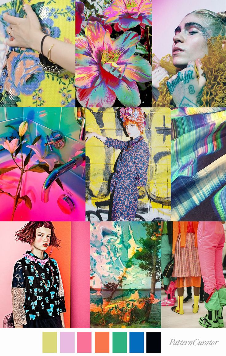
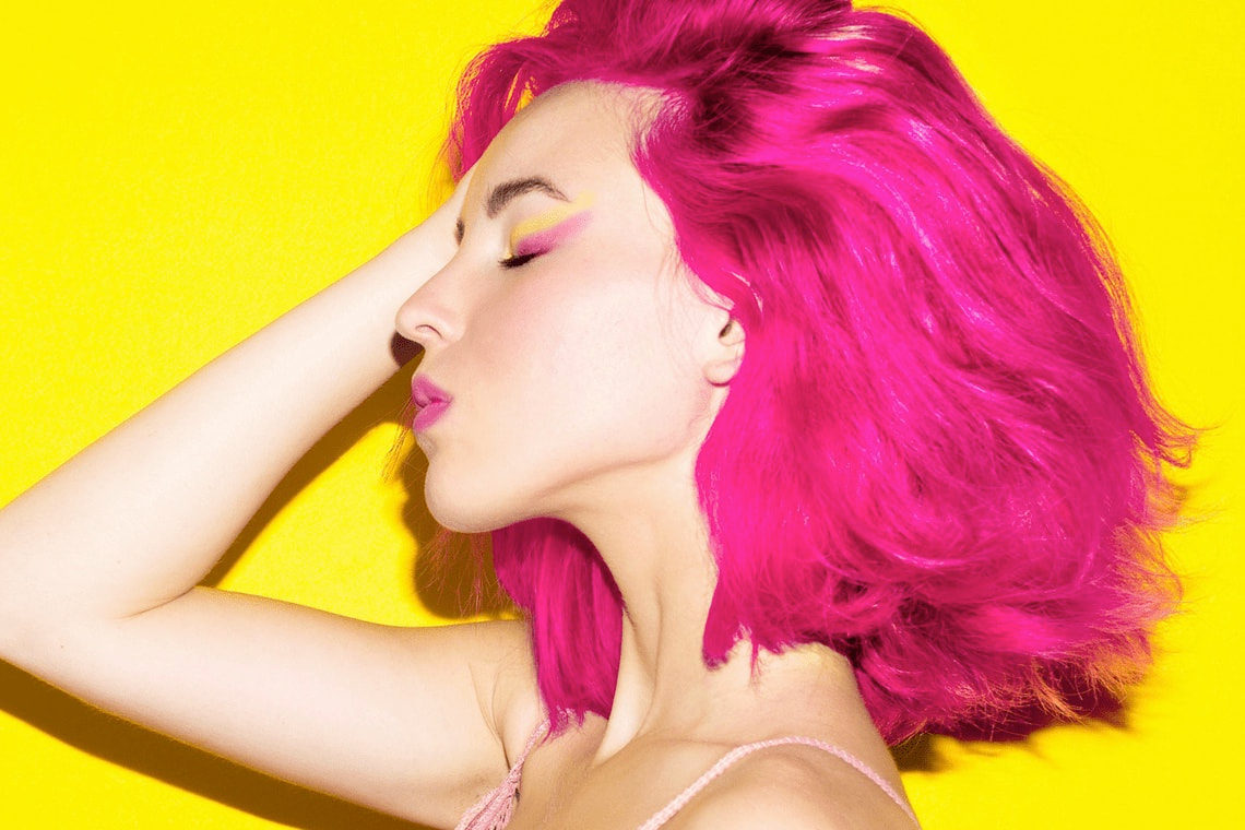
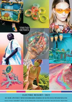
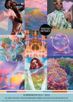
Colour trends:
Phil from Crooked River gave us a talk in which he mentioned trending colours and how that strongly influences his designs for the company. I wanted to explore what was currently trending. Below are notes and information I found online.
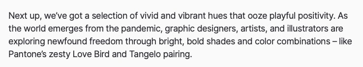
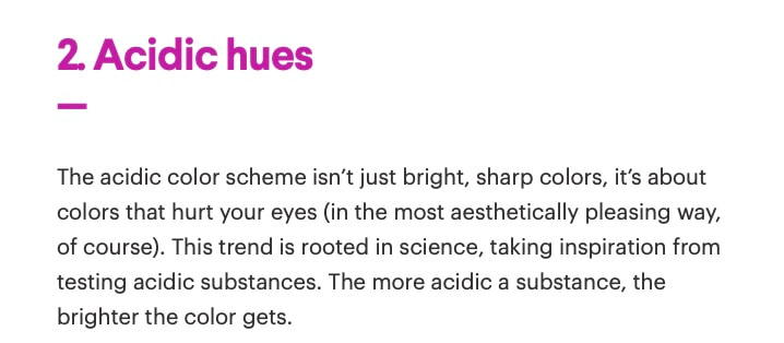
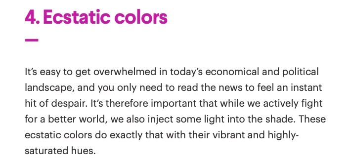
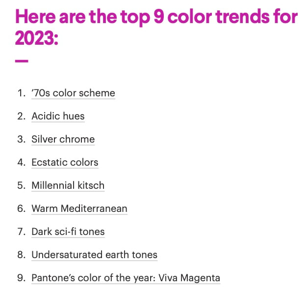
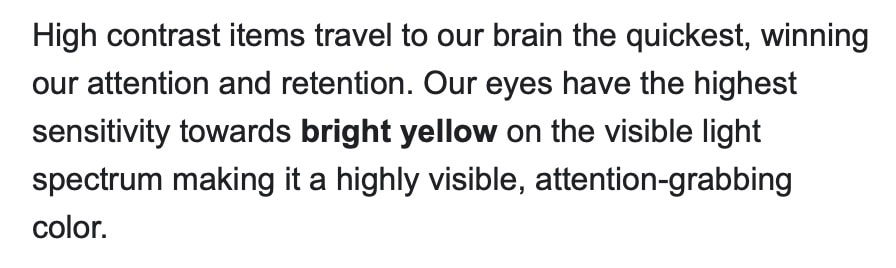
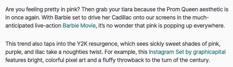
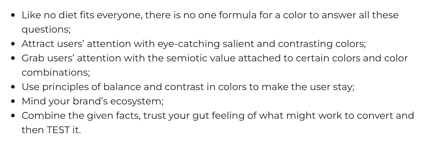
I continued this research into visuals for trending colours but also palettes I personally found appealing or thought would fit the current brief.


Thumbnails/Exploring Ideas:
I put pencil to paper and explored some ideas and colours on paper. This is just to get the energy moving for the brief and see how things look. I want to keep the designs simple as the lines over the top of the design (which Crooked River branding already incorporates) already add an element of busyness.
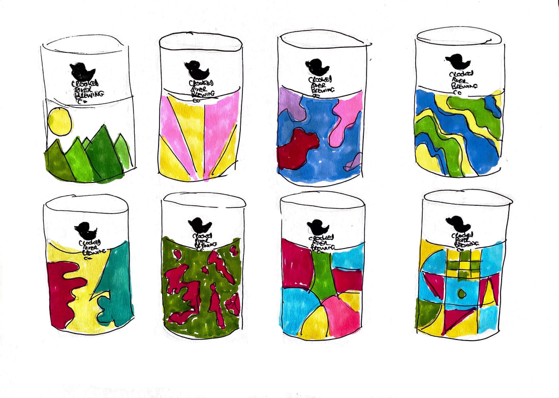
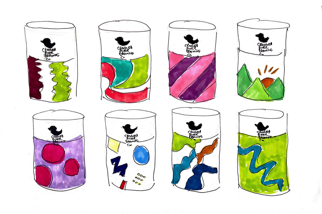
Exploration:
It is one thing appreciating a style and having a vision for it for a design brief and another to create it. I have a lot in my head and I now need to work out using tutorials on patterns and technique to see how I can bring some of these ideas to life. Below are patterns I have created categorised by theme.
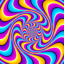
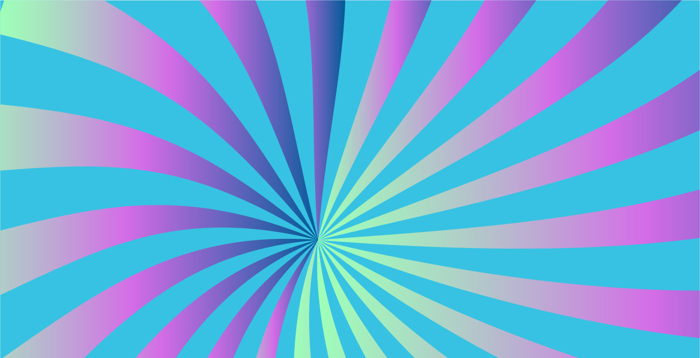
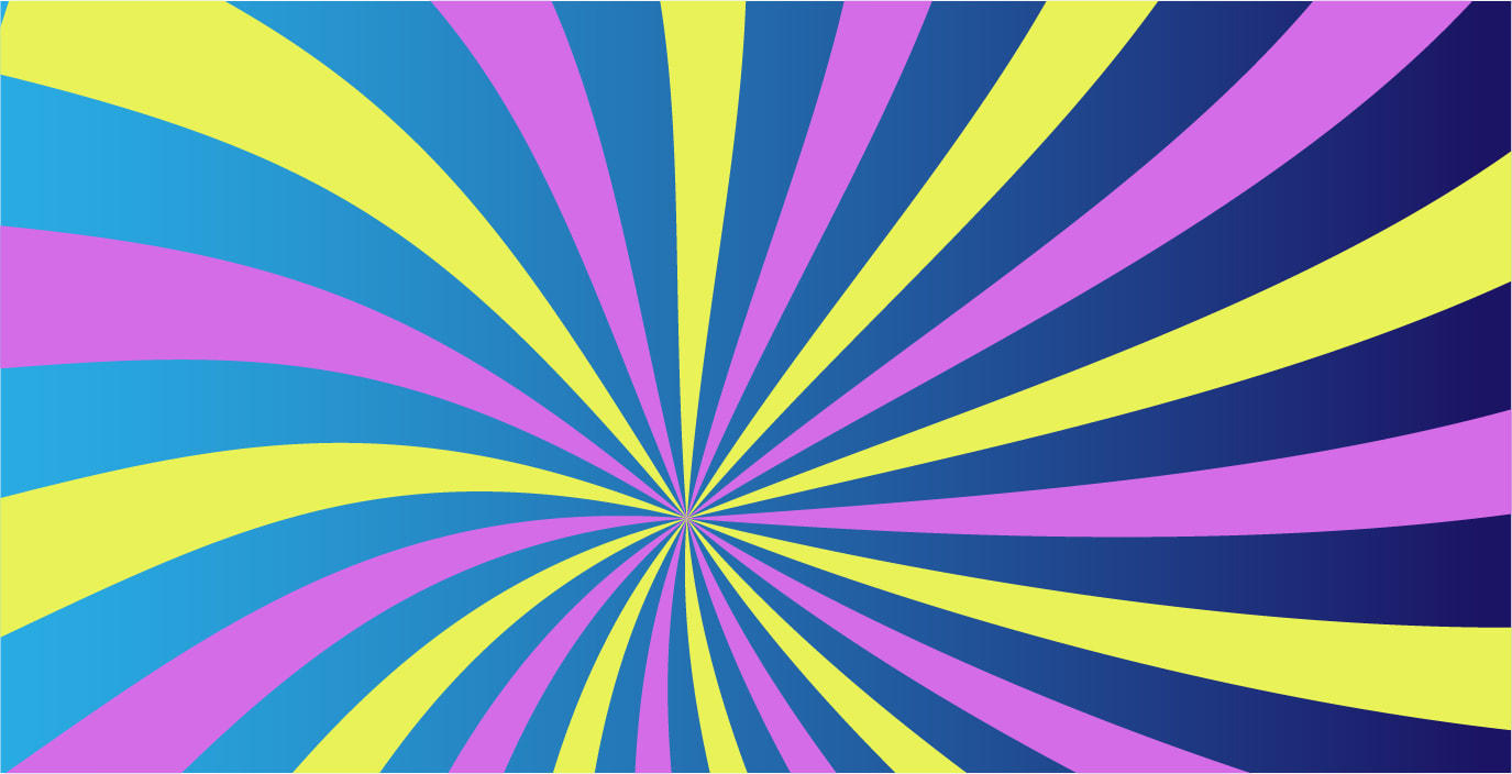
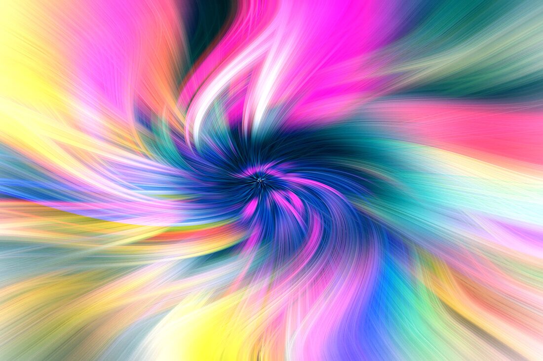
Spiral Effect:
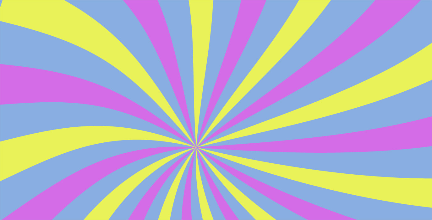
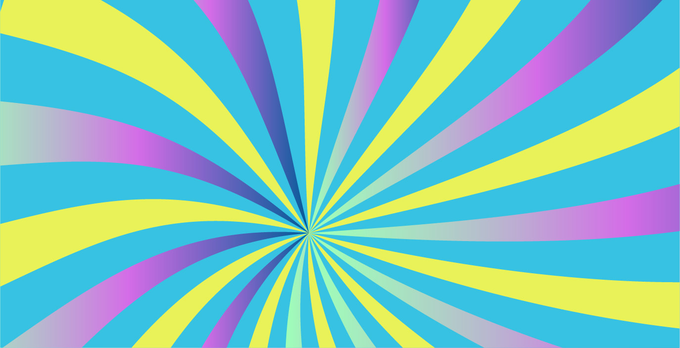
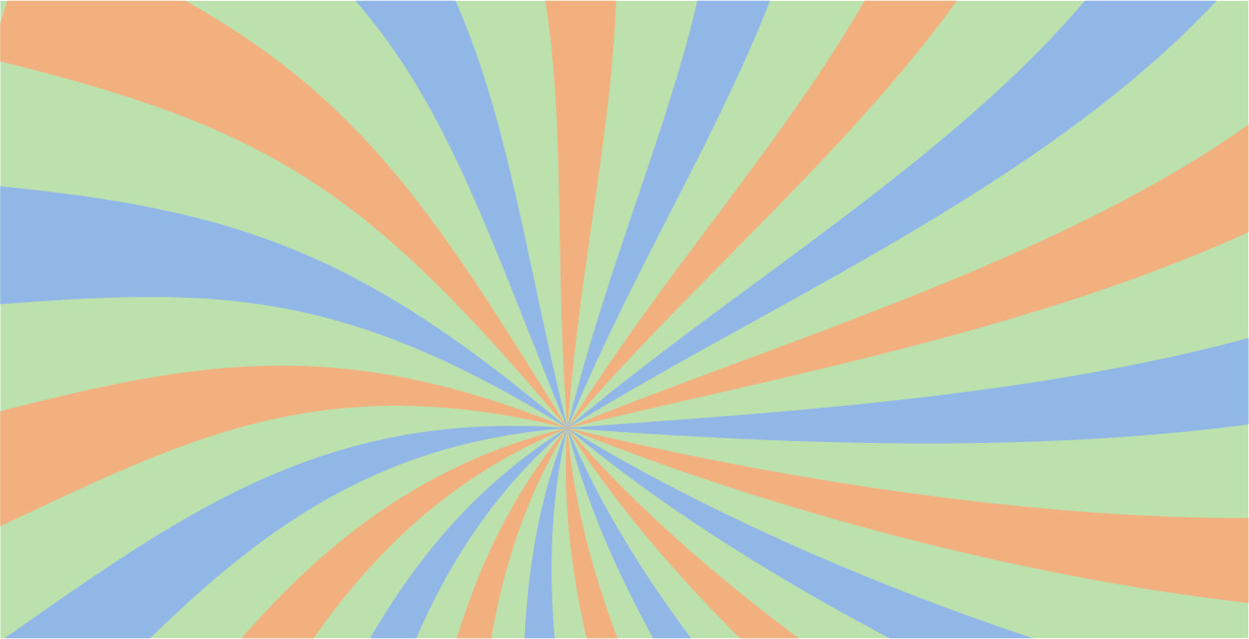
This pattern is effective and eye catching. It is one of the easier ones I learnt to create for the exploration of this brand.

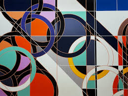
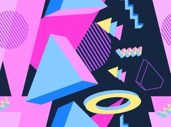
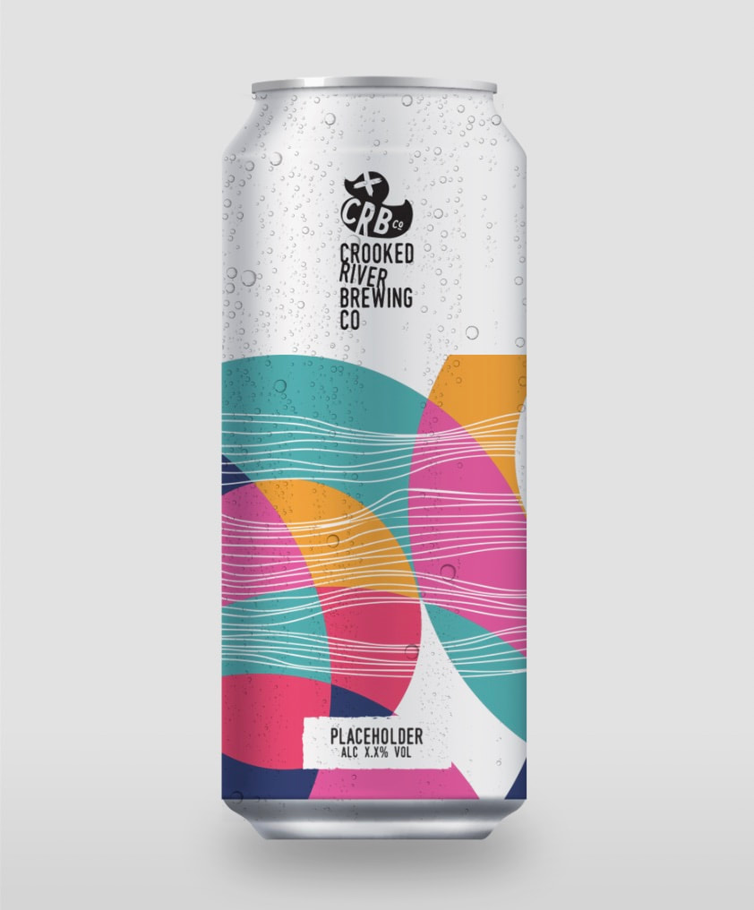
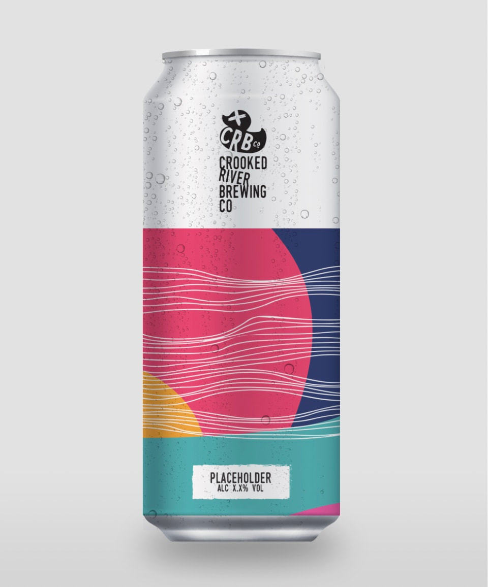
Shapes:
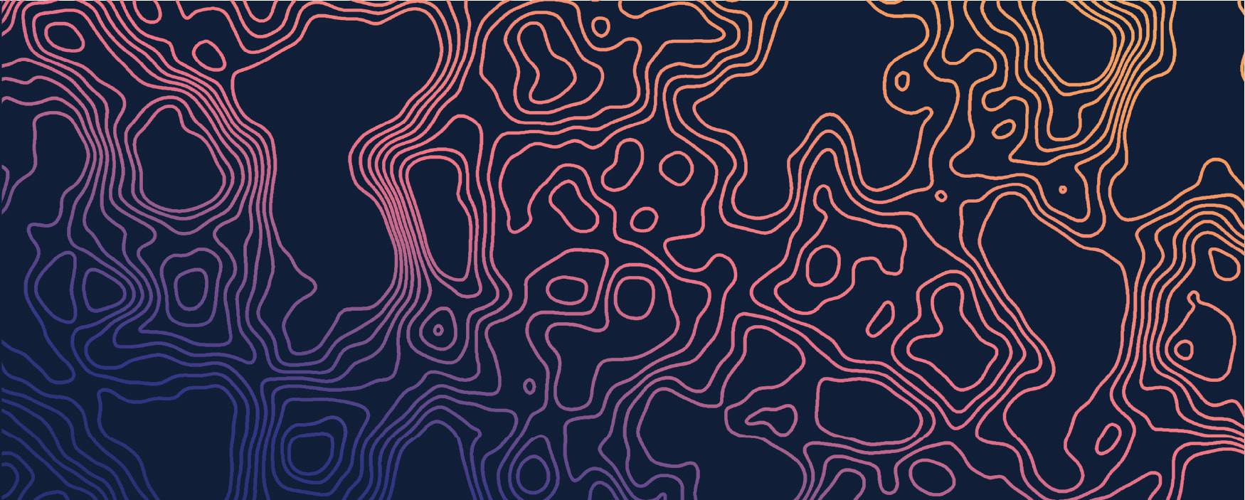
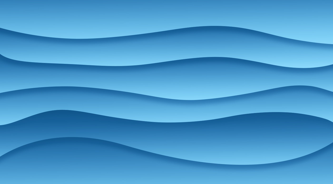
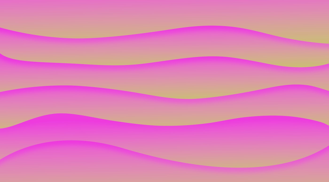
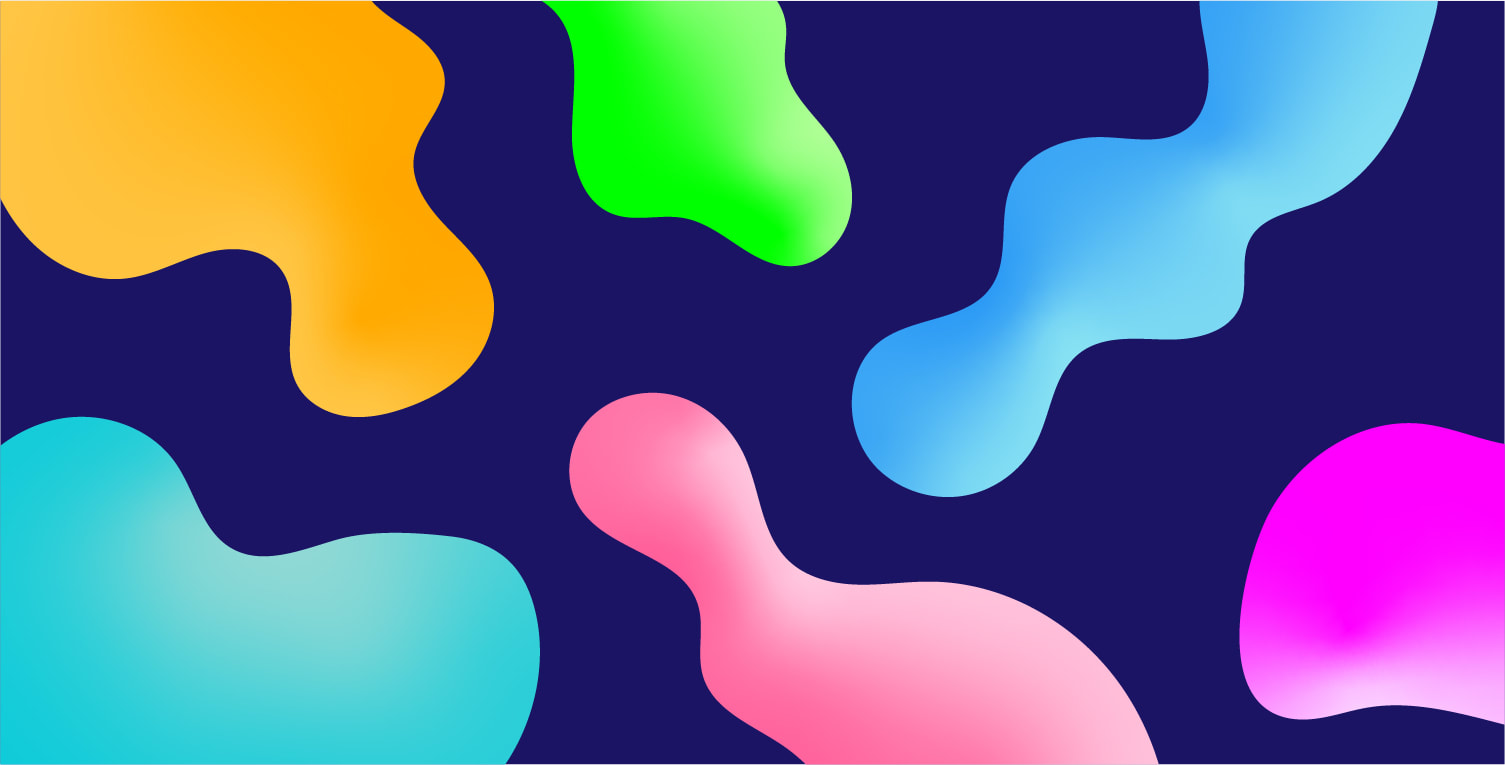
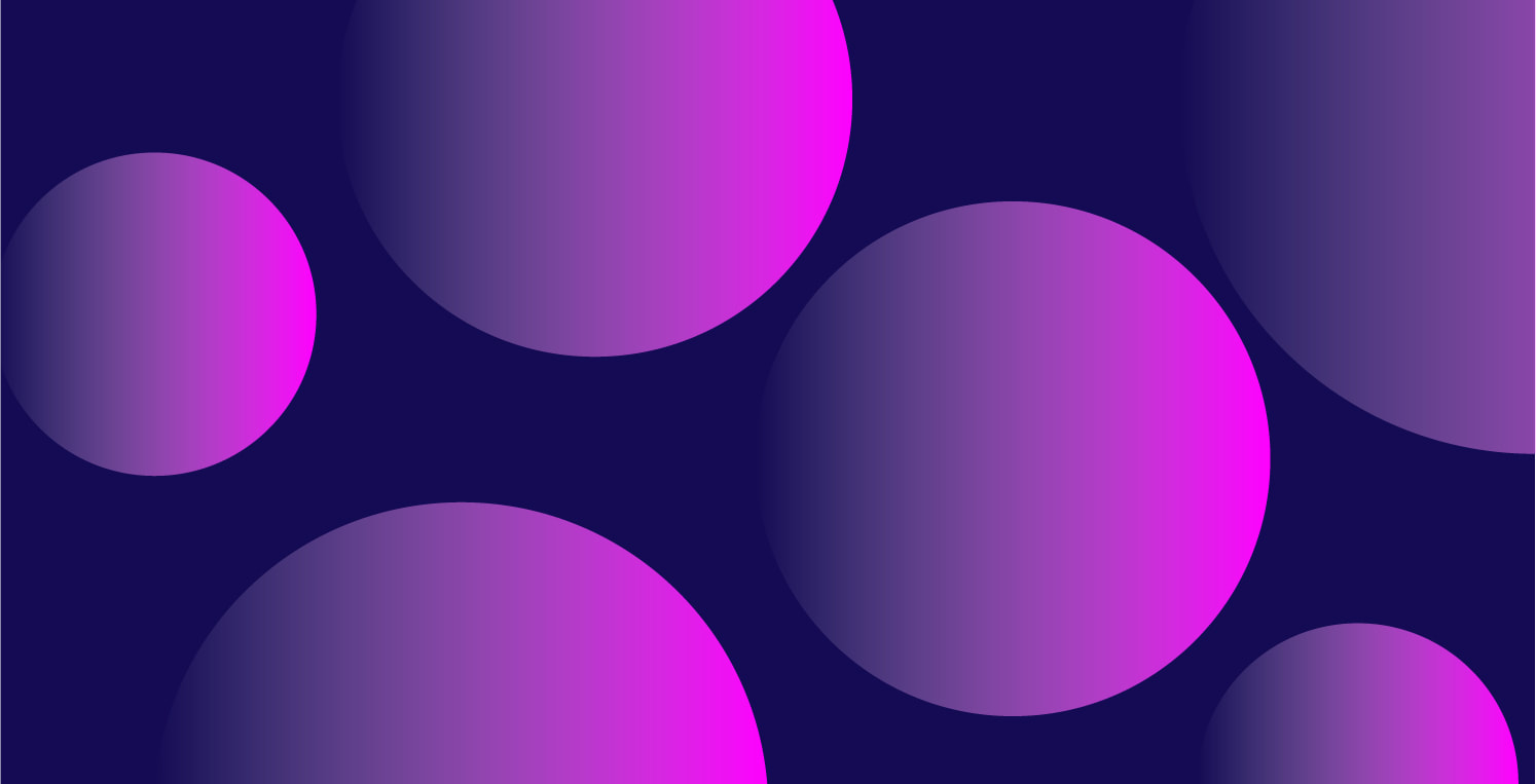
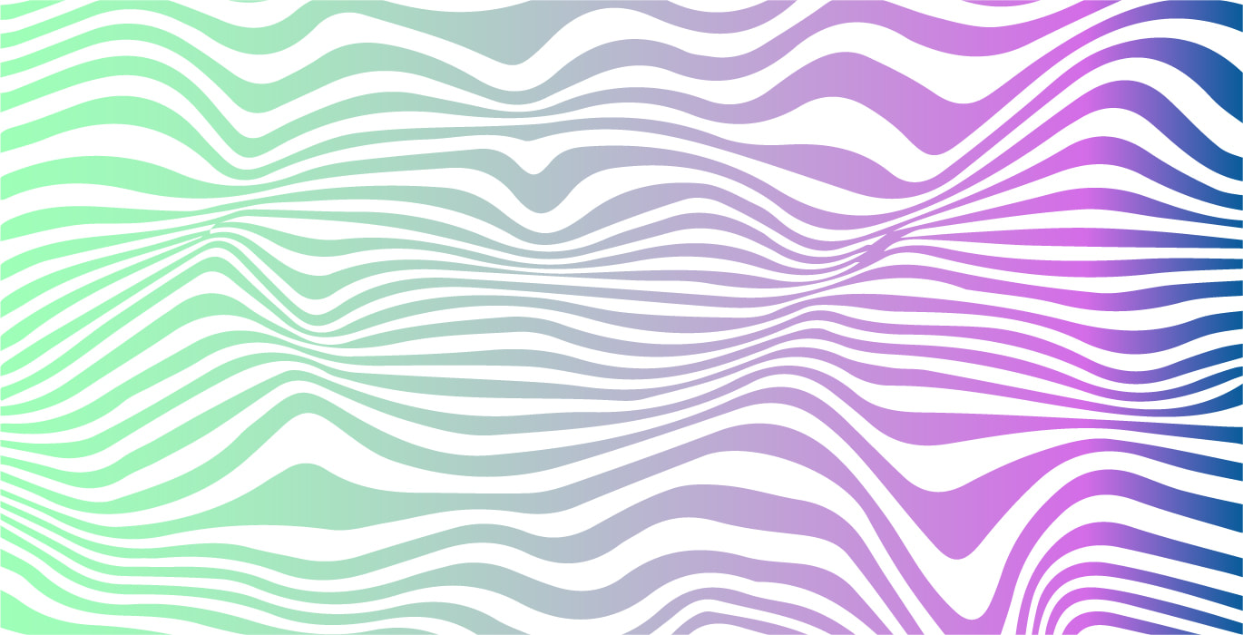
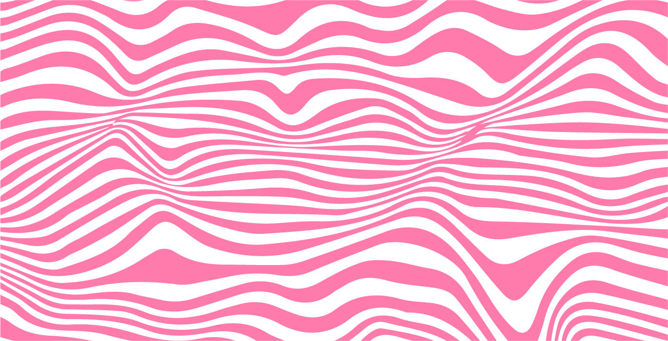
These shape patterns are largely simple and some a little more complex. I really enjoyed learning how these could be created. Some were difficult in part and had many stages to go through to get to the end result. I really love the pink with the yellow combination and the gradient combined with the contours.

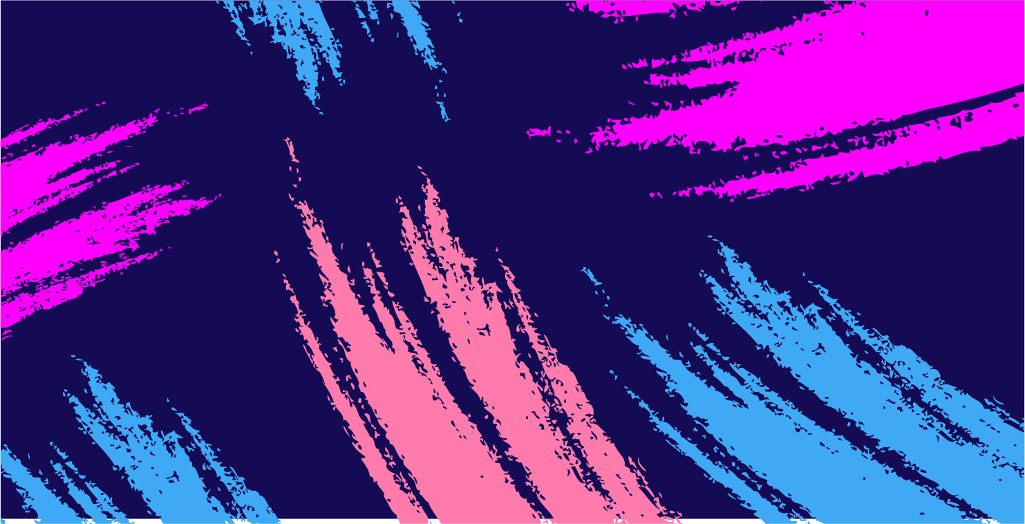
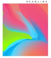
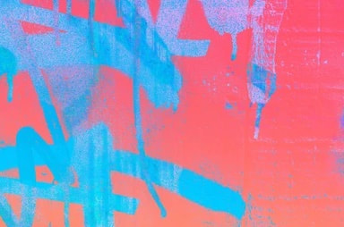
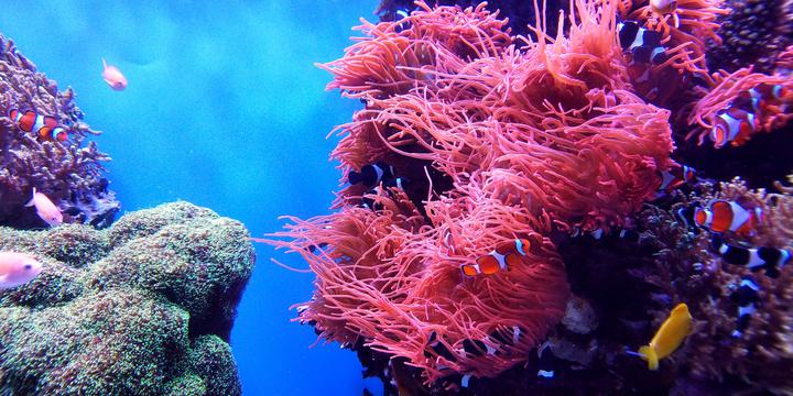
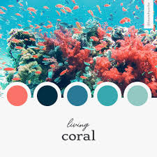
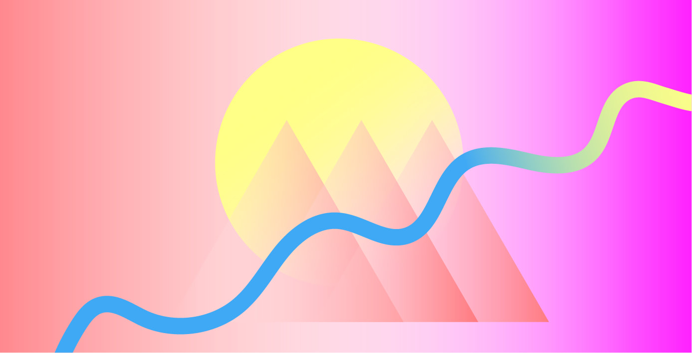
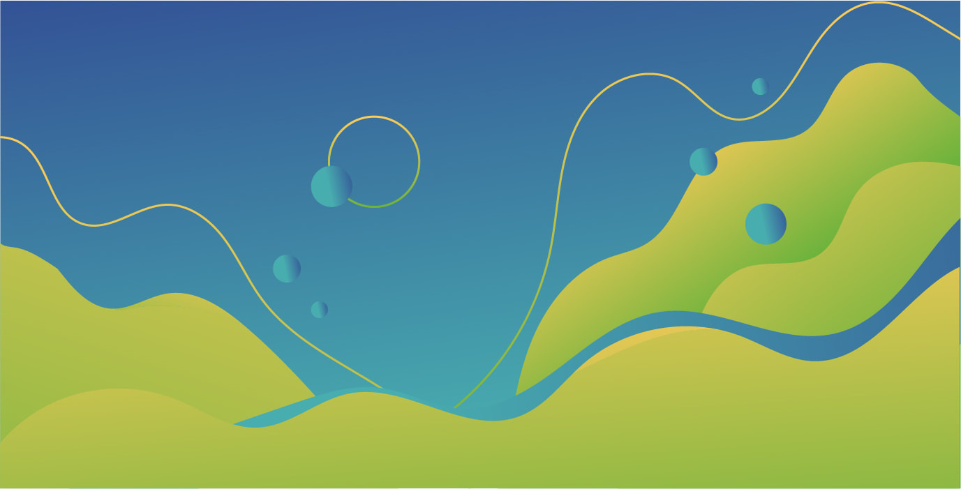
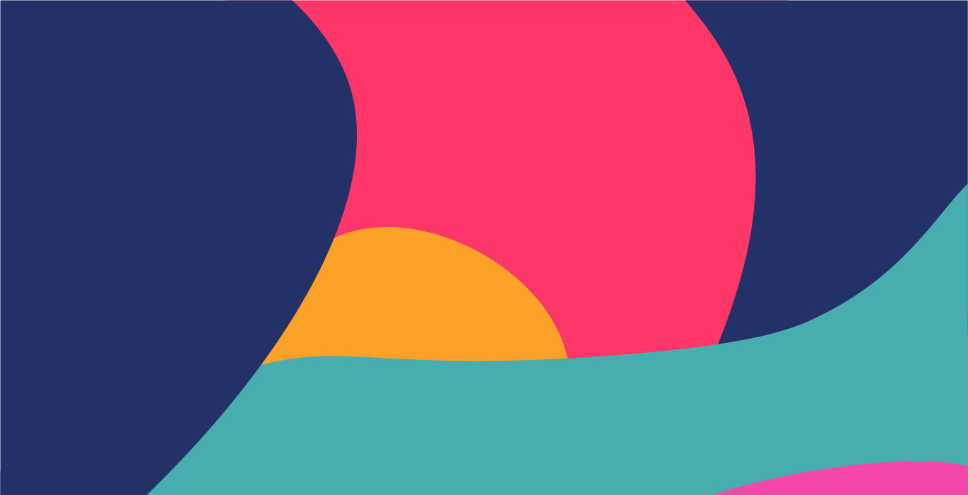
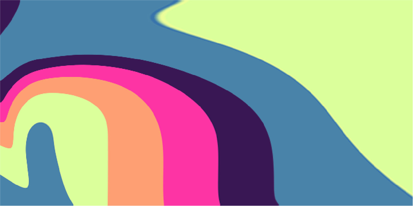
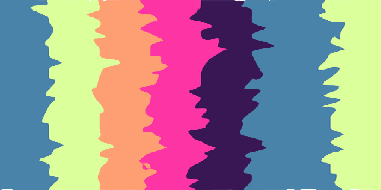
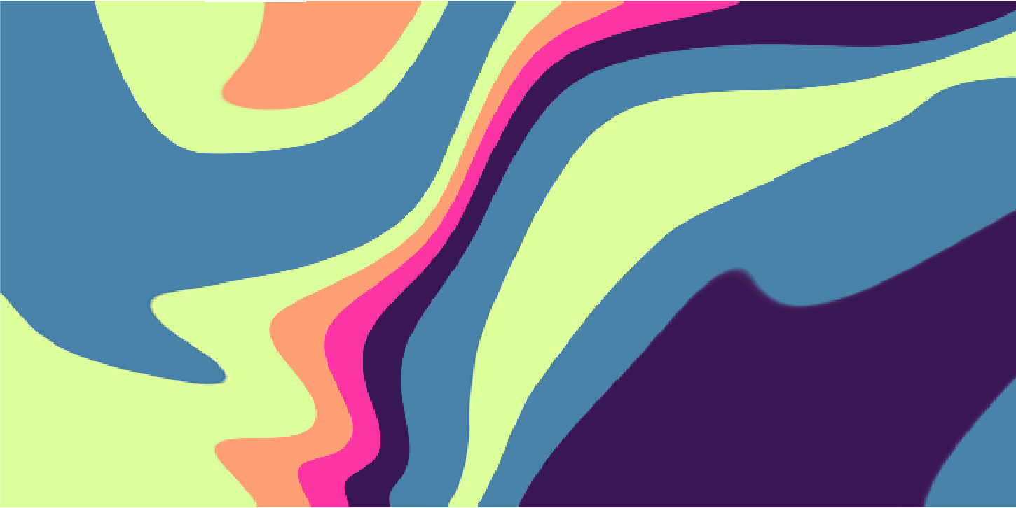
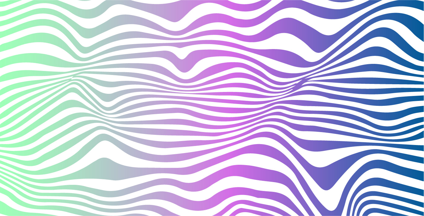
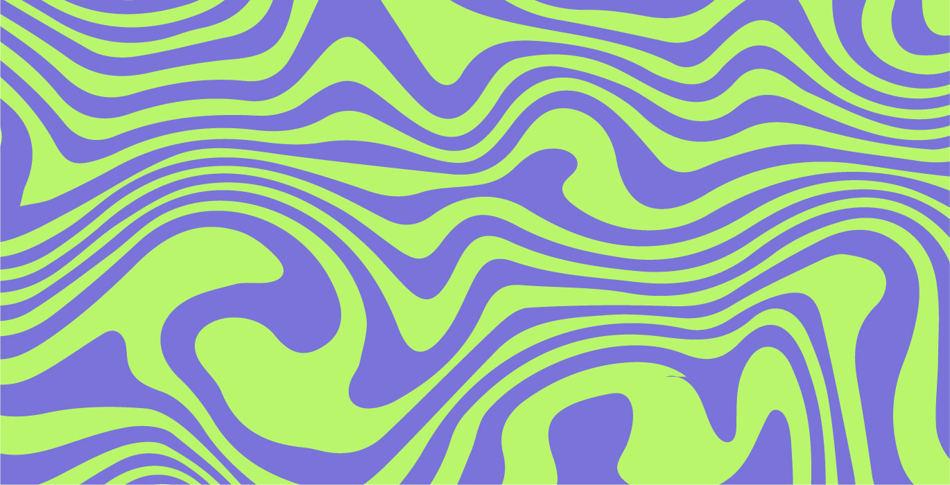
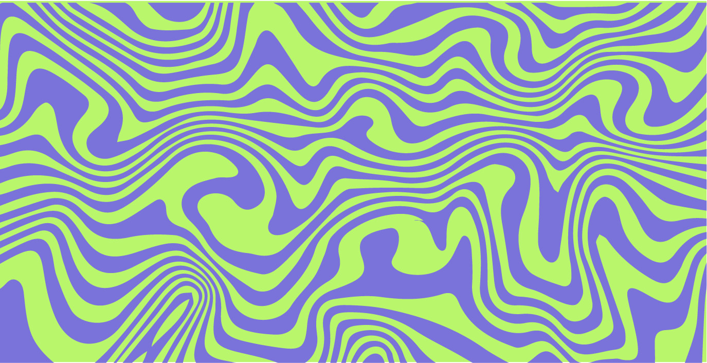
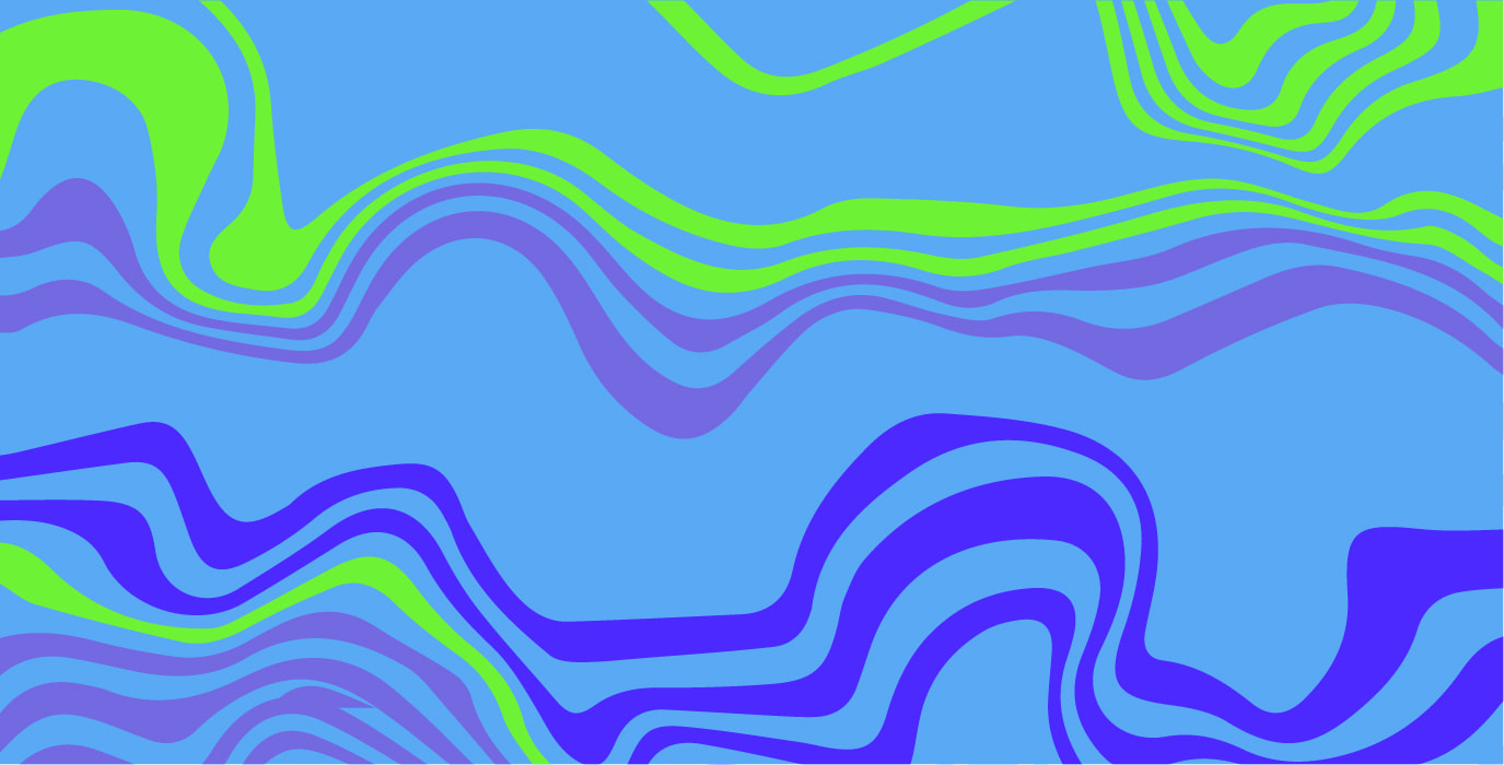
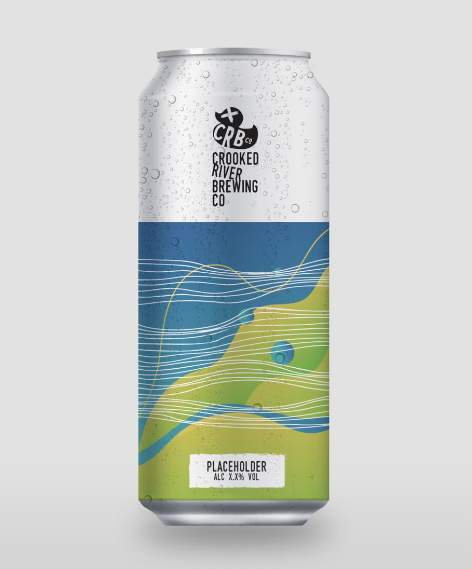
Abstract:
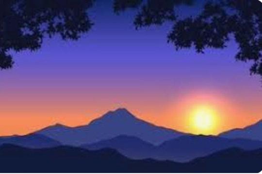
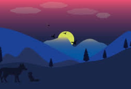
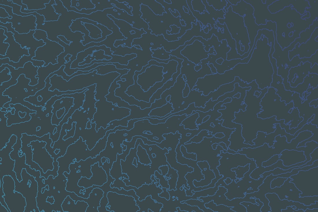
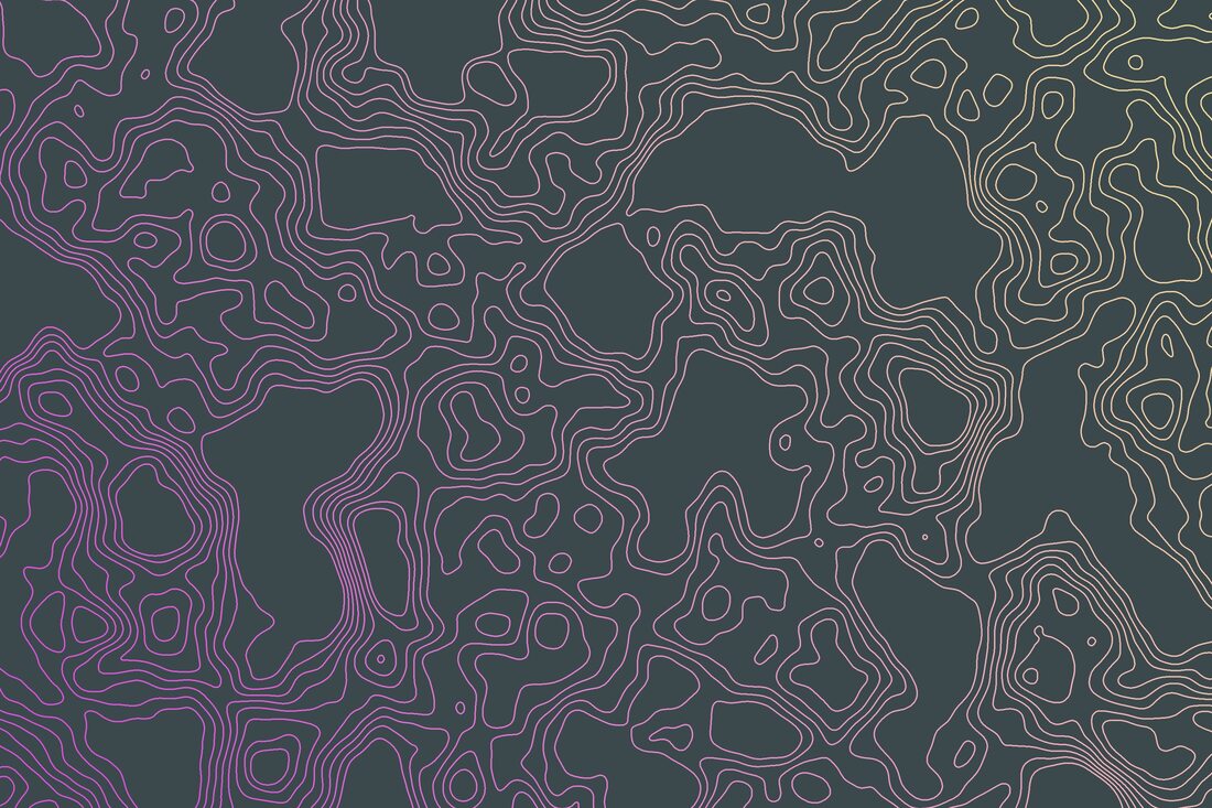
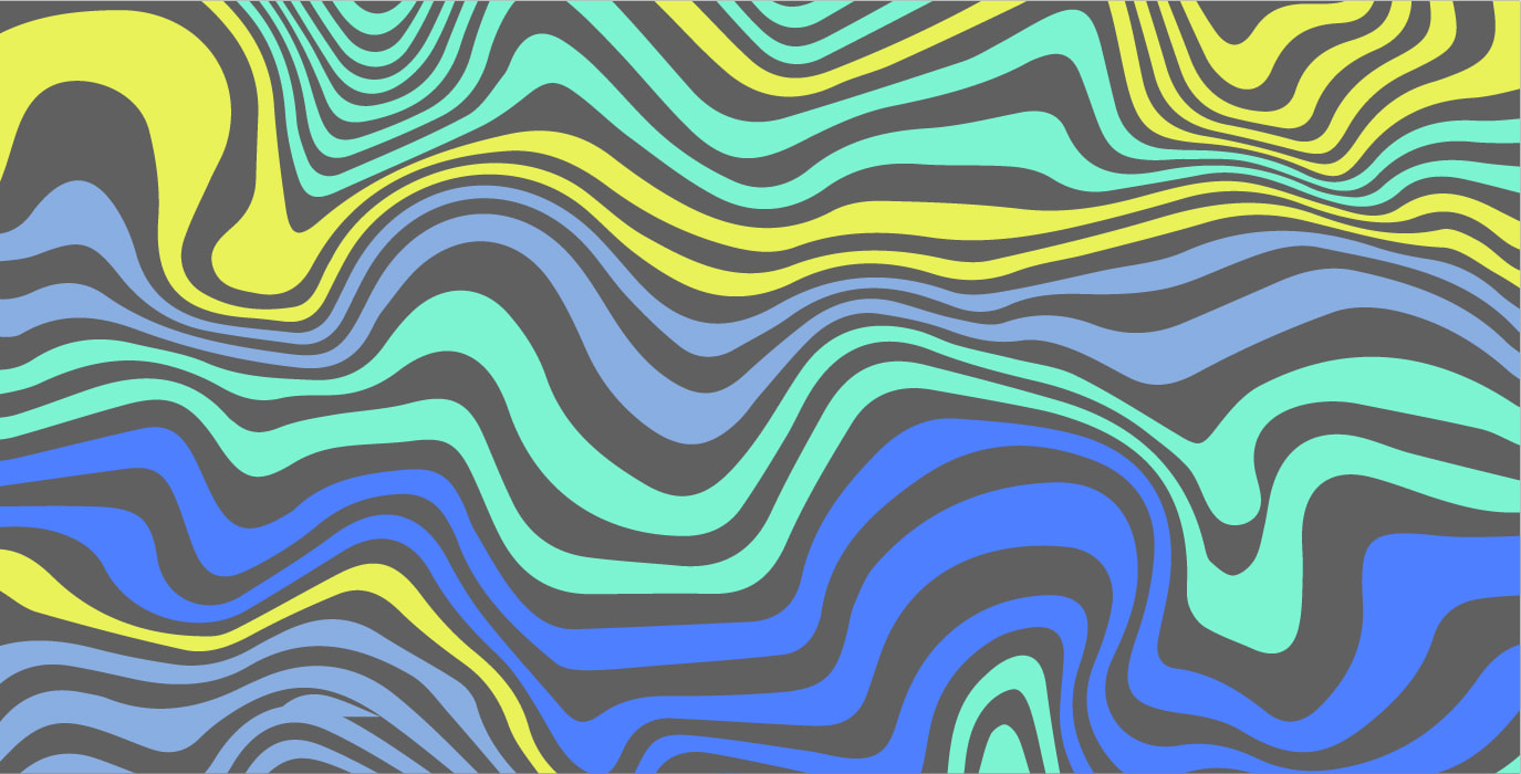
These were more abstract patterns I created. Some have a link or were inspired by the outdoors, rivers and nature. Again I enjoyed finding colour combinations that created harmony and balance when working together.


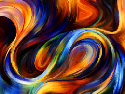
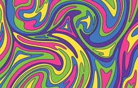
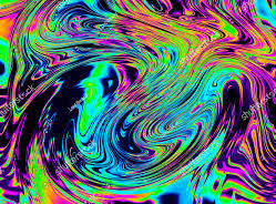
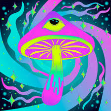
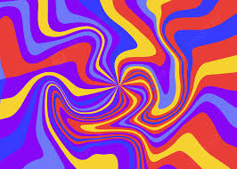
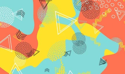
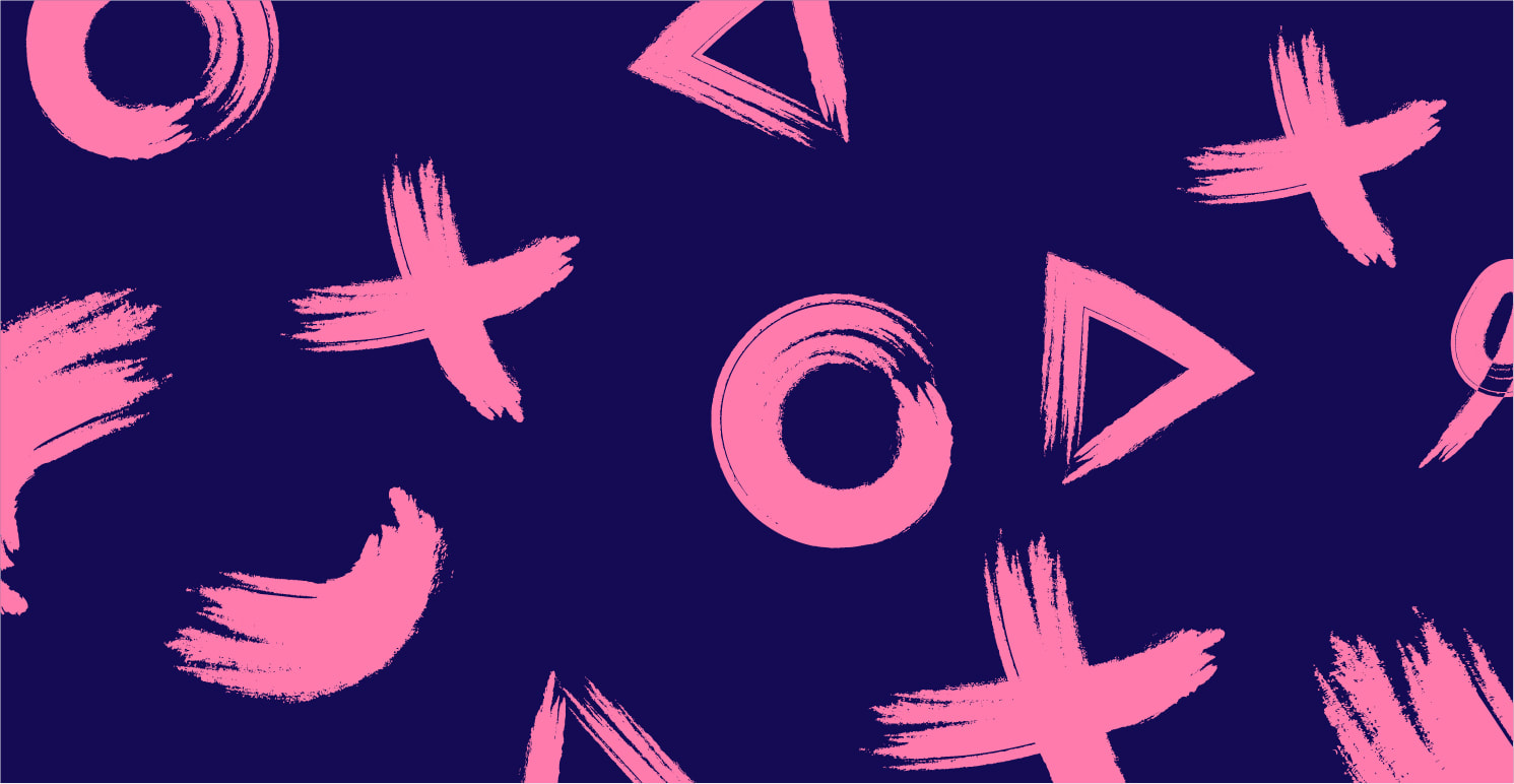
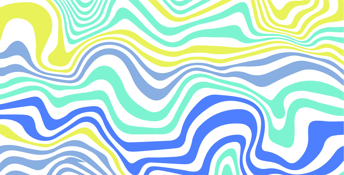
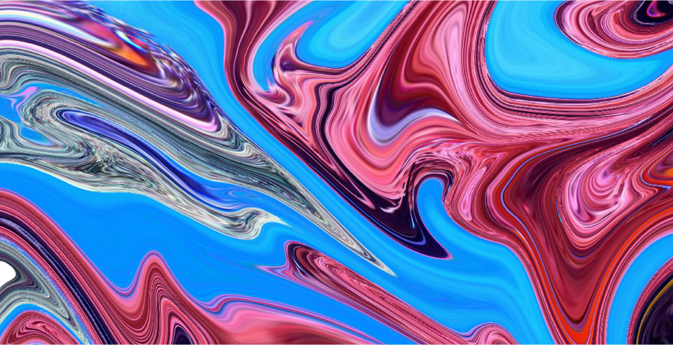
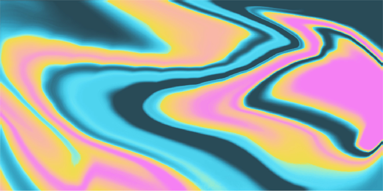
Psychedelic:
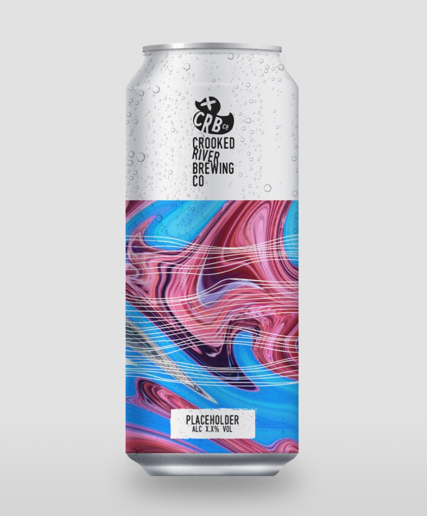
These were more abstract and busy. I love the patterns that swirl almost into lotus flower looking shape. They may be a little busy, but I would like to try them in mockups to see how they look. I also tried creating a hazy looking design for the beer with these attributes but I wasn't sure on how the design looked, as I felt it looked a little flat.


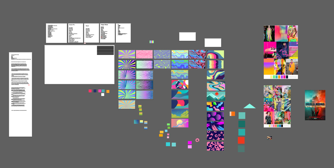
As usual I gather my work space with notes, palettes and ideas so it is all visible to help me stay focused on the associated styling I was moving towards.
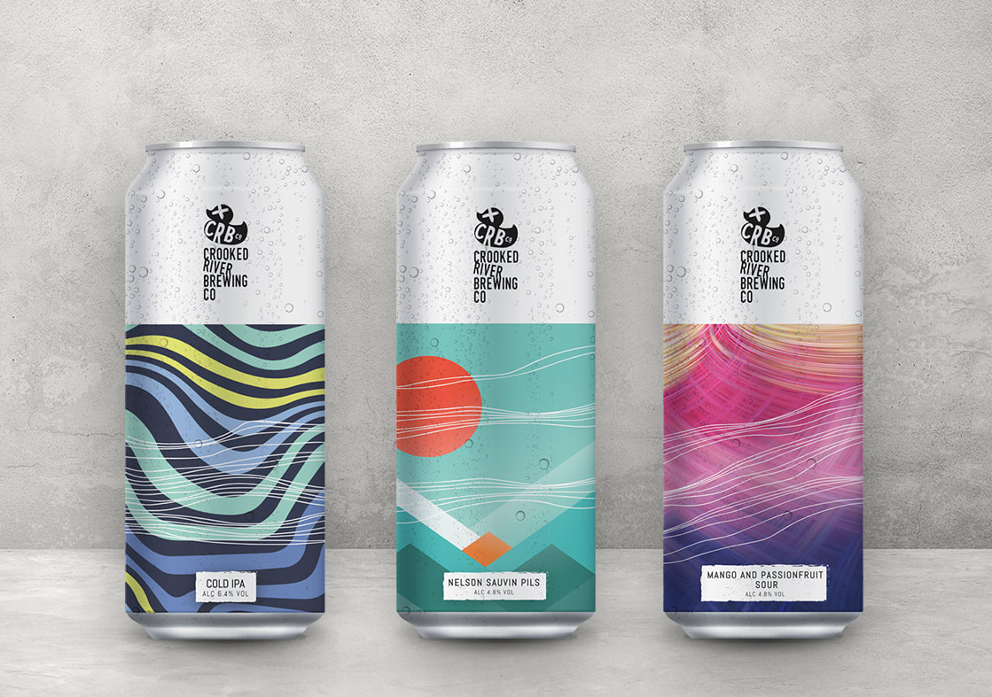
Mockups:
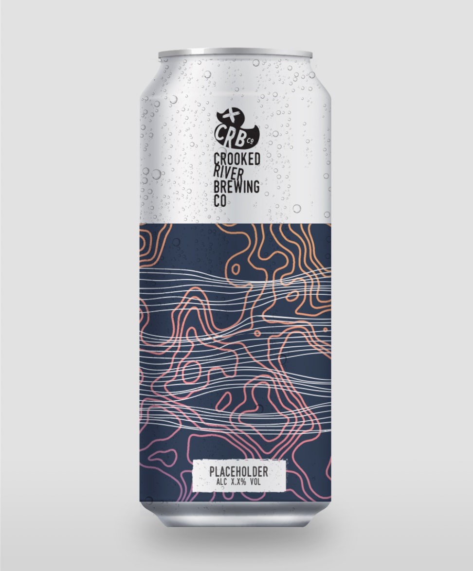
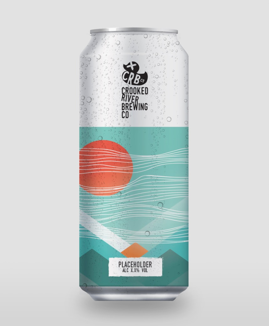
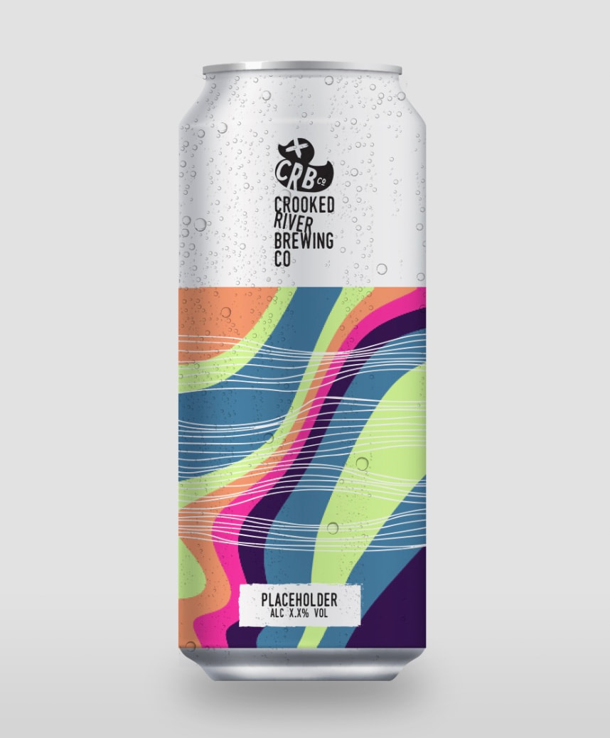
I mocked up many of the images as I wanted to see how they would look visually. I was surprised with how effective some of these designs looked.
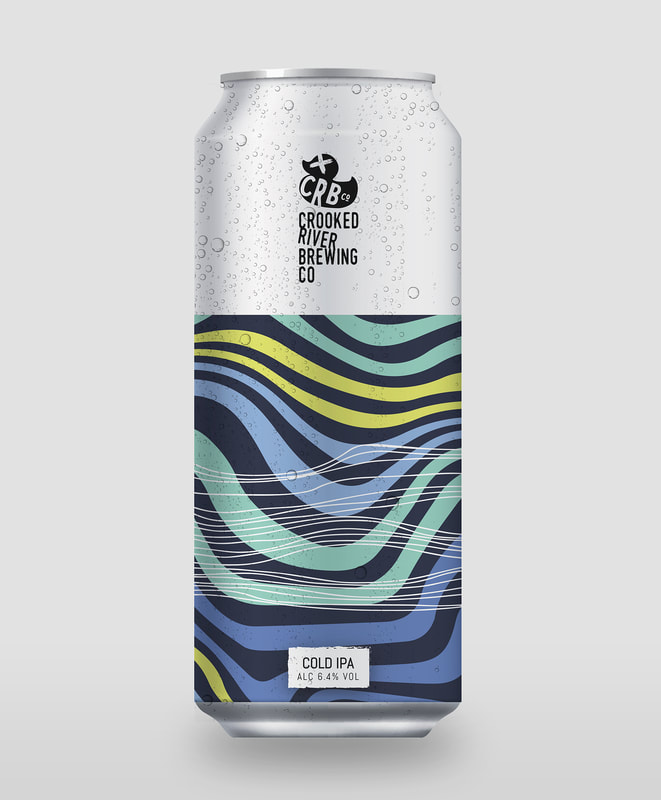
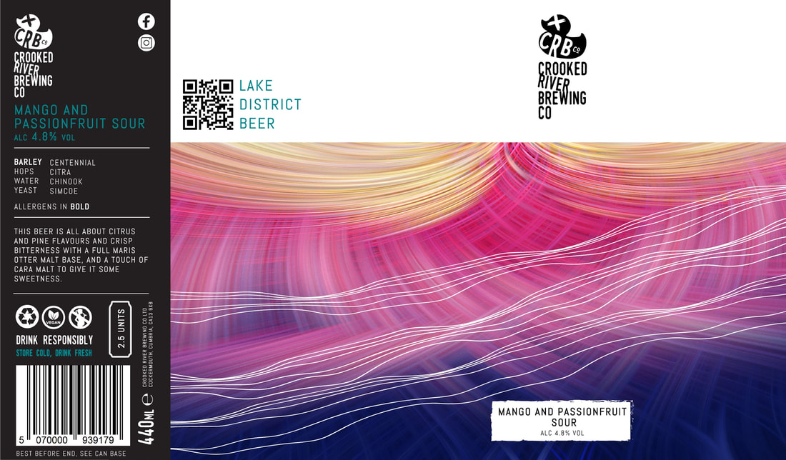
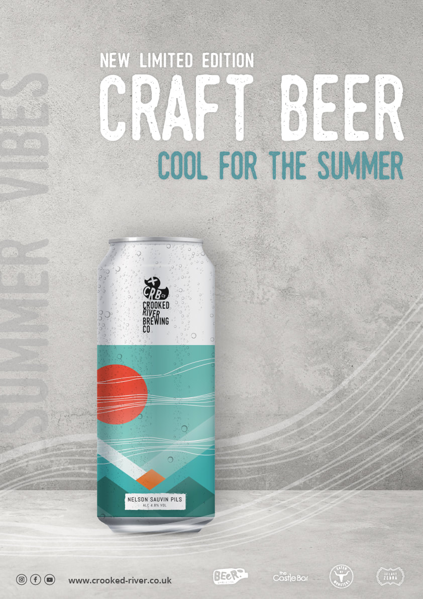
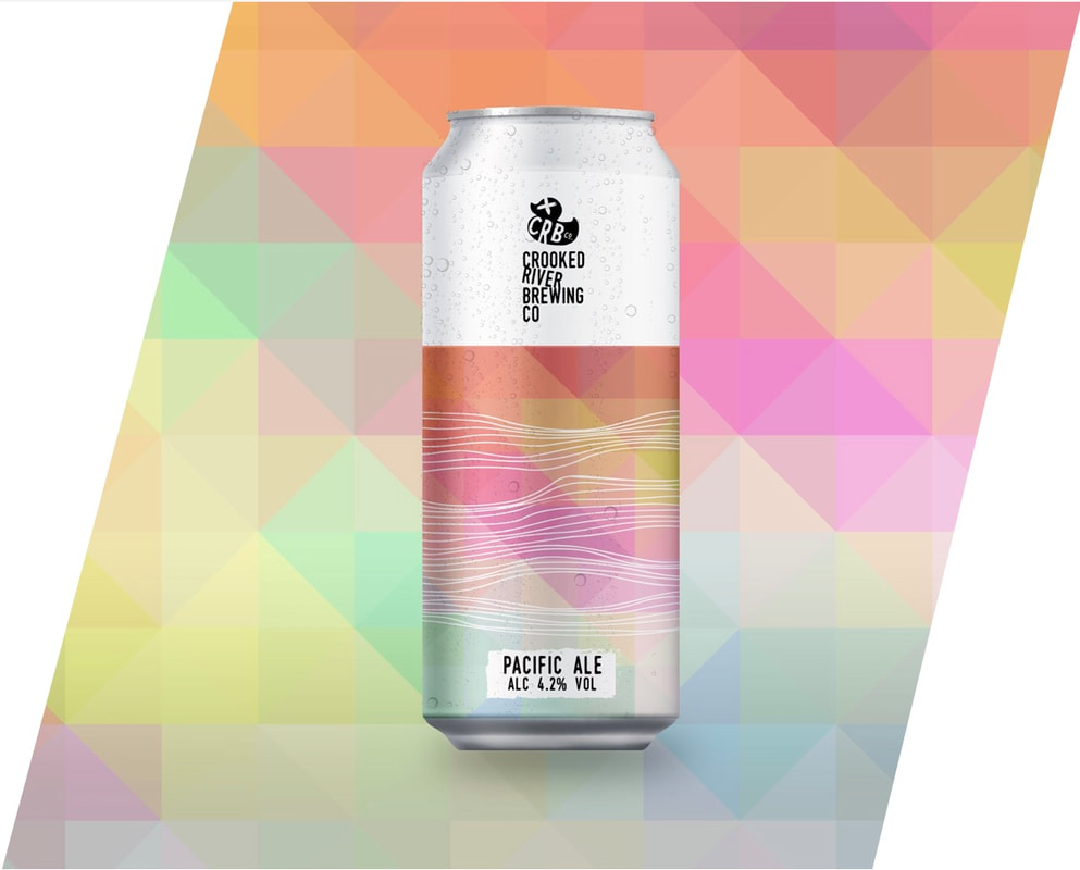
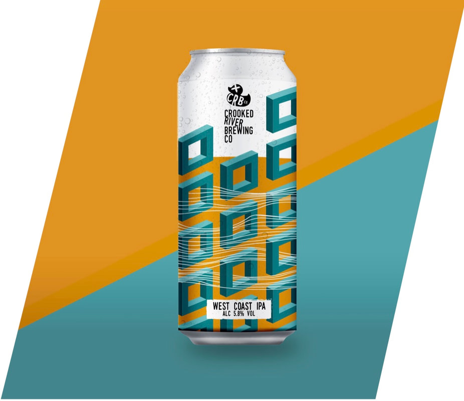
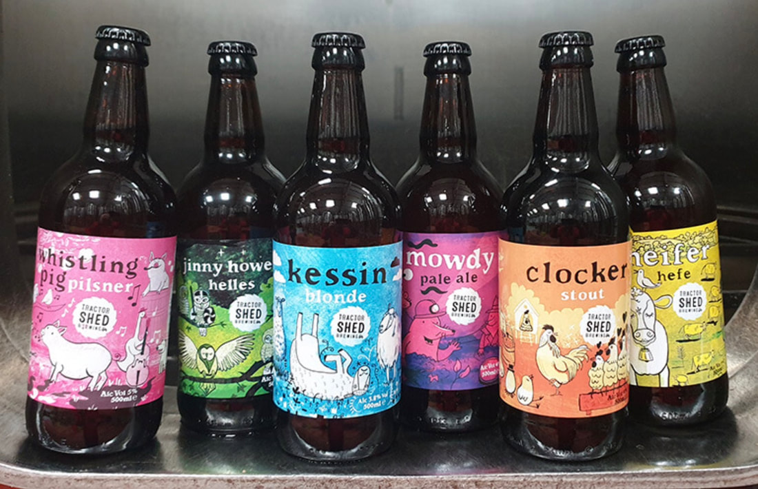
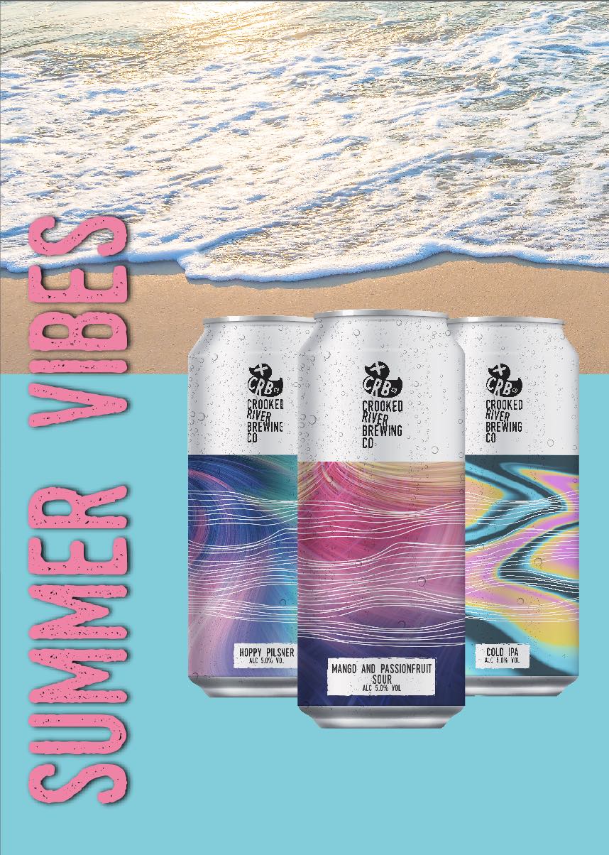
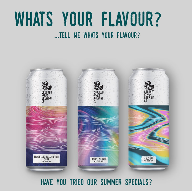
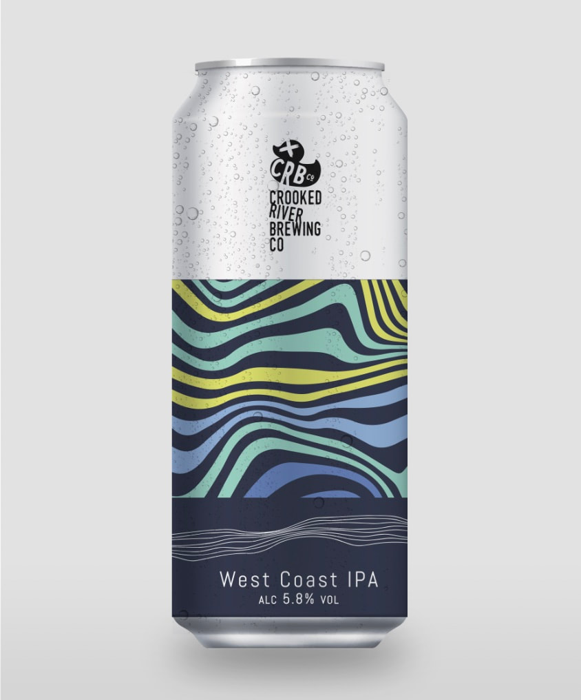
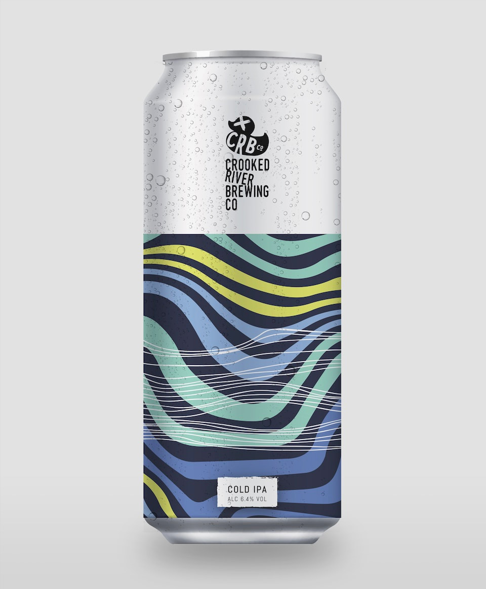
Cold IPA Suggestion:
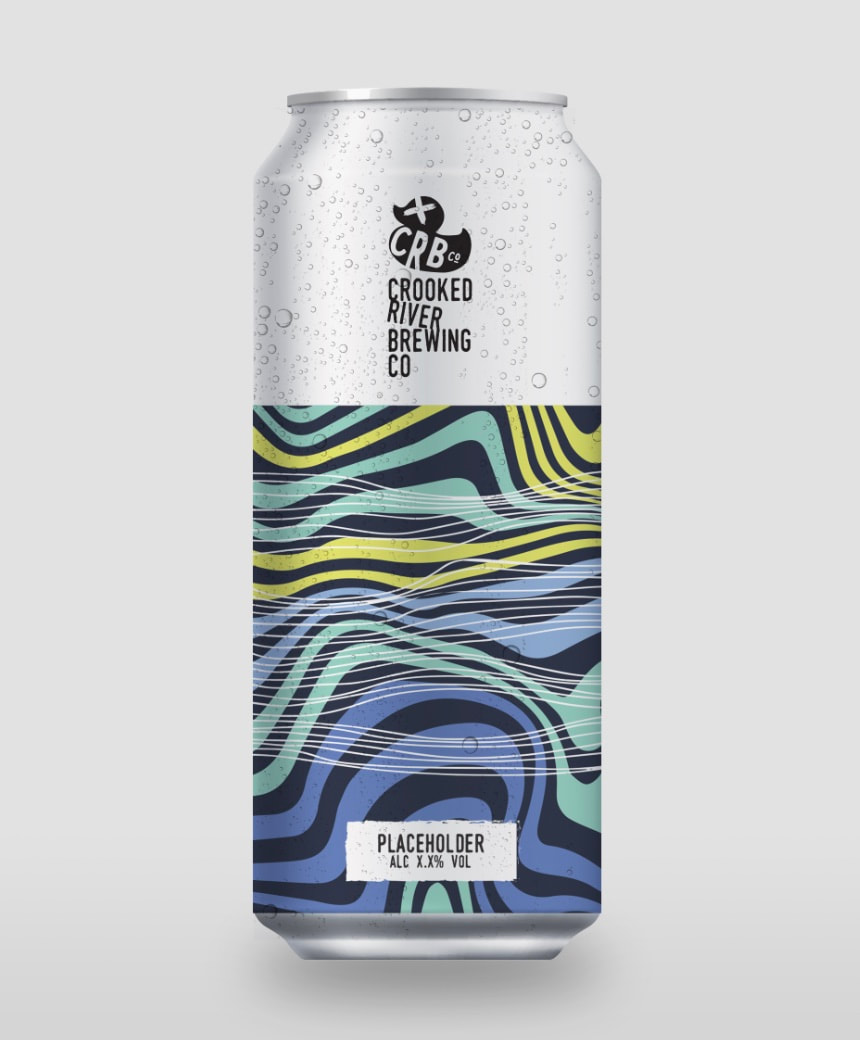
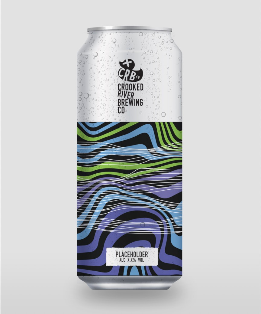
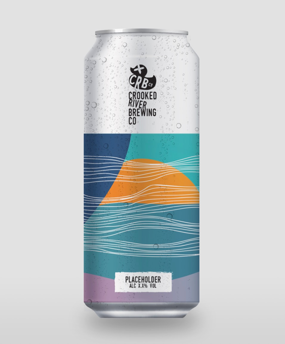
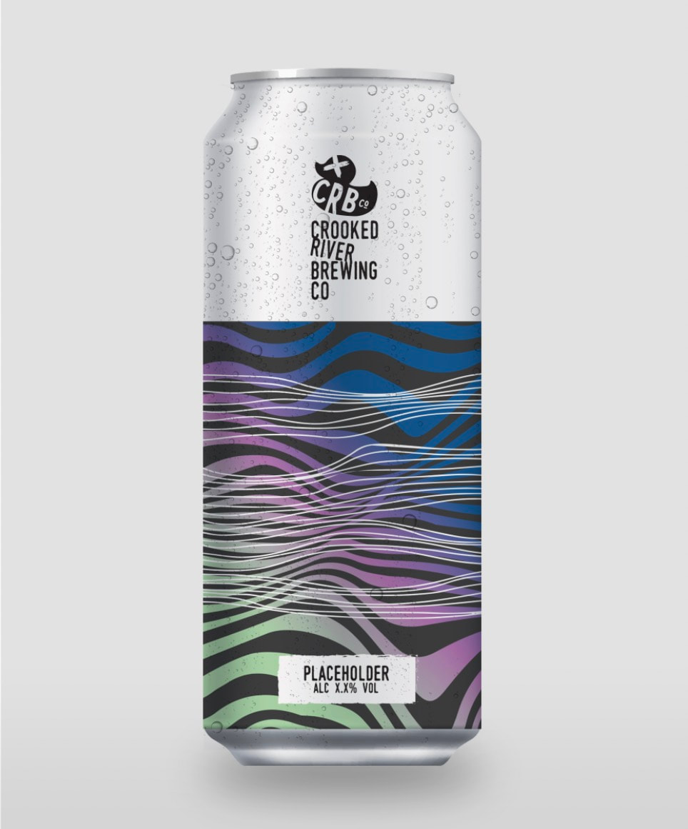
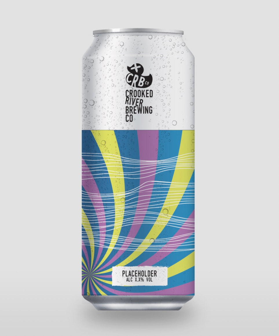
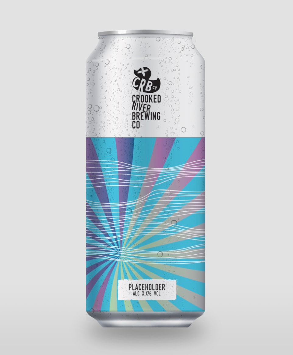
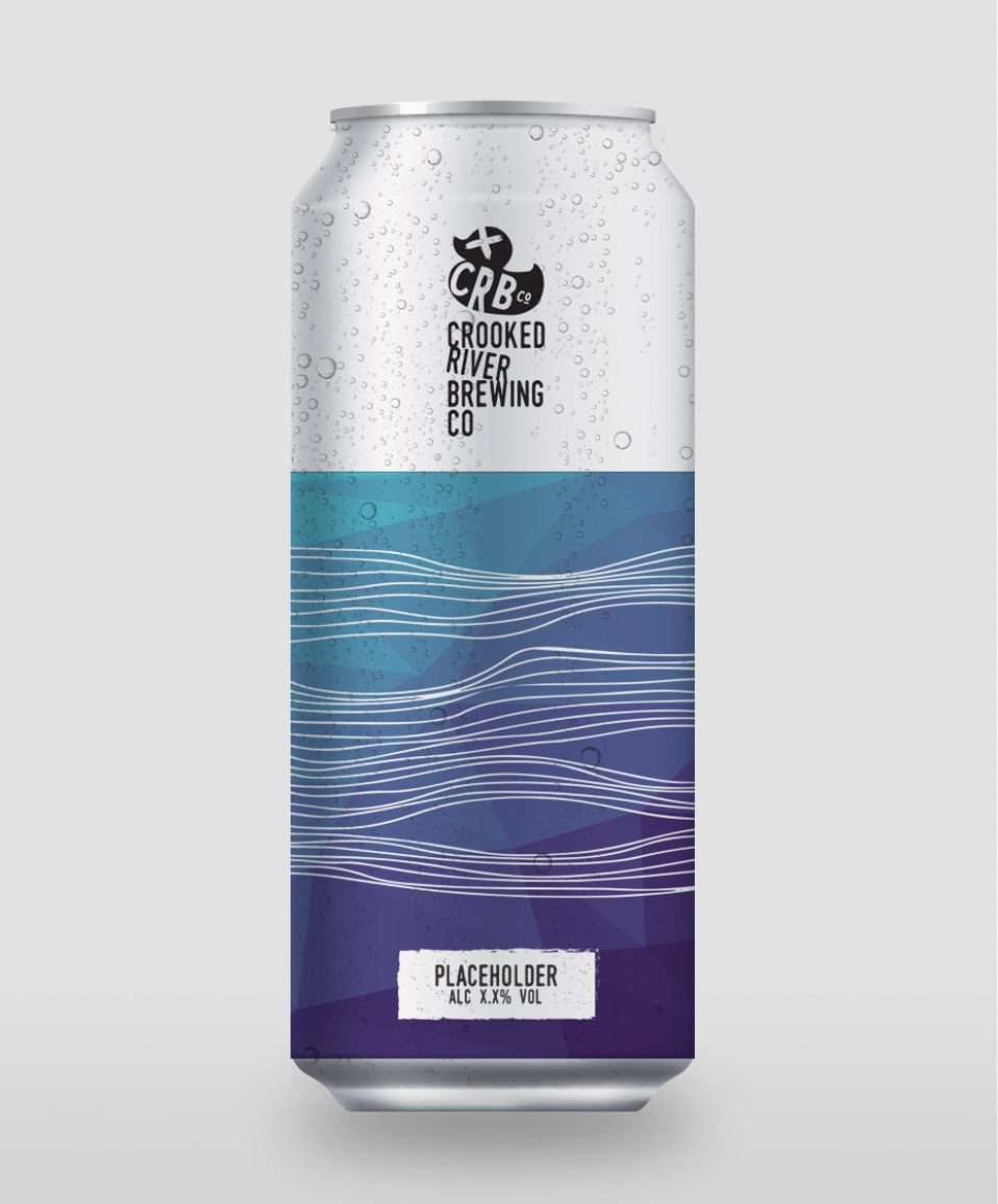
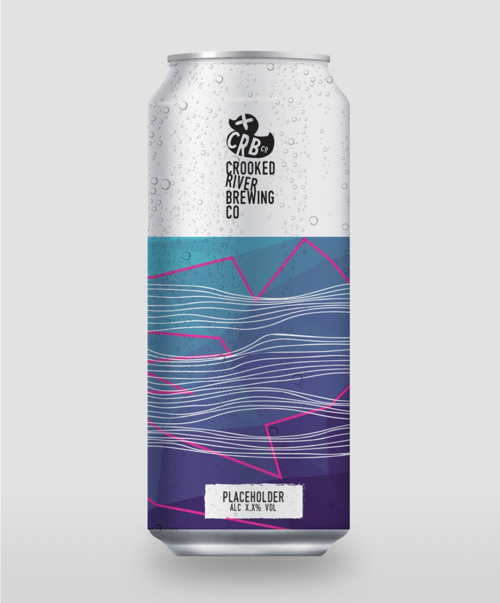
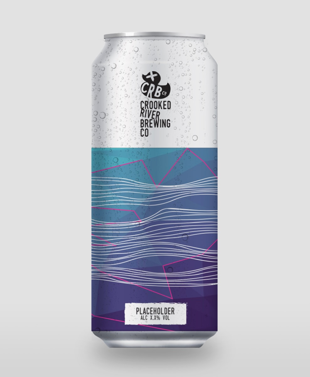
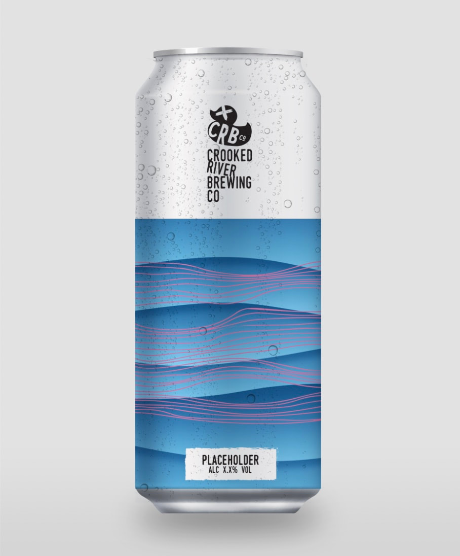

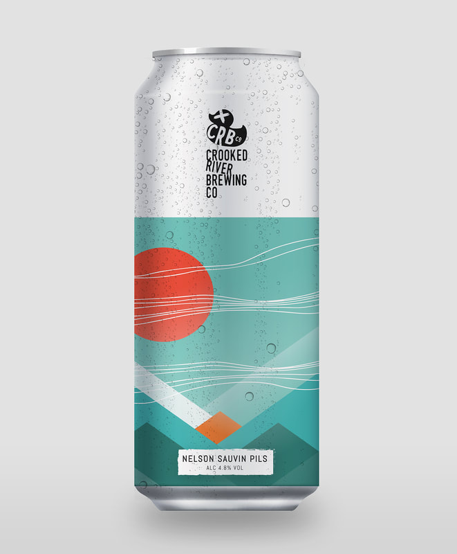
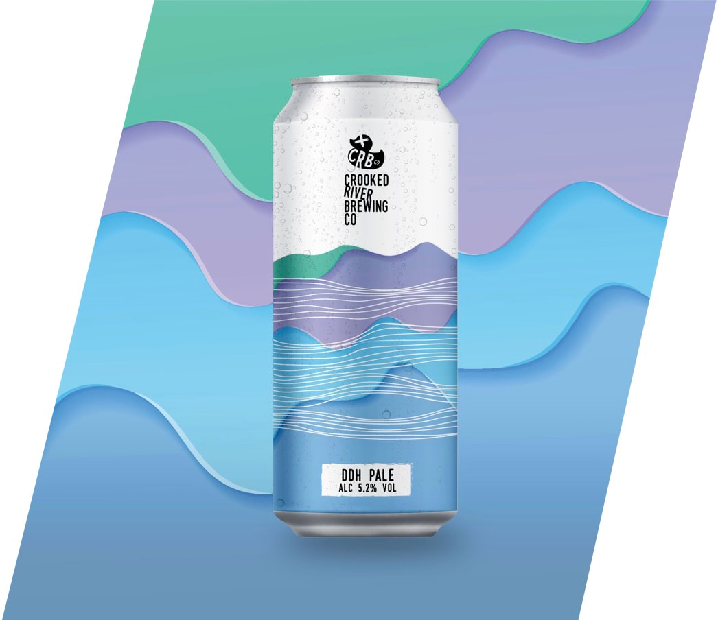
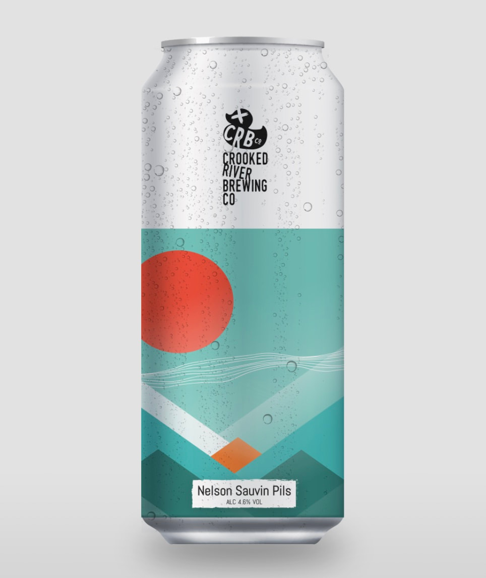
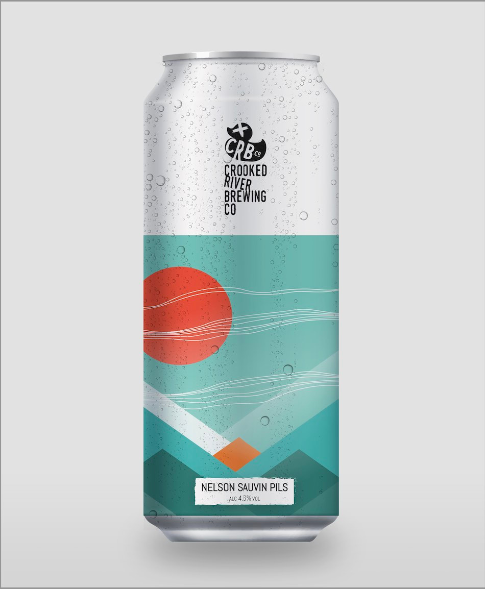
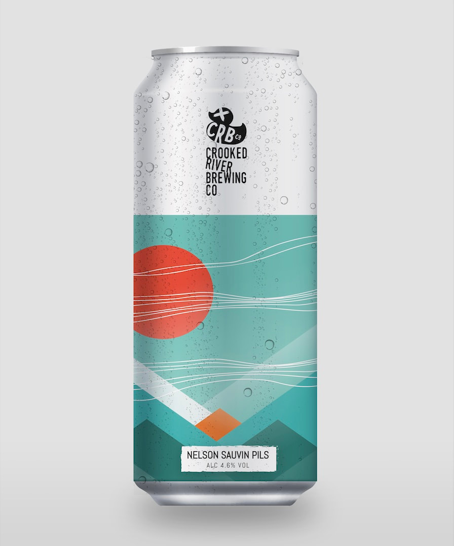
Nelson Sauvin Pils Suggestions:
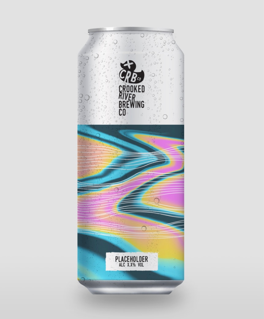

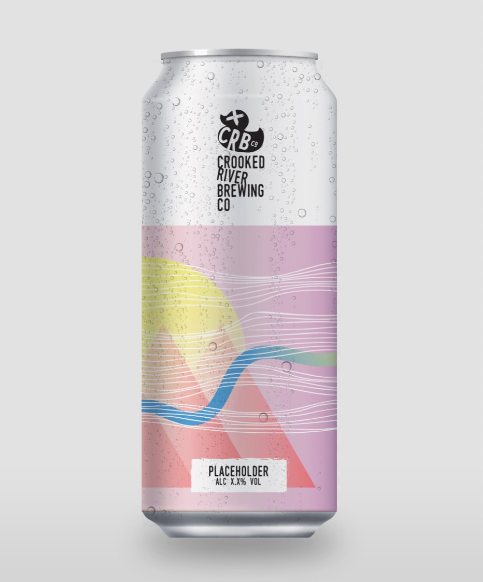
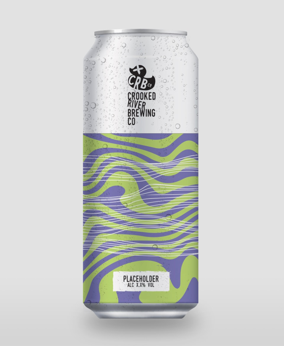
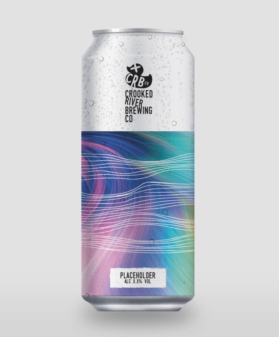
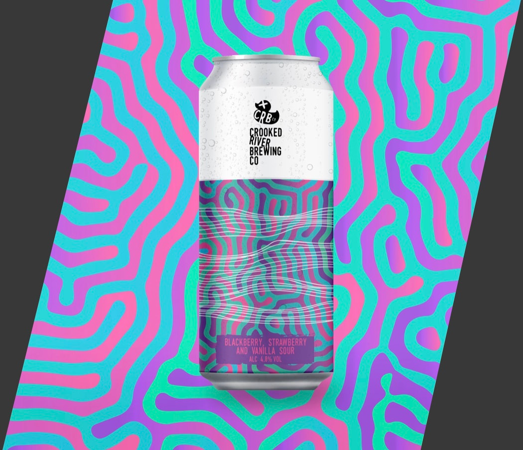
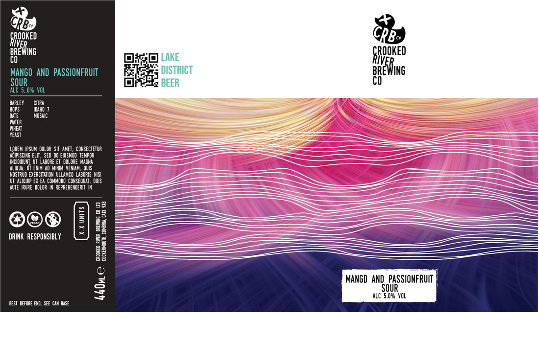
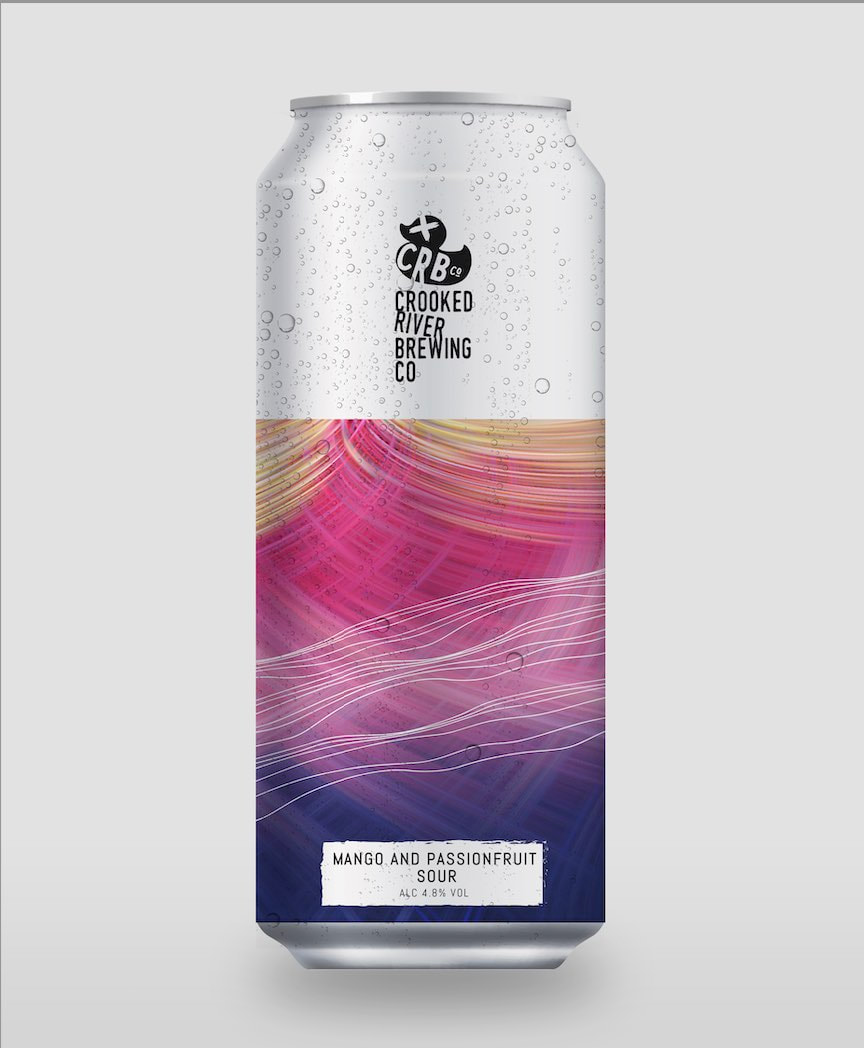
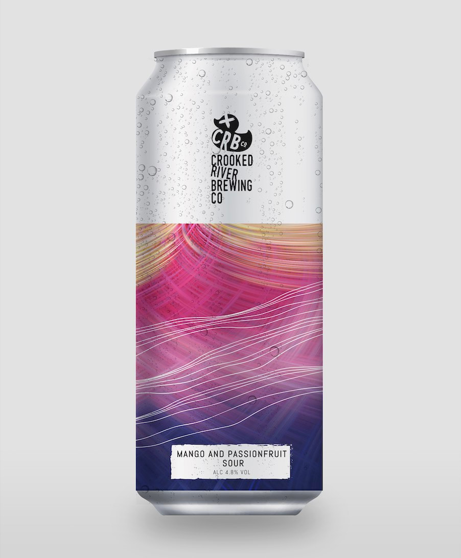
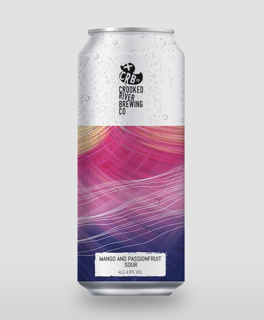
Mango, Passionfruit Sour Suggestions:
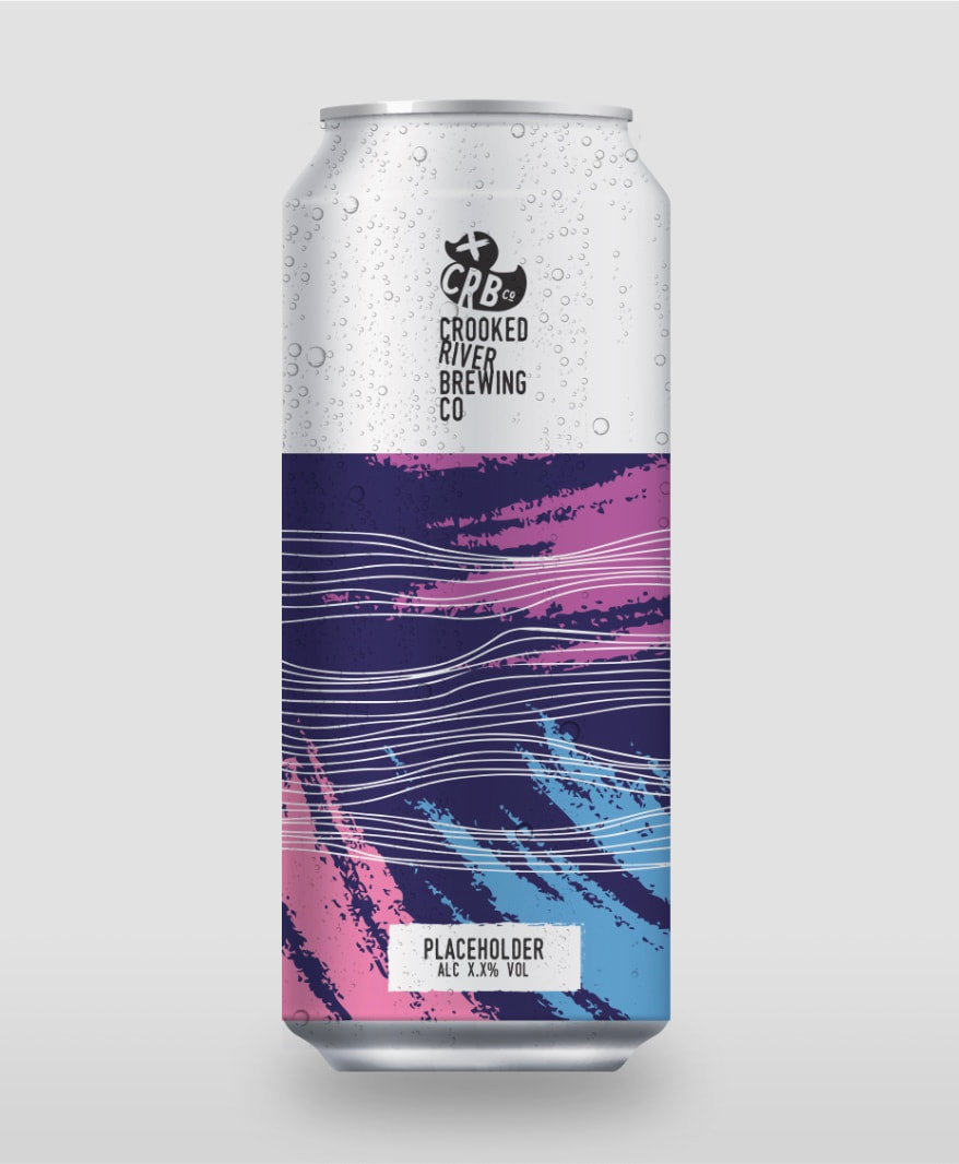
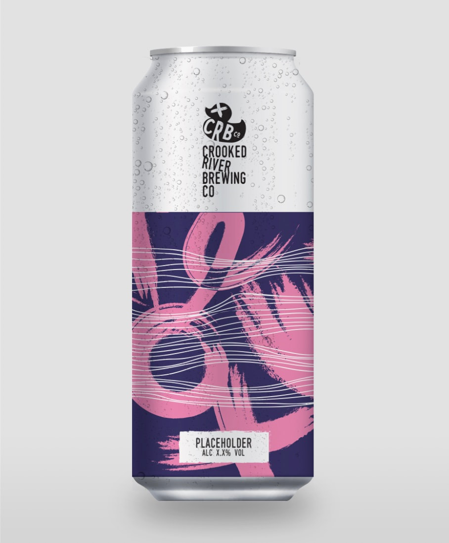
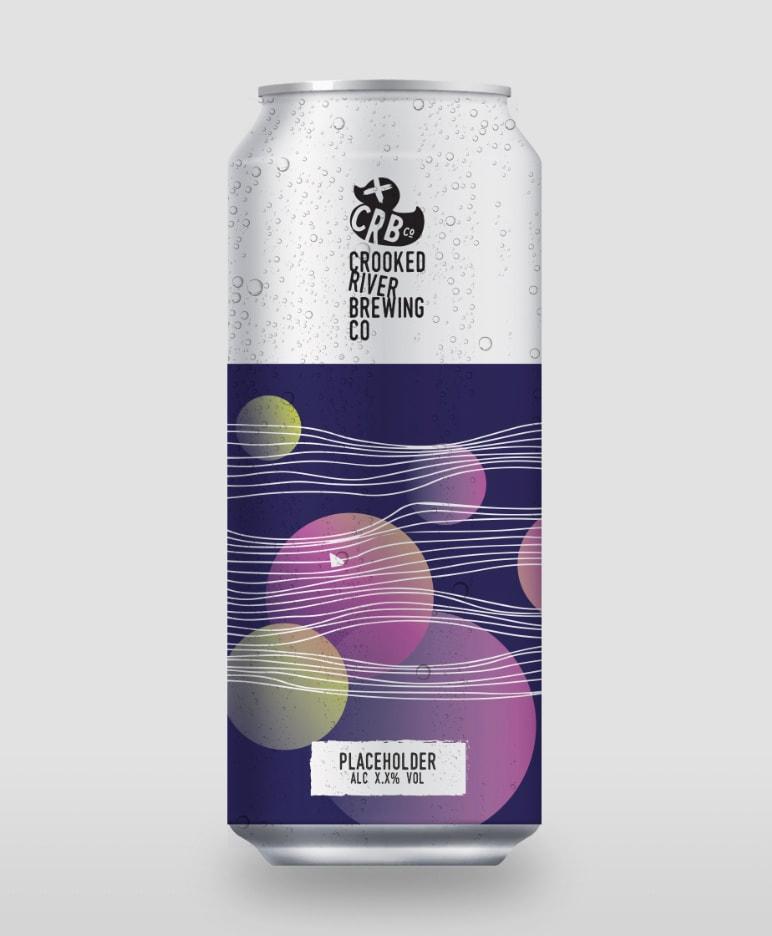
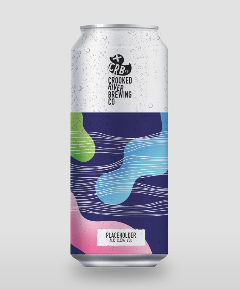
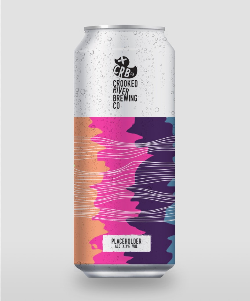
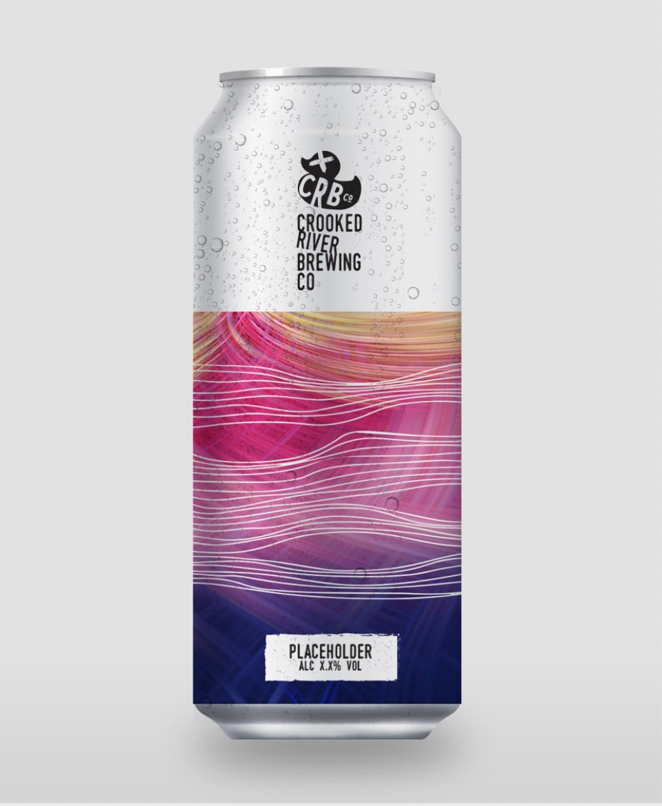
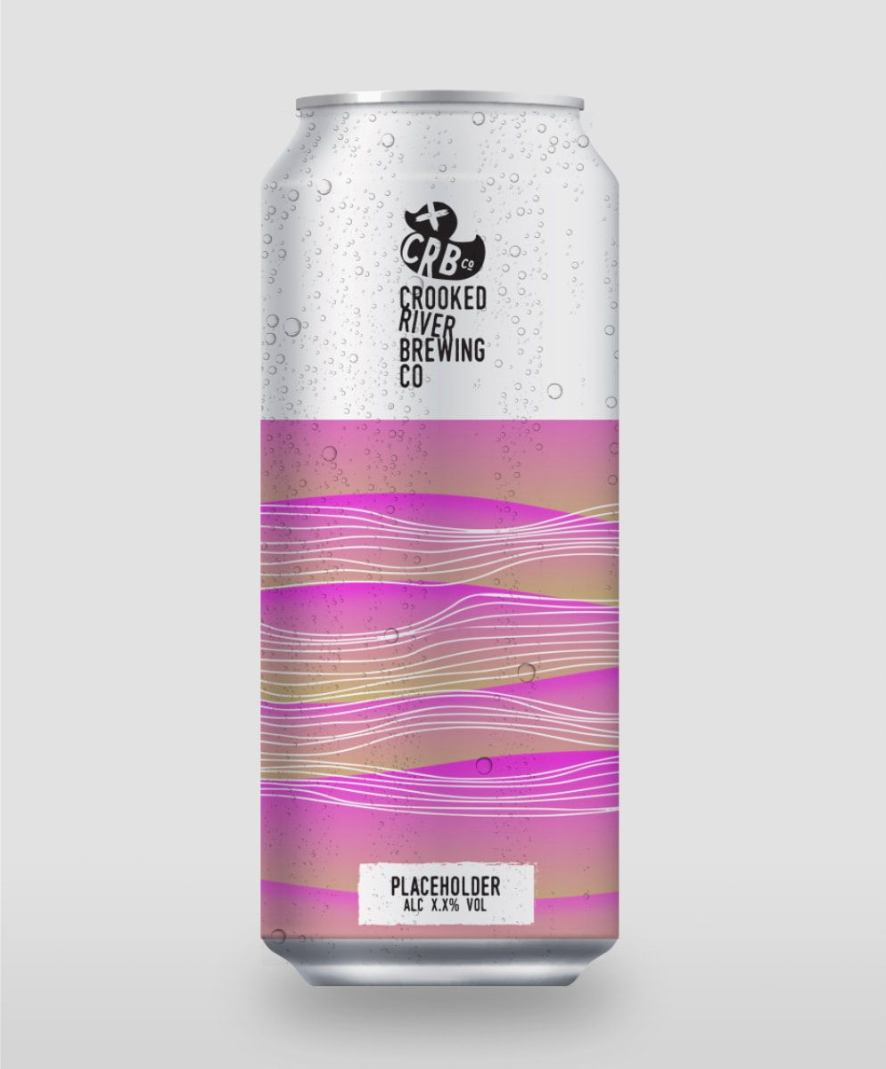
After speaking to many people and doing a little research on how people received the cans and what was their preferred choice (or visually more attention grabbing) I chose these three.
I finalised the die lines to see how these would look.
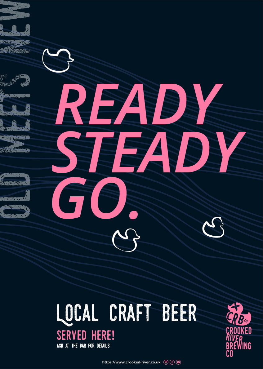
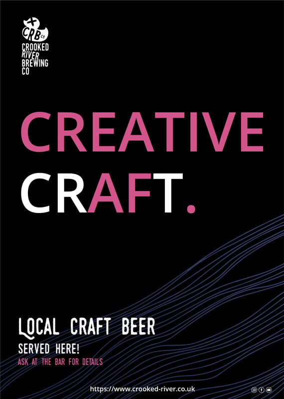
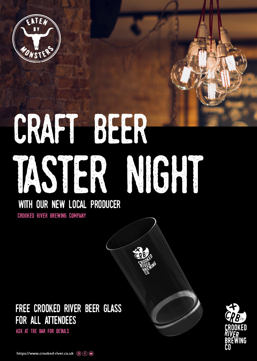
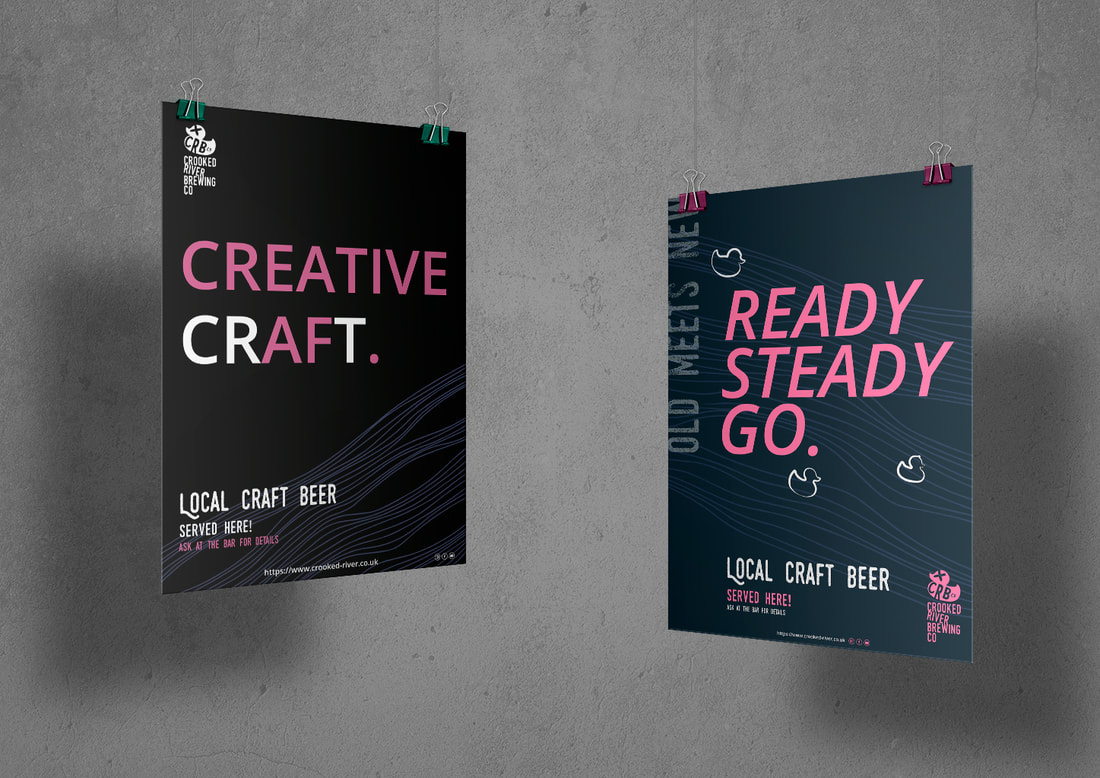
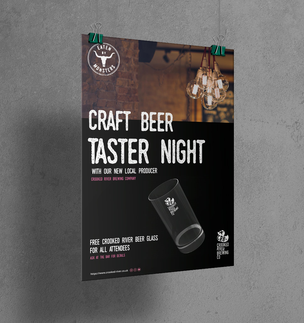
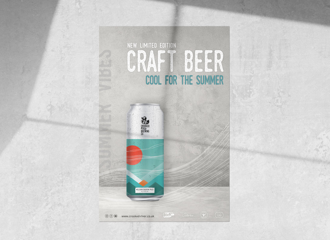
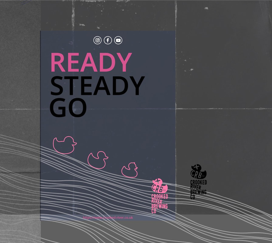
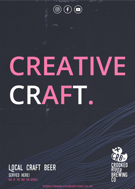
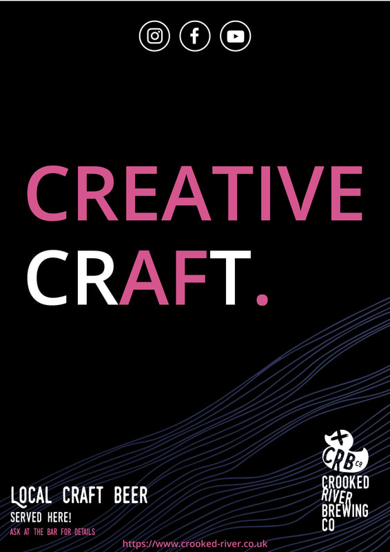
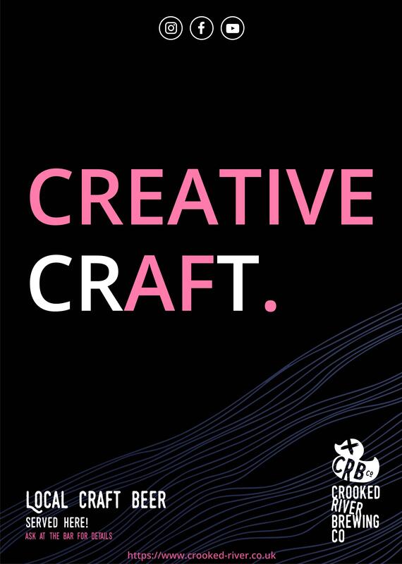
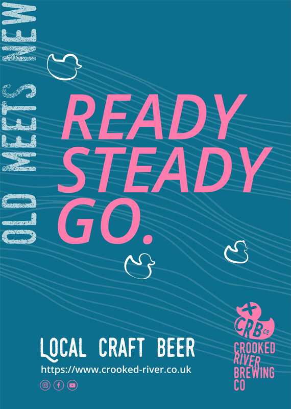
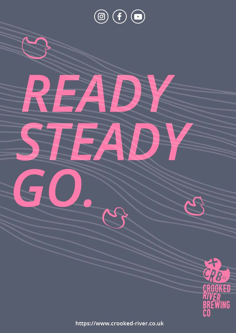
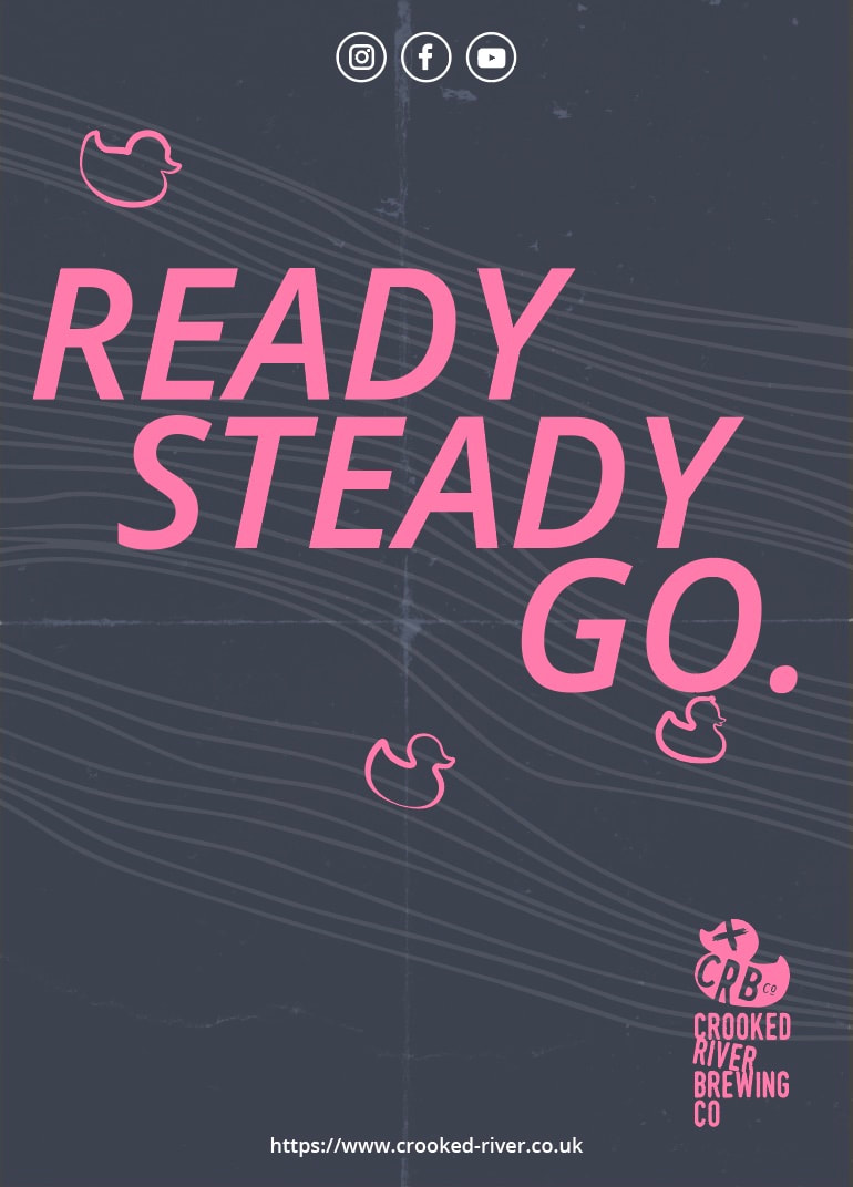
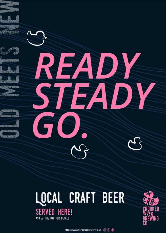
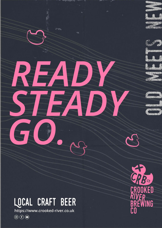
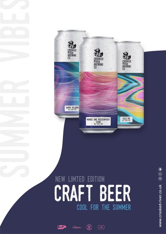
Poster/Advertising Exploration:
I decided to spend a little time exploring some advertising visuals for Crooked River to push this brief a little further.
I decided to spend a little time exploring some advertising visuals for Crooked River to push this brief a little further.
AF is currently short hand in text for "As Fuck" (among the cool and trendy...sadly this doesn't include me). I thought this was fun yet a subtle nod to the brand being creative, confident and embracing old/individualised or old school methods like craft and bringing it back.
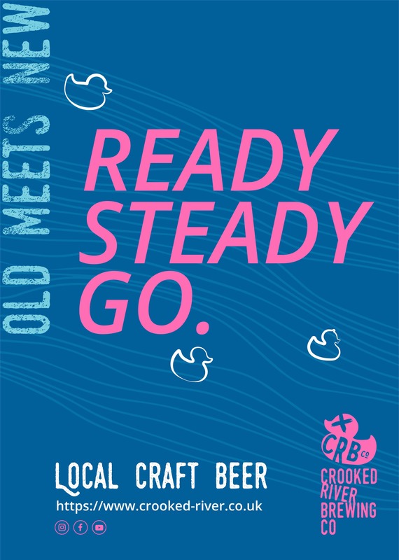
I also explored a really lovely story about how the town of Cockermouth (Crooked River Origins) use to race rubber ducks down the river annually which I thought was so quirky and fun that I wanted to draw links to it. This would hopefully make viewers really soak the image in while trying to understand it (a tactic I read about when less a literal more conceptual design is used in marketing).
Change of direction:
After speaking to Damon, and Zoe on my work it made me question my choices and so I went for slightly different choices to the ones selected as possibly being more viable choices. I have explored ways to bring a little more balance to them and refine them further.

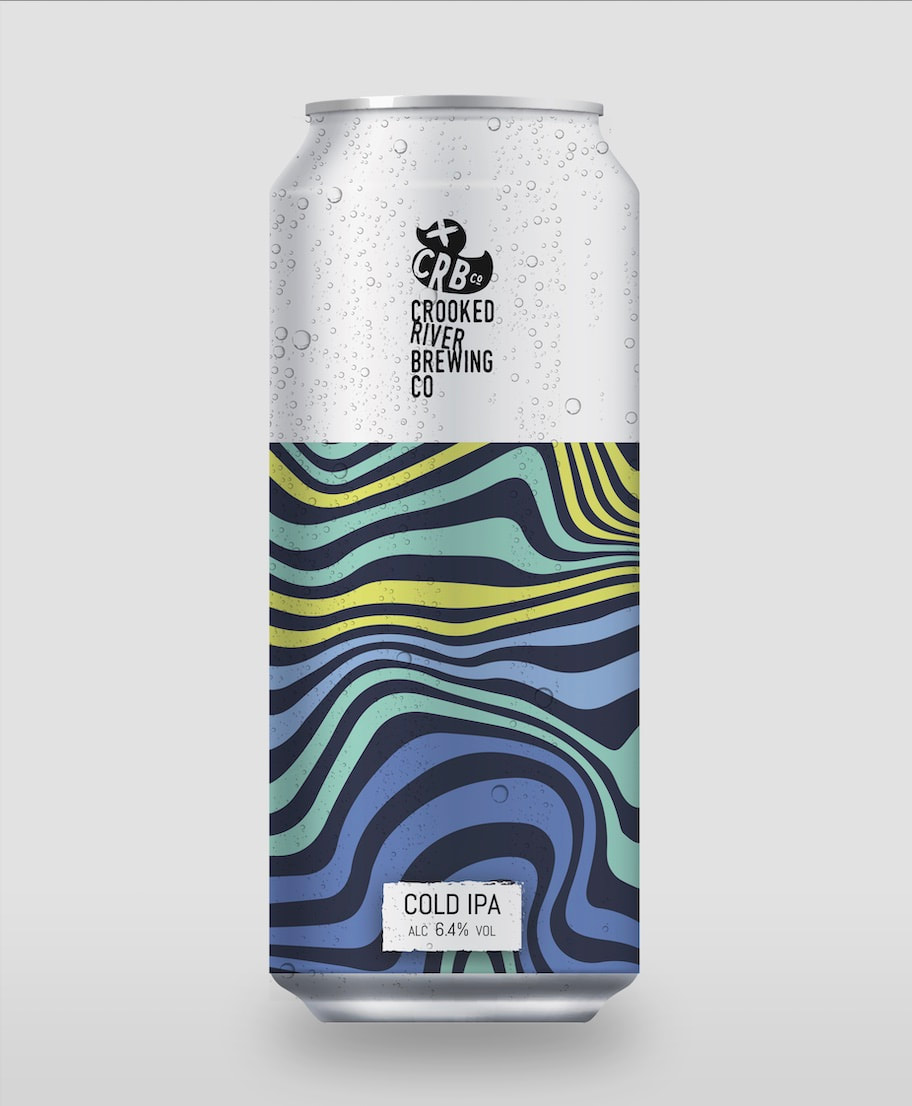
I kept coming back to this can as I love the colouring of it.
I liked the colour combination of this but felt the lines needed simplified across the front.
Finals