Graphic Design Showcase
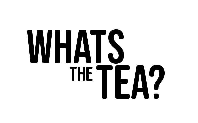
Brief: What's the Tea?
Brief:
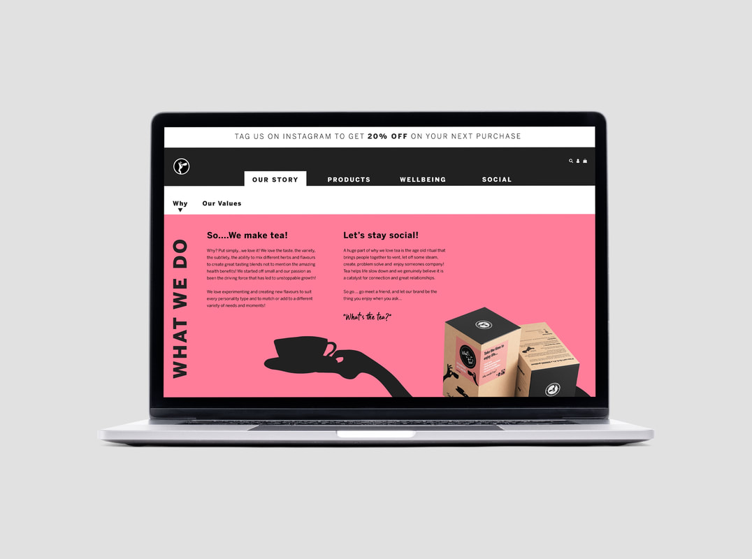
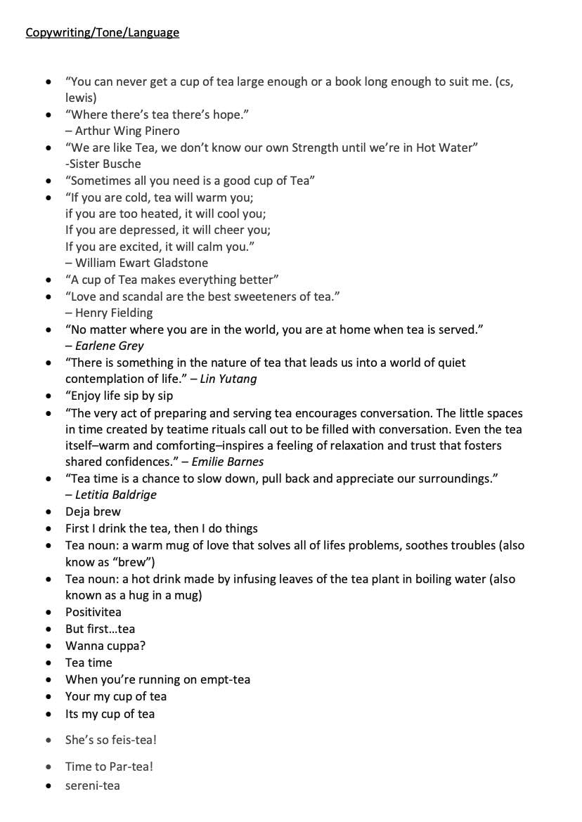
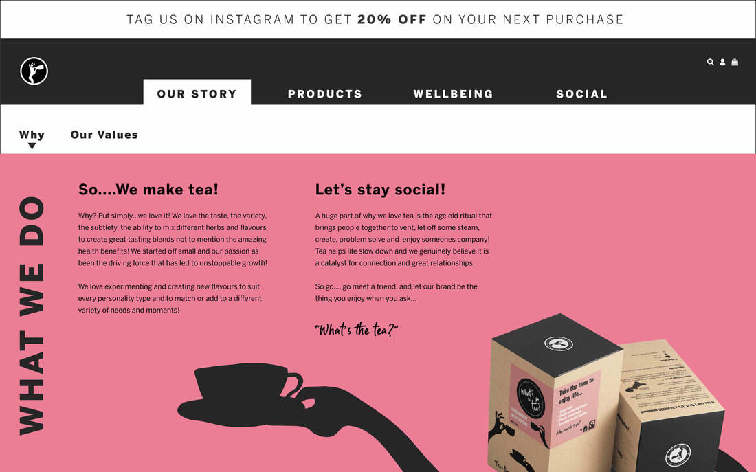
“The very act of preparing and serving tea encourages conversation. The little spaces in time created by teatime rituals call out to be filled with conversation. Even the tea itself–warm and comforting–inspires a feeling of relaxation and trust that fosters shared confidences."
- Emilie Barnes
“You can never get a cup of tea large enough or a book long enough to suit me.
- cs, lewis
“If you are cold, tea will warm you;
if you are too heated, it will cool you;
If you are depressed, it will cheer you;
If you are excited, it will calm you.”
– William Ewart Gladstone
What's the tea?:
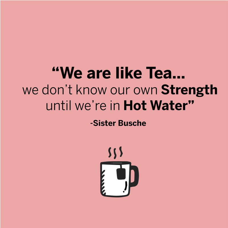
The above quotes are a few selected to show how tea has purpose that is more than enjoying its flavour. There are many quotes from well known people throughout the ages who have expressed their view on how this age old ritual brings people together, can change the mood, offer landing strips for rest, vent, problem solve and connect.
This tea brand concept offers a fun name from a saying used in young culture as a way of asking what's the crack? (News/gossip/been up to?). Its offers a way from the off set to allow the market to understand this is a tea product and there is a link to meeting friends for a catchup and the importance of this.
Studies show that tea is mainly enjoyed by older people and there is perhaps an opportunity to attract a young market and create a trendier vibe that perhaps is more associated to a cup of coffee.
Studies also show the value of connection and support as being vital ways for people in their enjoyment of life and keeping equilibrium in an often stressful world.
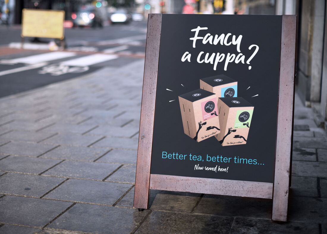
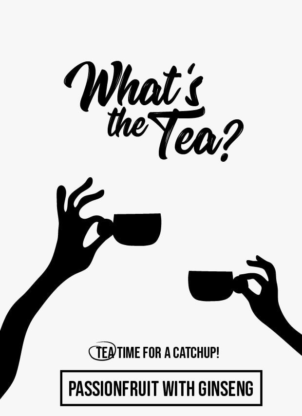
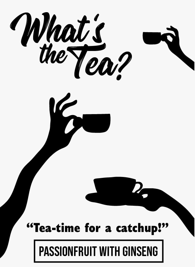
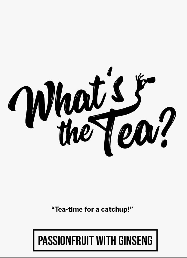
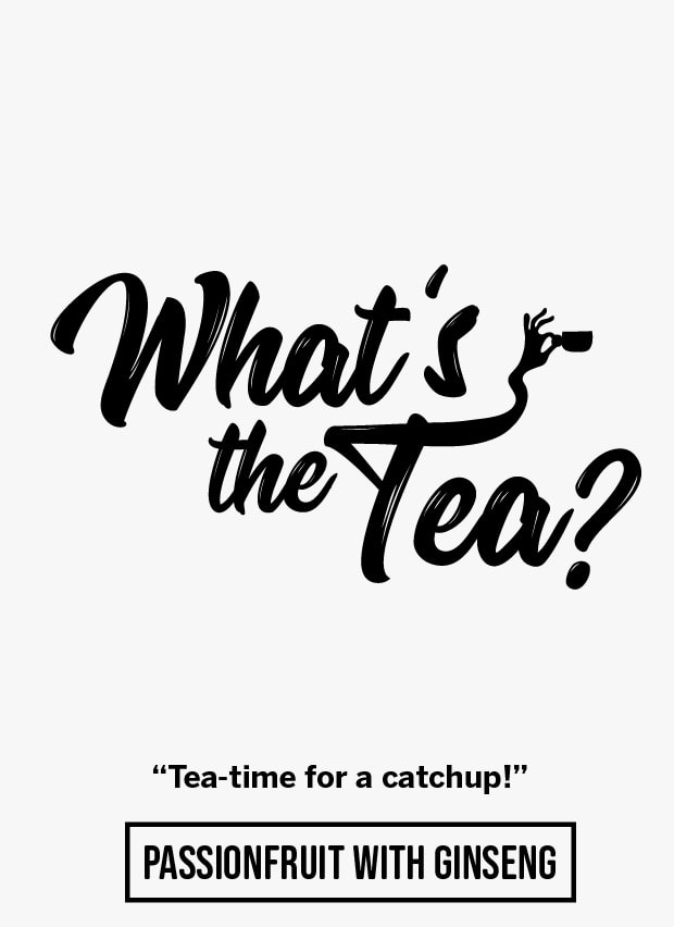
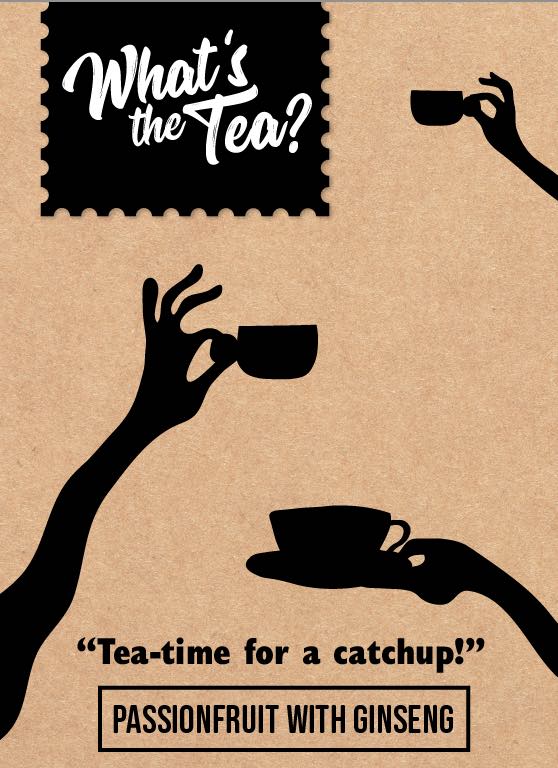
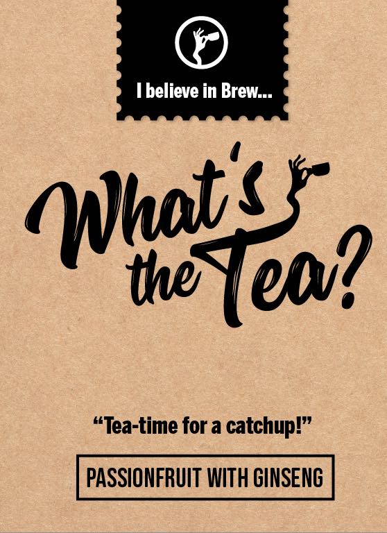
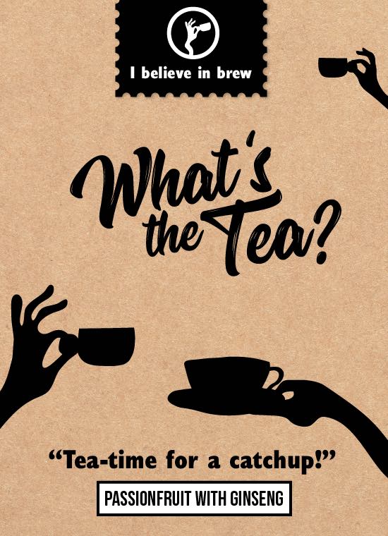
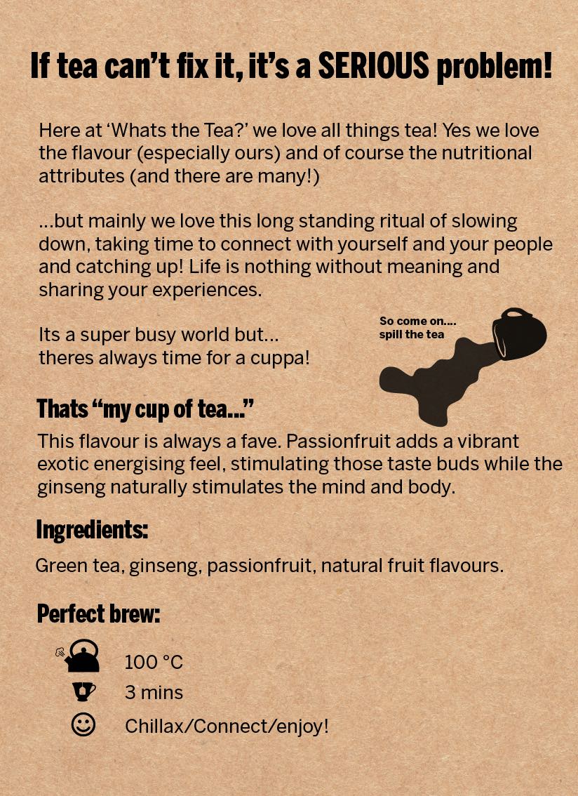
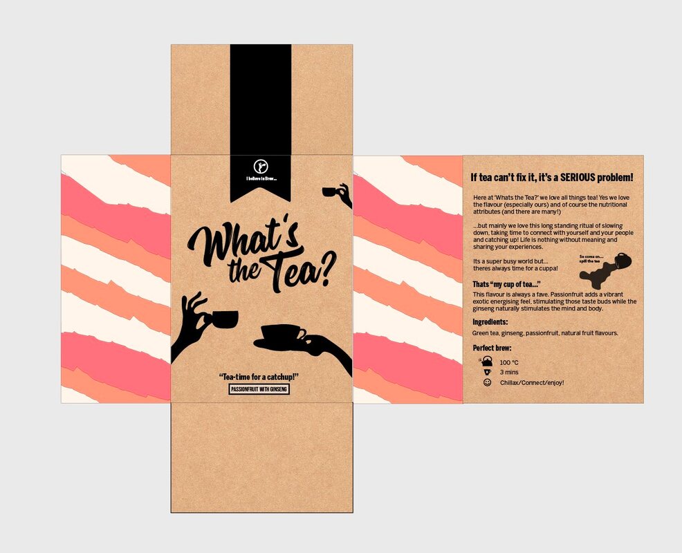
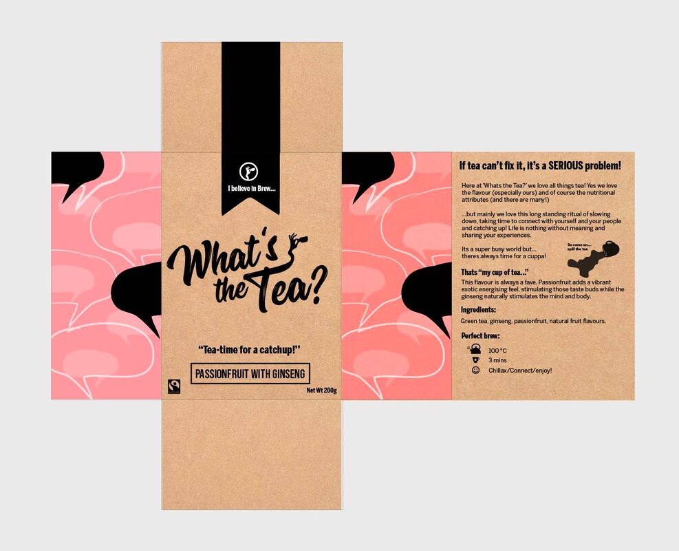
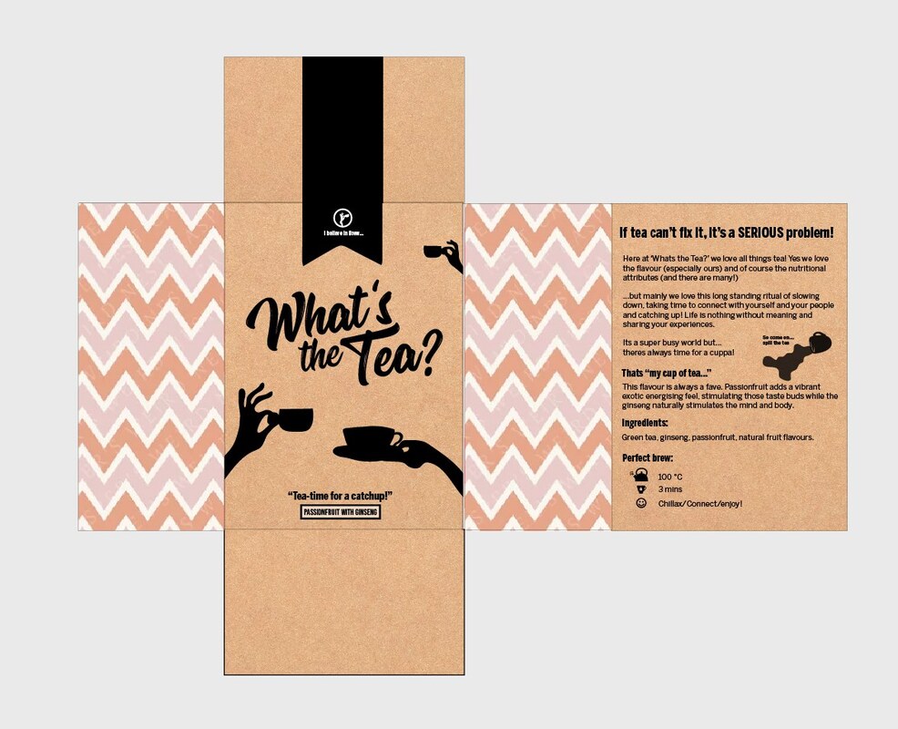
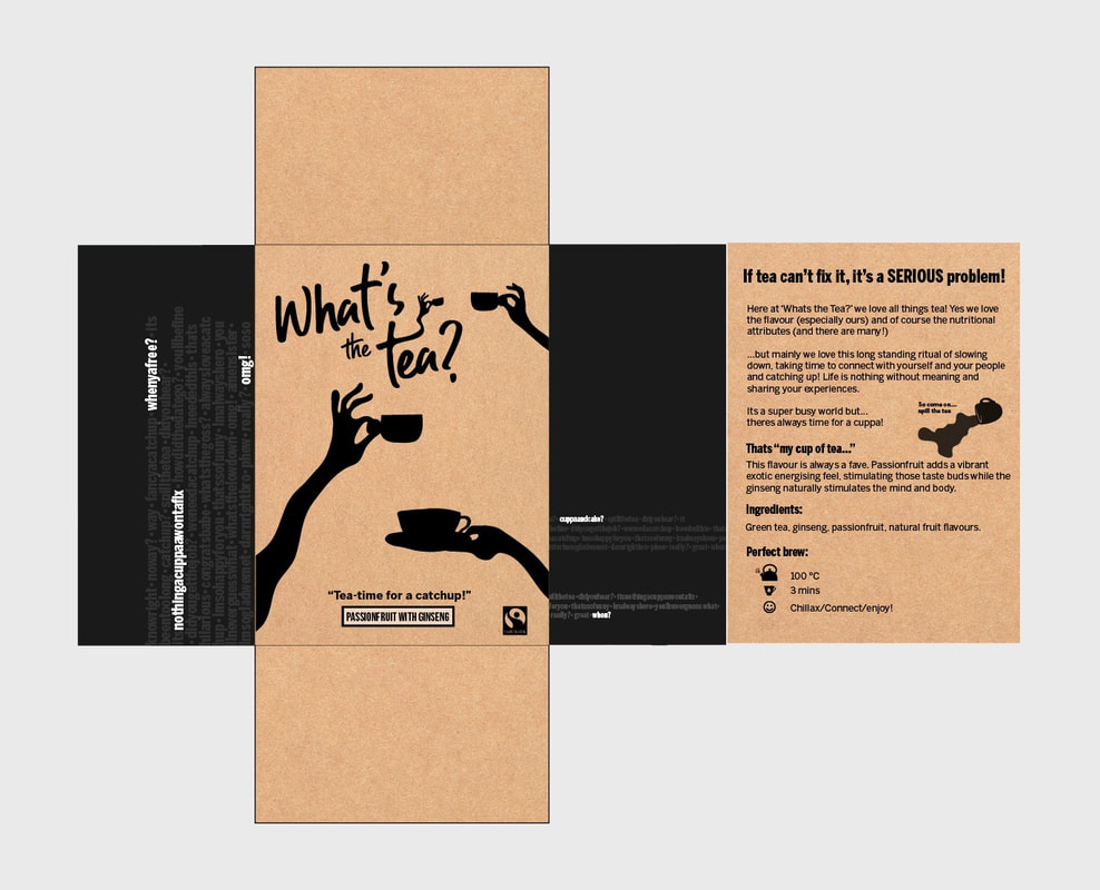
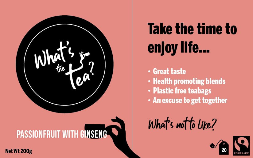
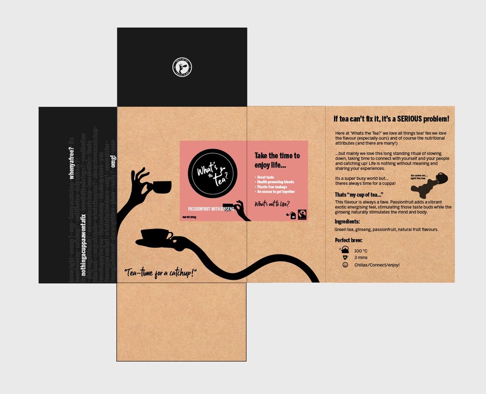
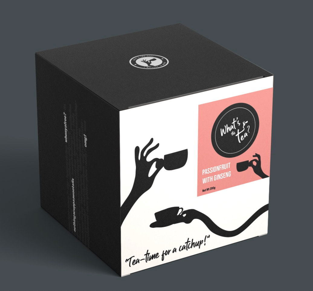
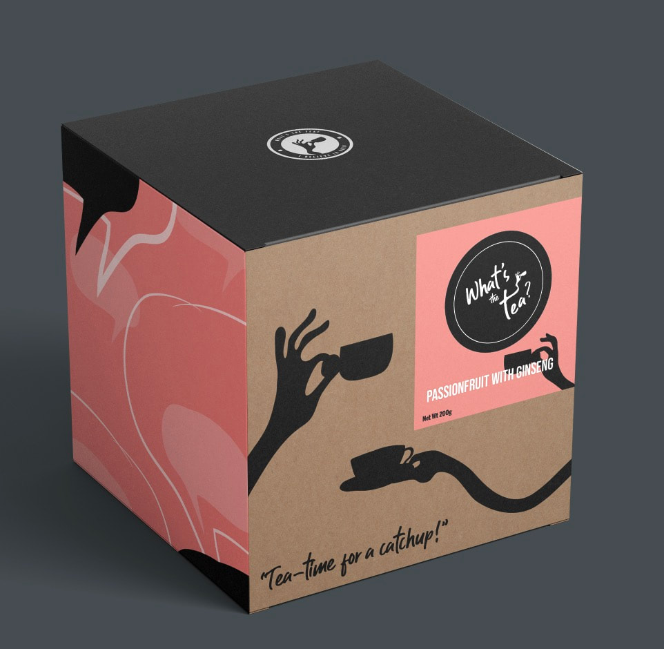
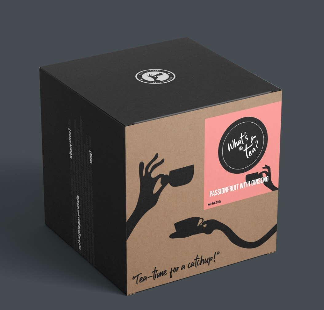
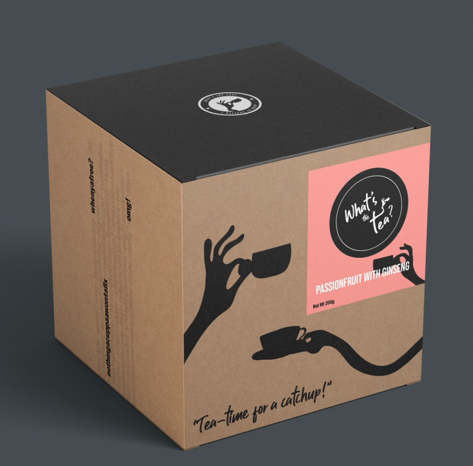
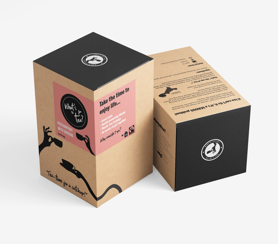
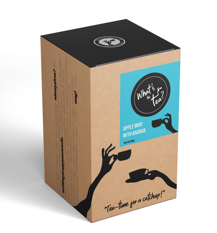
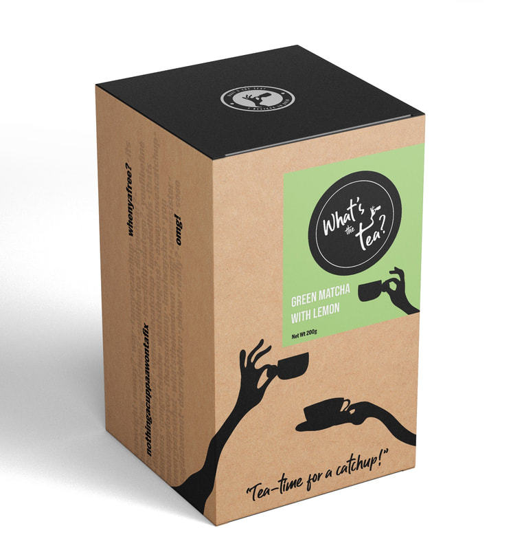
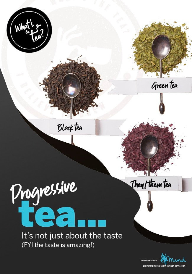
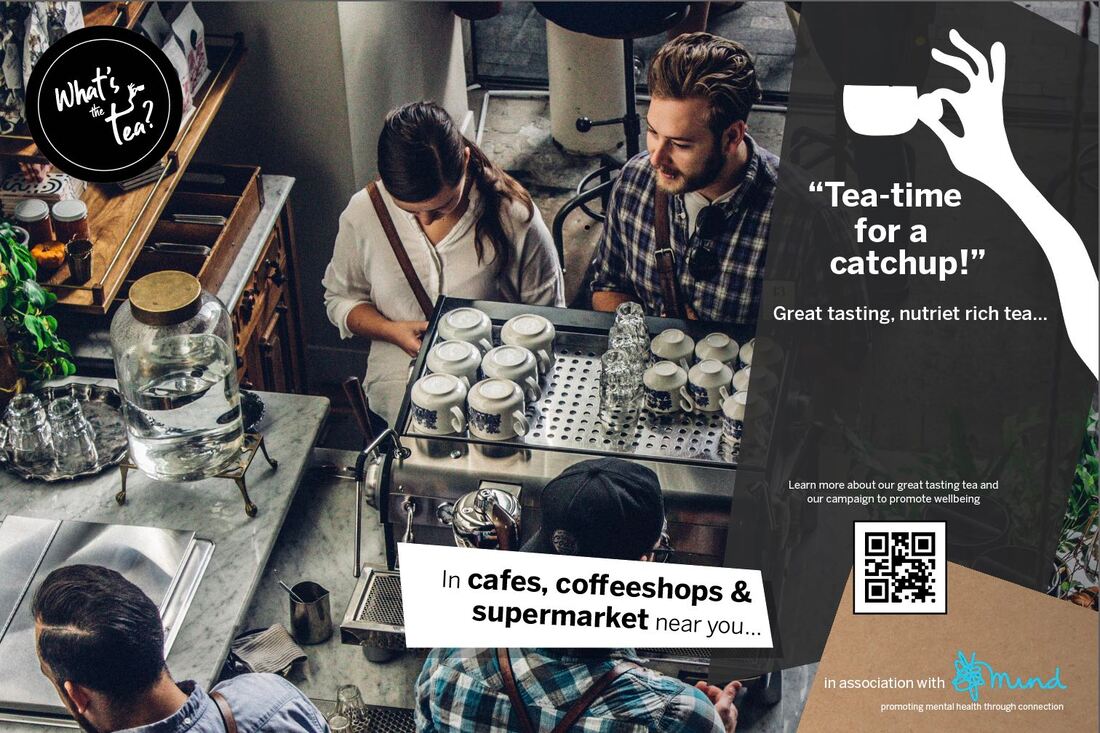
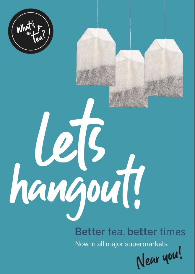
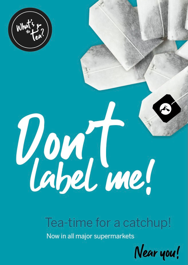
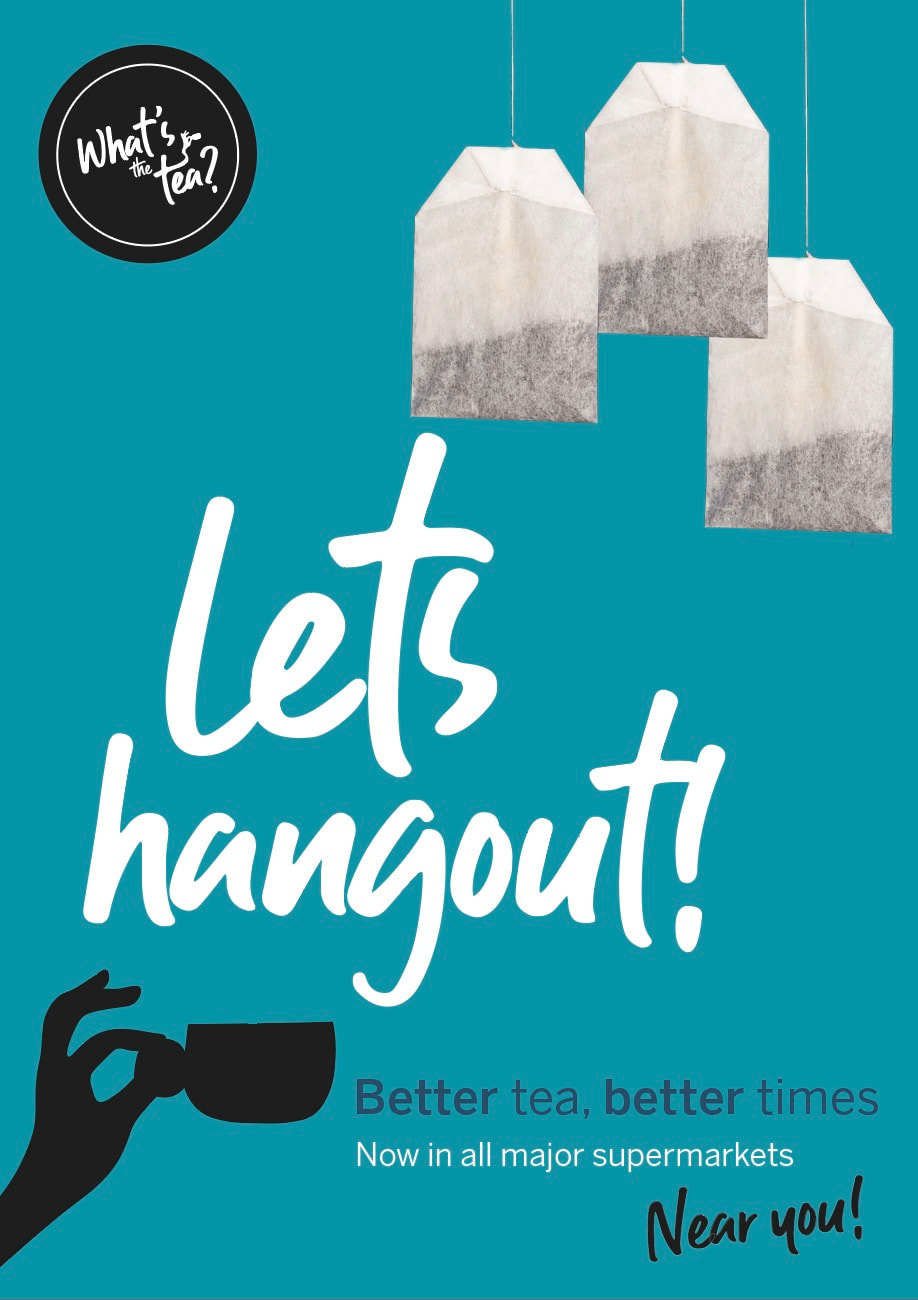
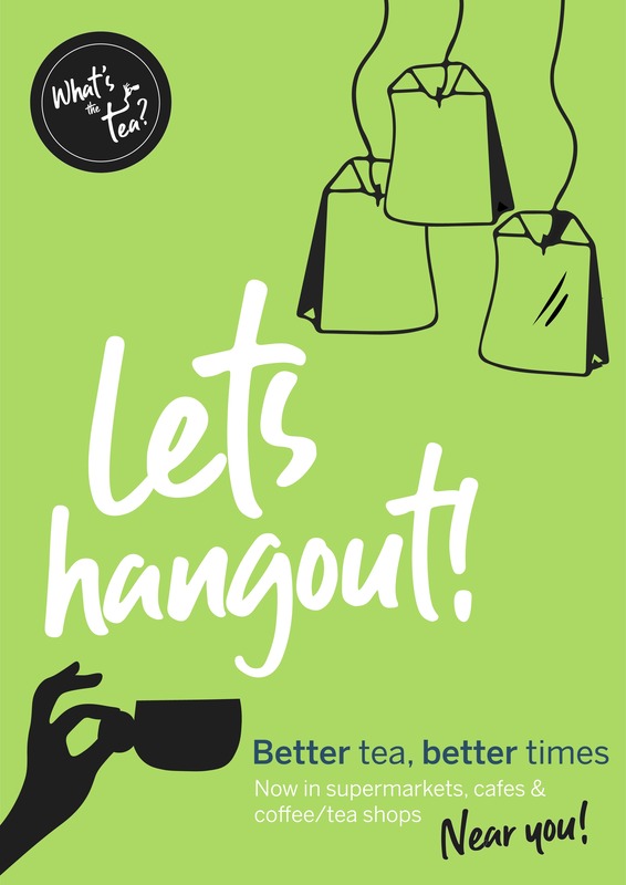
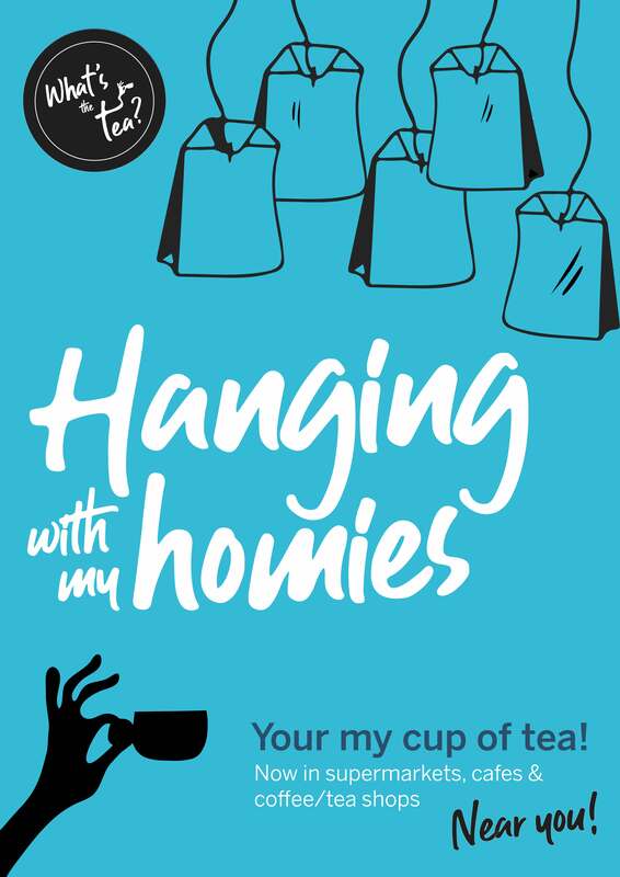
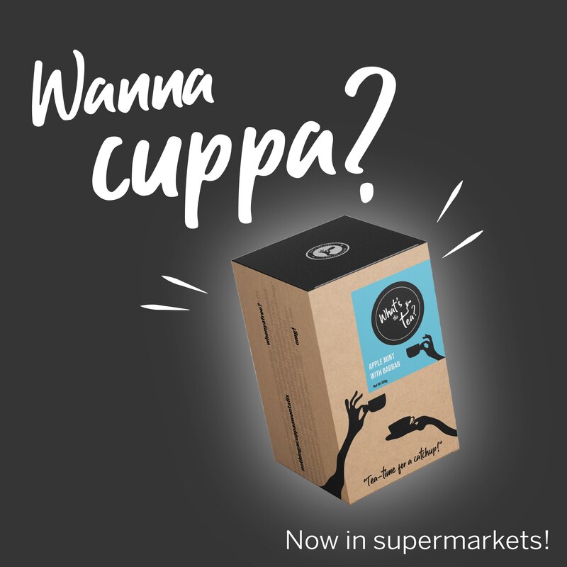
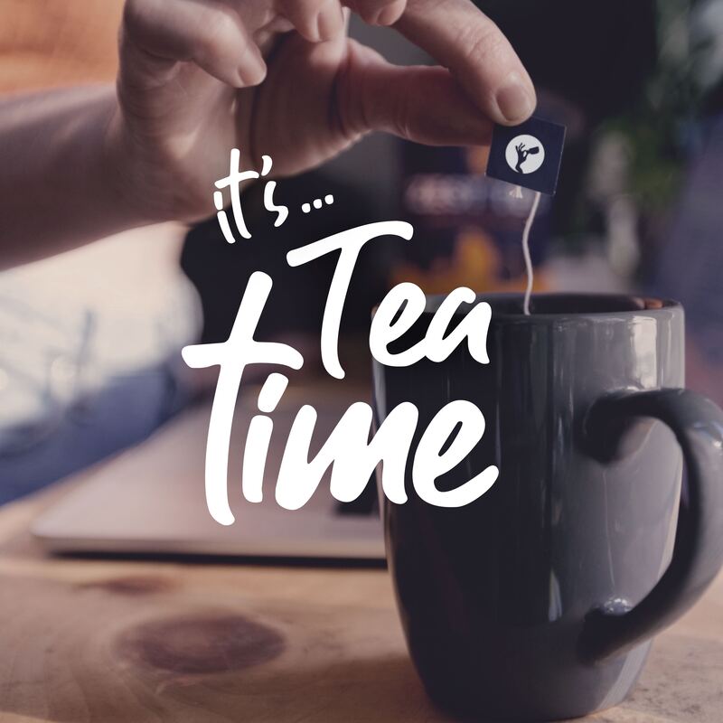
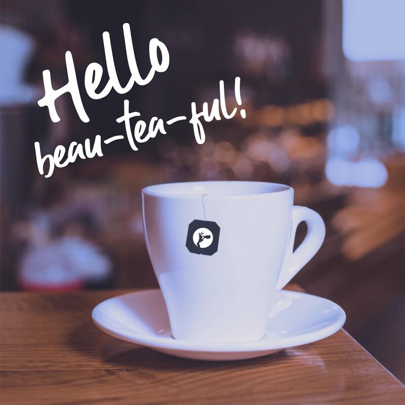
“Whats the tea?” package design. Fruit/herbal tea aimed at a younger audience. Linking the importance of socialising and meeting up with friends providing a healthier option than “hitting the drink on the town.” The brand hopes to push this tea into cafes nationwide to revamp the older narrative of meeting up with a friend for a cuppa. A young, vibrant funky style would be needed to attract the younger audience the product is aimed at.
56% of people drinking tea several times a day are aged 65+, this falls to 25% for those ages 18-24. Only 15% of those aged 65+ do not drink tea at all, and this rises to 24% when aged between 18-24. This poses potential to attract a younger audience to the market and help promote socialisation and wellbeing.
Women tend to drink a wider array of tea as a whole. Herbal tea reaches 35% of women, compared with 25% of men. Similarly, 19% of women drink decaf tea, a figure that falls to 15% of men.
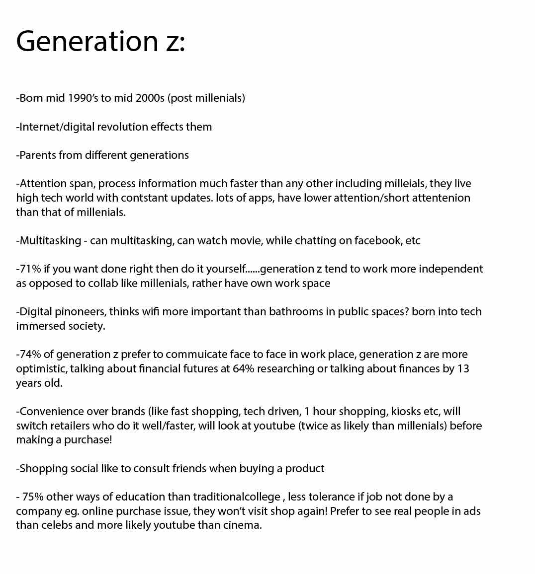
Target audience age:
Will be 16 to 30 year olds both male and female (This predominantly suggests generation Z - born 1997 onwards.
Character traits:
A young audience wanting to pursue health and wellbeing, often driven, and place value social support, friendship and connection.
Design:
A young vibey product design for a tea brand in multiple flavours that meet the brand values of the company and attractive to the target audience. Simple, fun and eye-catching to capture the attention of this young audience.
Outcome required:
The above quotes are a few selected to show how tea has purpose that is more than enjoying its flavour. There are many quotes from well known people throughout the ages who have expressed their view on how this age old ritual brings people together, can change the mood, offer landing strips for rest, vent, problem solve and connect.
This tea brand concept offers a fun name from a saying used in young culture as a way of asking what's the crack? (News/gossip/been up to?). Its offers a way from the off set to allow the market to understand this is a tea product and there is a link to meeting friends for a catchup and the importance of this.
Studies show that tea is mainly enjoyed by older people and there is perhaps an opportunity to attract a young market and create a trendier vibe that perhaps is more associated to a cup of coffee.
Studies also show the value of connection and support as being vital ways for people in their enjoyment of life and keeping equilibrium in an often stressful world.
“Whats the tea?” package design. Fruit/herbal tea aimed at a younger audience. Linking the importance of socialising and meeting up with friends providing a healthier option than “hitting the drink on the town.” The brand hopes to push this tea into cafes nationwide to revamp the older narrative of meeting up with a friend for a cuppa. A young, vibrant funky style would be needed to attract the younger audience the product is aimed at.
56% of people drinking tea several times a day are aged 65+, this falls to 25% for those ages 18-24. Only 15% of those aged 65+ do not drink tea at all, and this rises to 24% when aged between 18-24. This poses potential to attract a younger audience to the market and help promote socialisation and wellbeing.
Women tend to drink a wider array of tea as a whole. Herbal tea reaches 35% of women, compared with 25% of men. Similarly, 19% of women drink decaf tea, a figure that falls to 15% of men.
Target audience age:
Will be 16 to 30 year olds both male and female (This predominantly suggests generation Z - born 1997 onwards.
Character traits:
A young audience wanting to pursue health and wellbeing, often driven, and place value social support, friendship and connection.
Design:
A young vibey product design for a tea brand in multiple flavours that meet the brand values of the company and attractive to the target audience. Simple, fun and eye-catching to capture the attention of this young audience.
Outcome required:
- Brand logo
- Product packaging
- Interesting brand voice and tone
- A Website design style
- Campaign & Social media presence
Research:
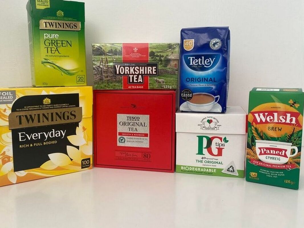
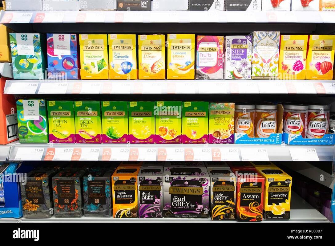
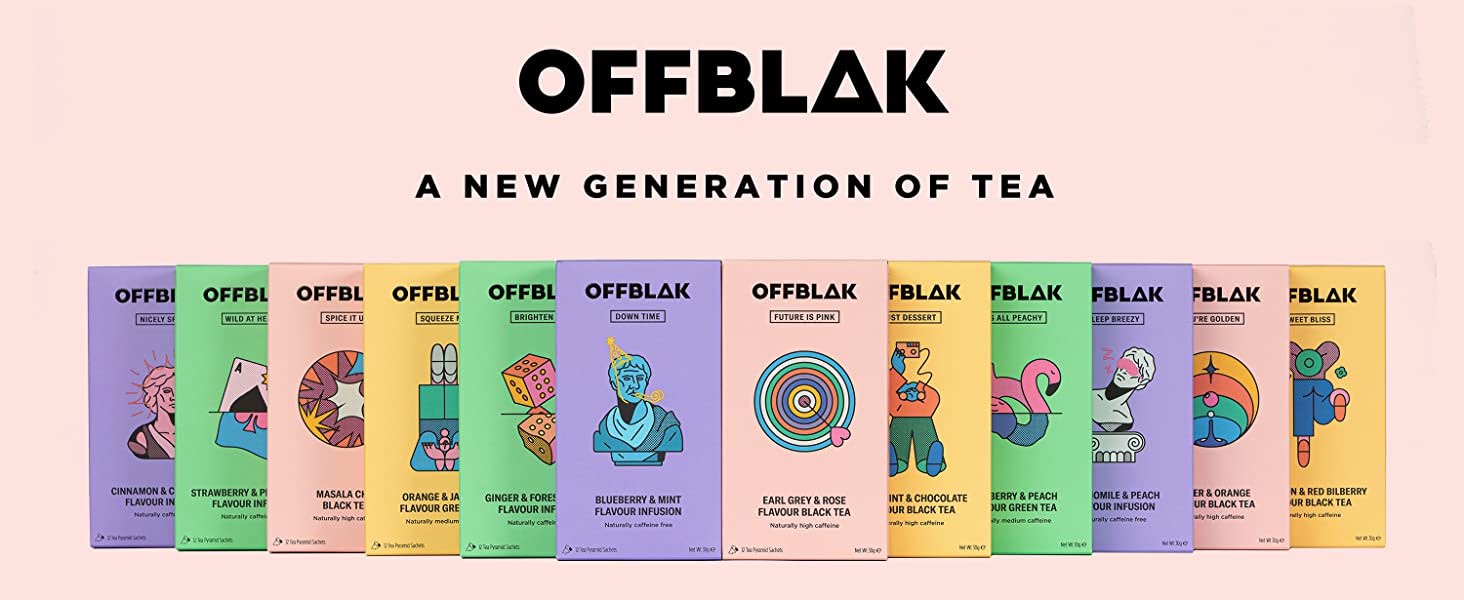
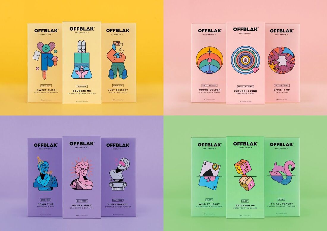
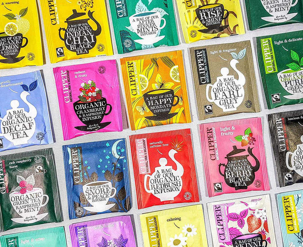
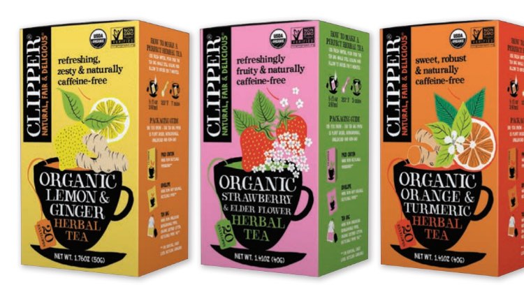
Tea industry/competitors:
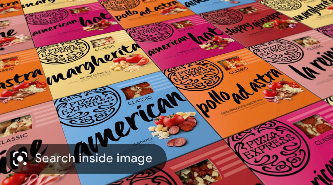
I wanted to look at competitors in the industry and see what styles are currently out there. This will help me target an area of design that may be less seen and with that standout amongst the brands competitors.
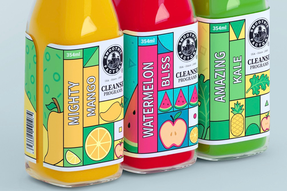
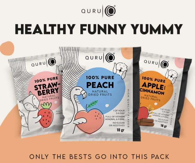
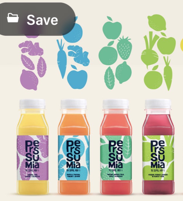
Tea industry/competitors:
I wanted to look at competitors in the industry and see what styles are currently out there. This will help me target an area of design that may be less seen and with that standout amongst the brands competitors.
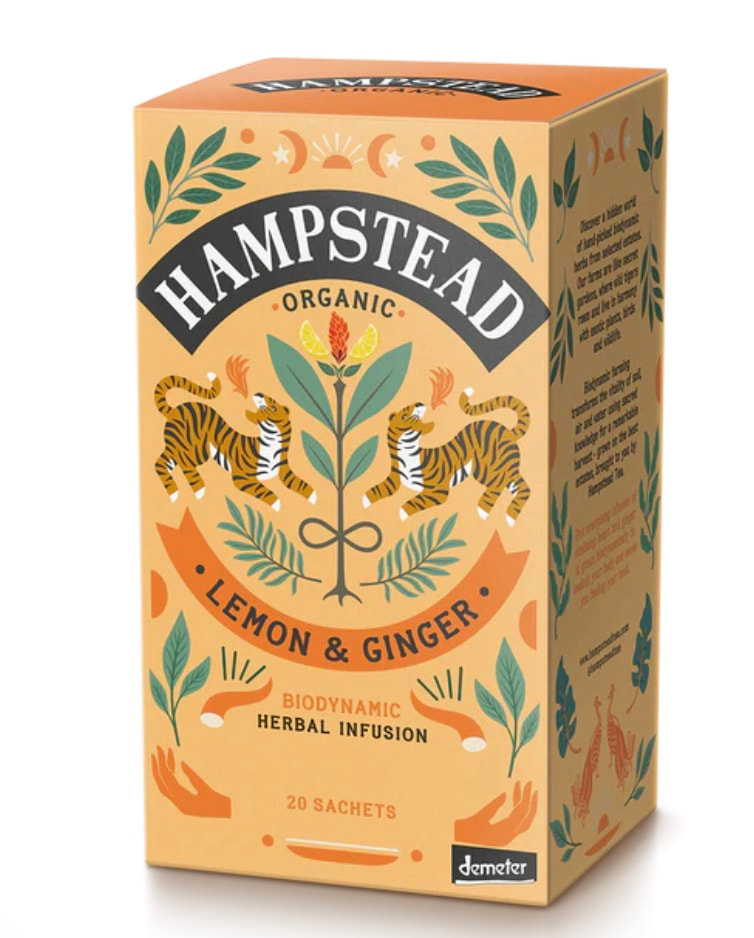
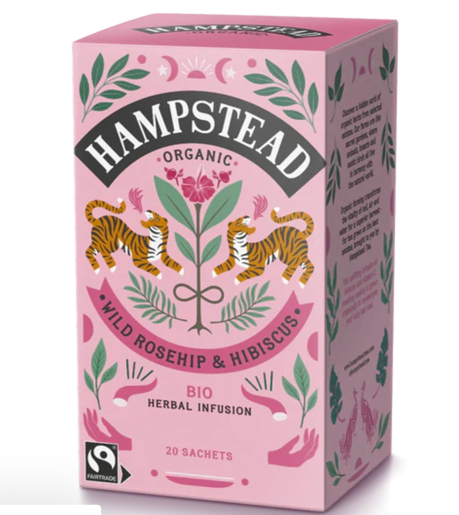
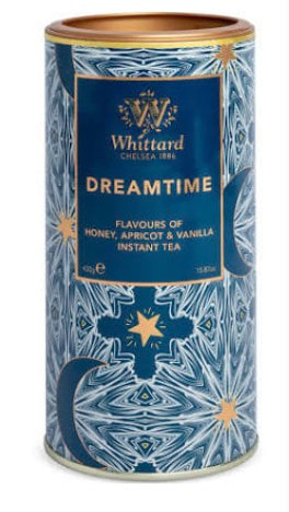
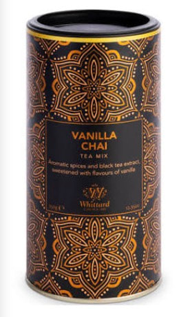
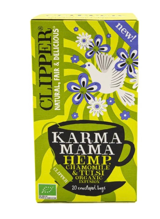
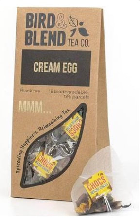
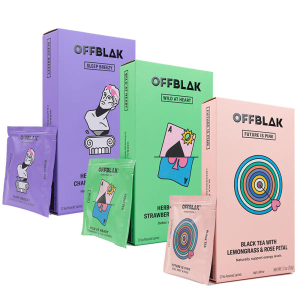
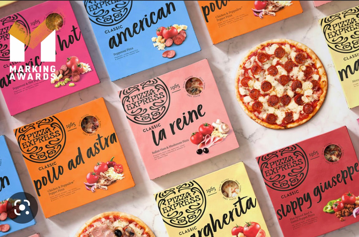
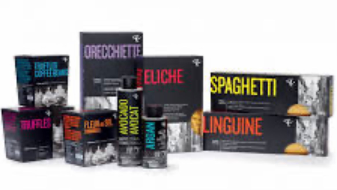
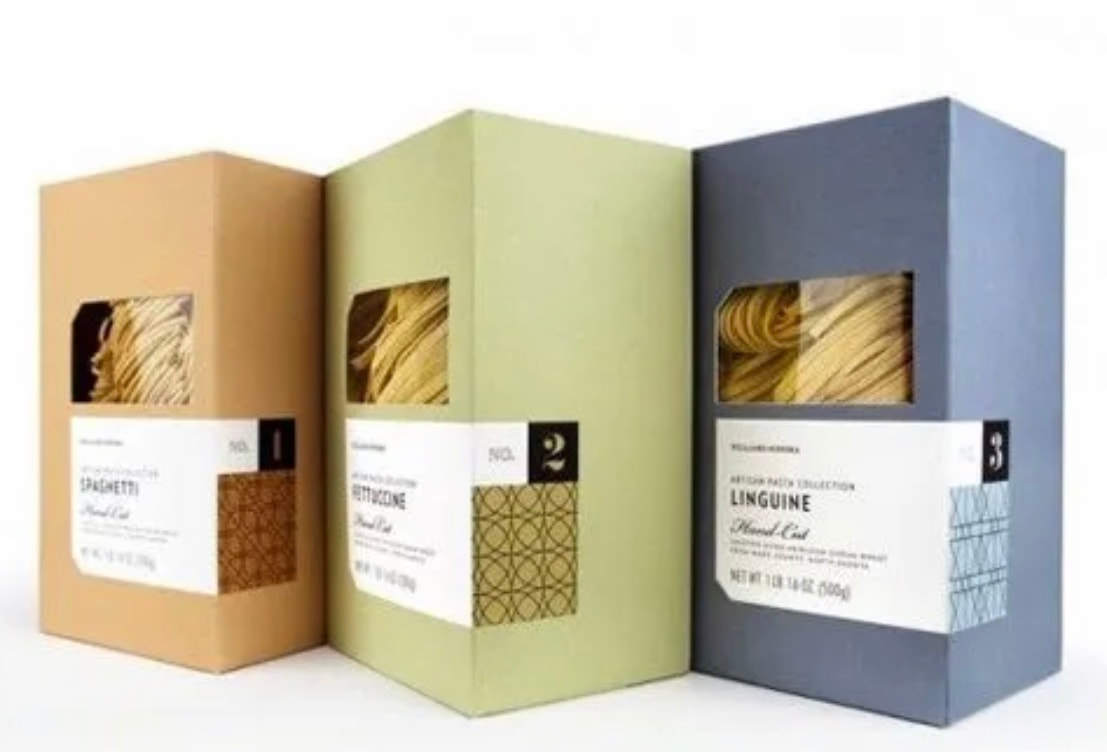
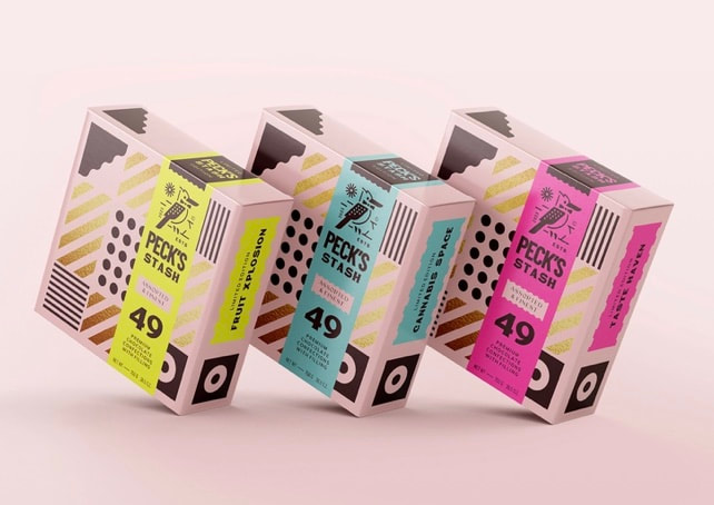
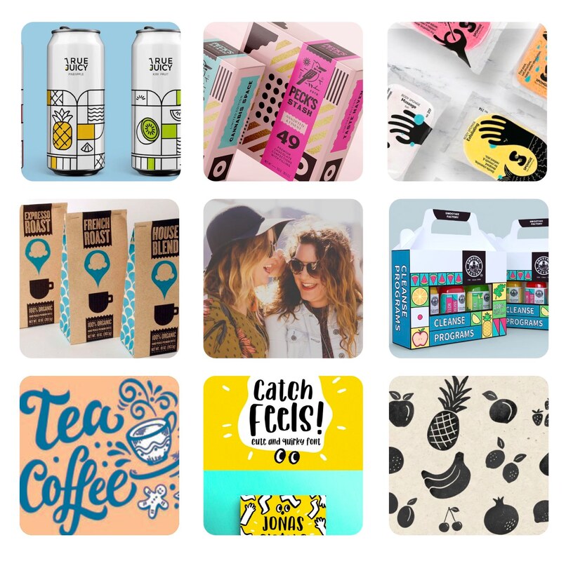
Brands moving with the times:
These brands are more eye-catching and playful. I really like the black being used here and the fun use of colour which draws the eye. I also like the simpler designs and how they are understated yet still show great design.
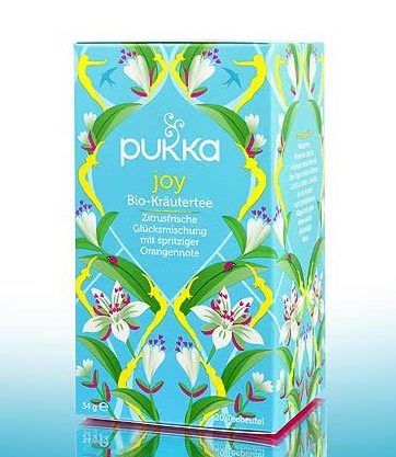


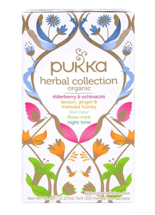

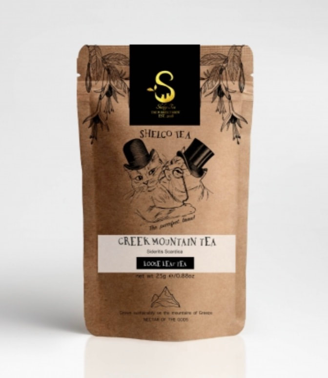
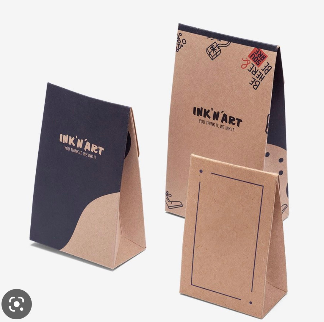
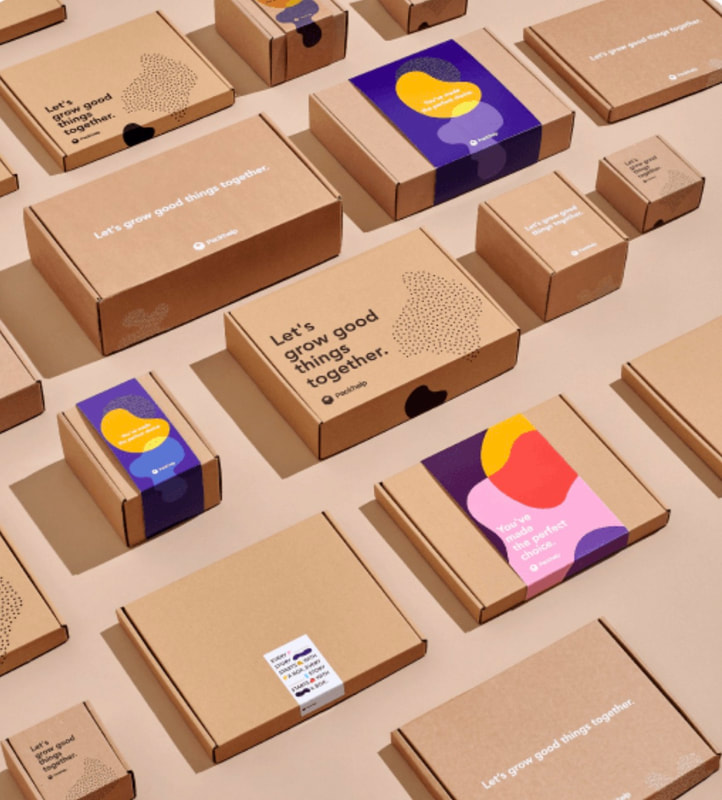
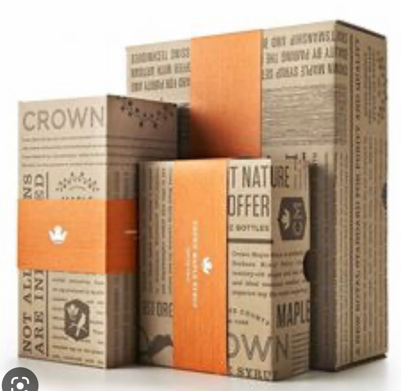
Packaging styles/Liked elements:
I like the earthy nature of the brown cardboard here which makes me think of sustainability and simple designs. The colours here are also a good example of eye-catching well balanced colours which I may explore later on.


Further research has been explored on Pinterest. This link below shows packaging I like, competition, patterns, typography and design elements to help consider direction forward to meet the company values and vibe, all while considering the audience.
I took many images which I liked and grouped/places them in areas on a board to see how they sat next to each other. This may help me see which elements work against each other. I feel sometimes I think something will work but then when I see it against other visuals it doesn't fit and the design elements conflict.
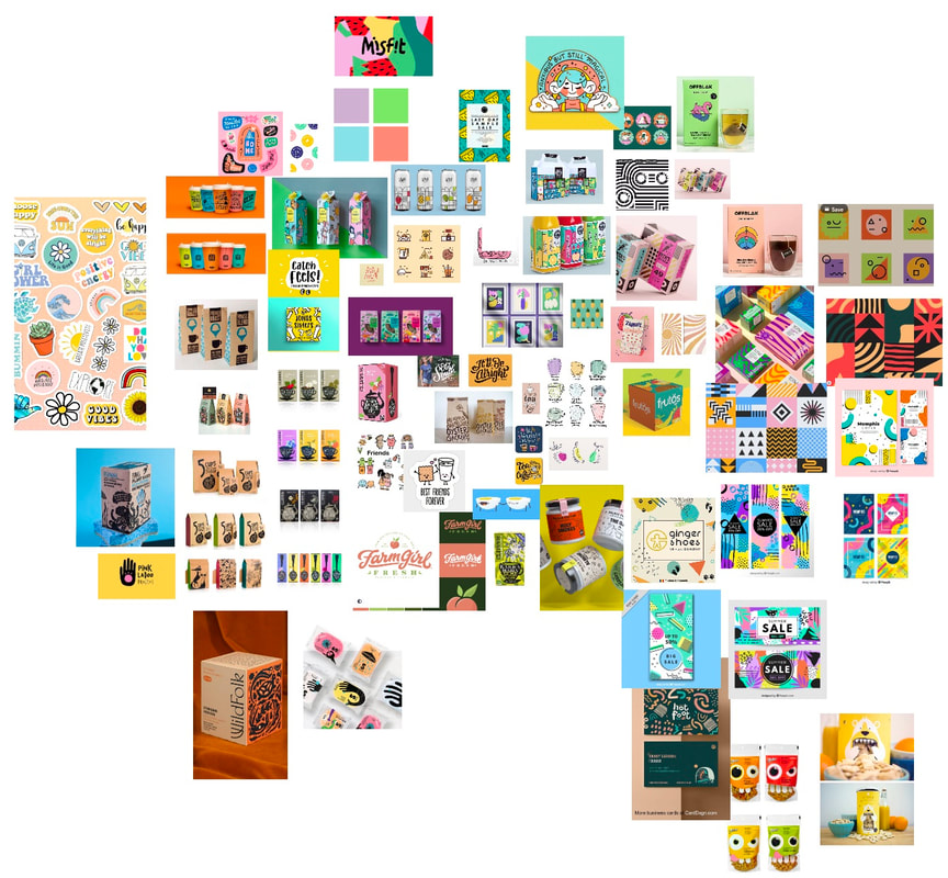
Moodboard:
I created a moodboard of images I liked. I feel these work well together and may help me create a style that would suit this brand.
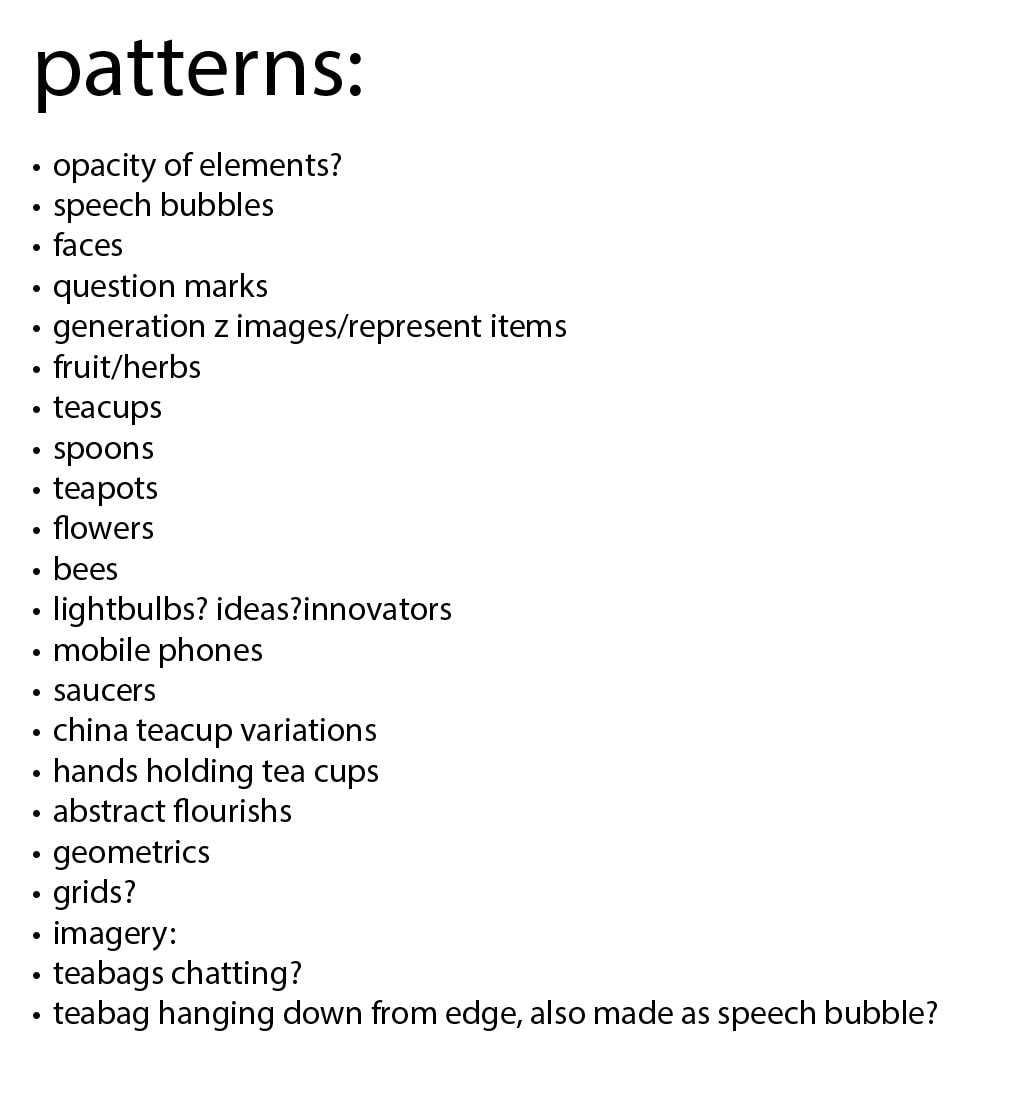
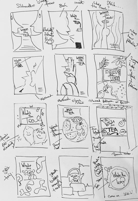
I wanted to get some ideas out of my head and on to paper. I looked the main target audience and potential pattern ideas I may have a go at creating.
|
|
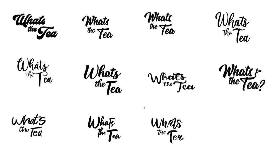
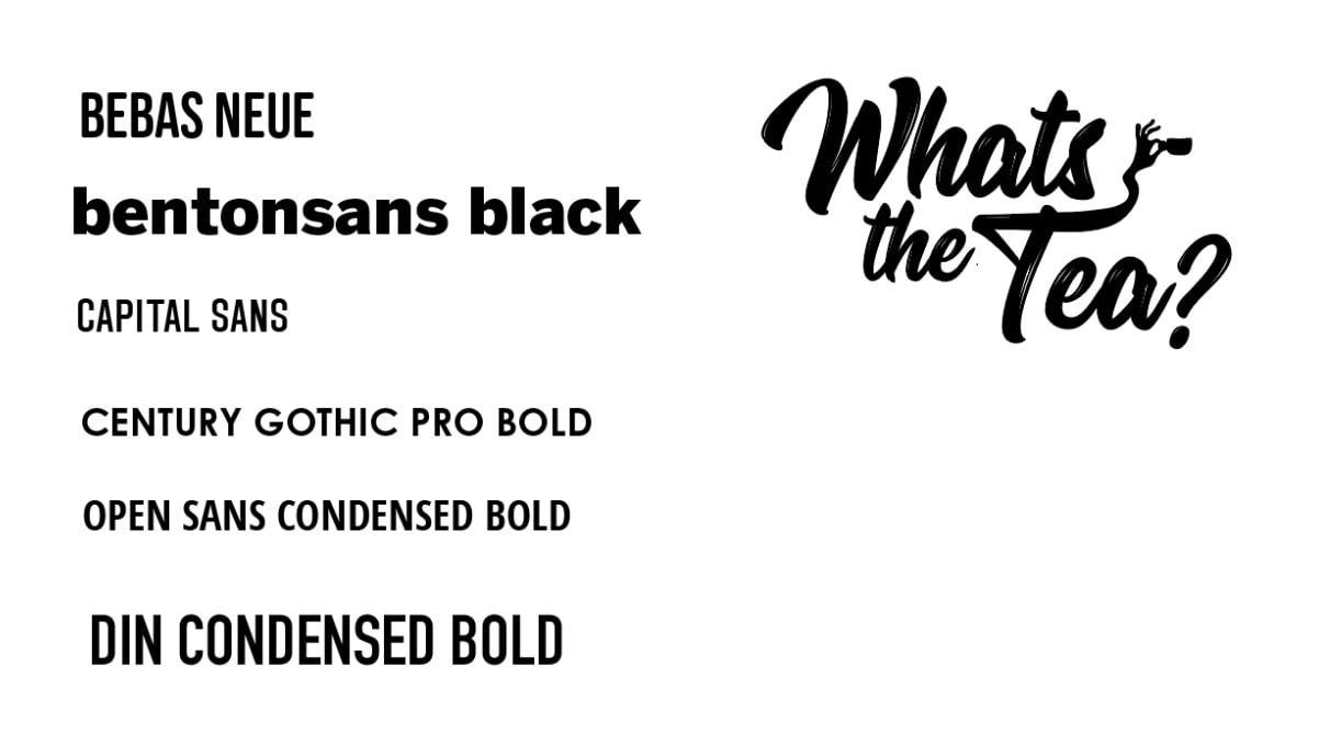
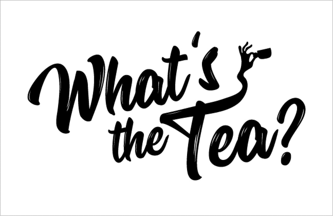
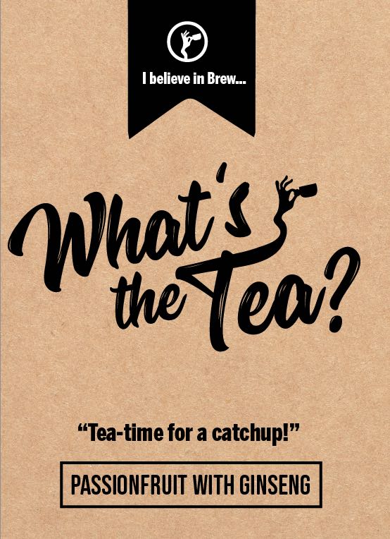
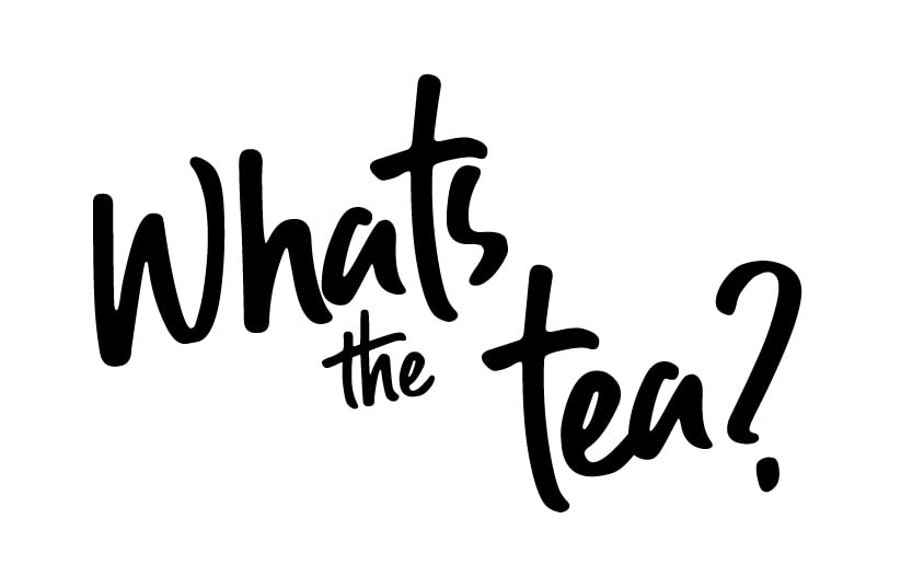
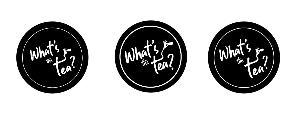
Typography and Logo Exploration:
I looked at fun quirky typography that may suit the brands language or potentially a logo.
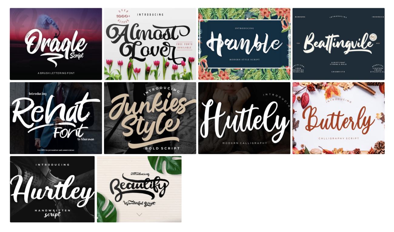
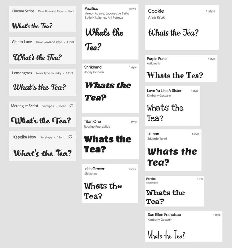
I also wanted to see what fonts work well against a logo with this typeface. Its a very quirky font and so a simple text will help pull back the design.
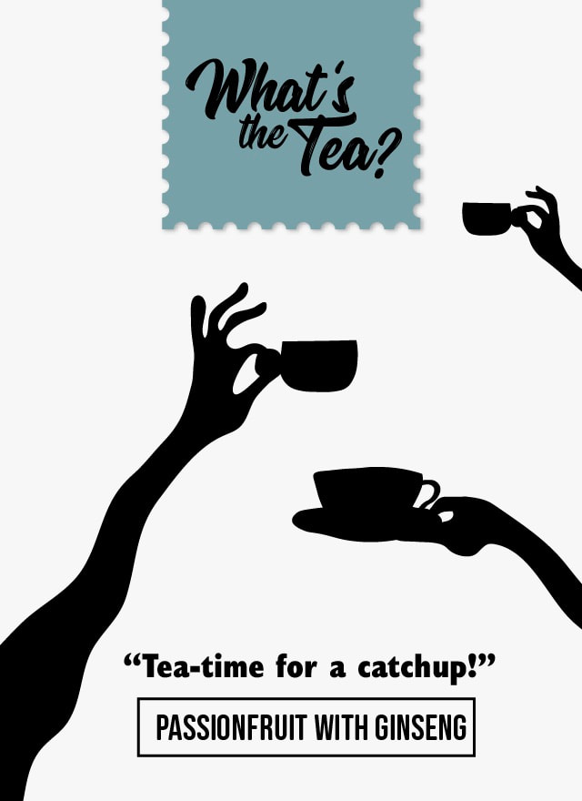
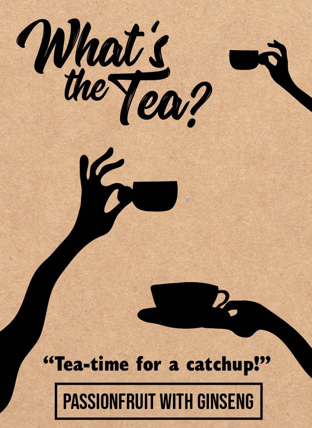
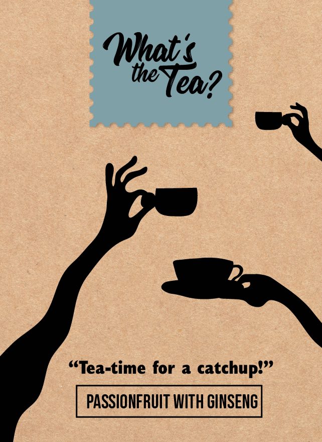
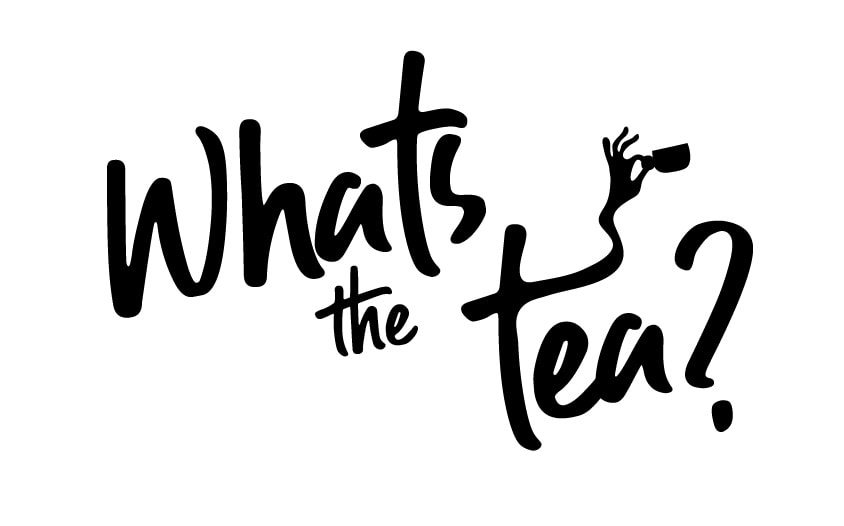
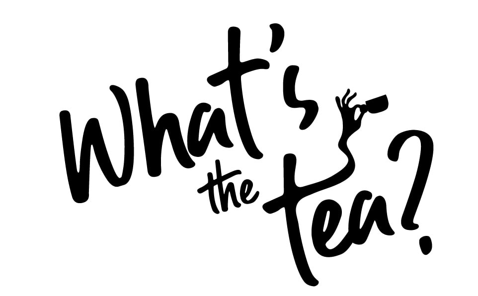
I drew up lots of ideas that could be used for packaging. I wanted to convey a feeling of coming together for tea in a playful light manner.


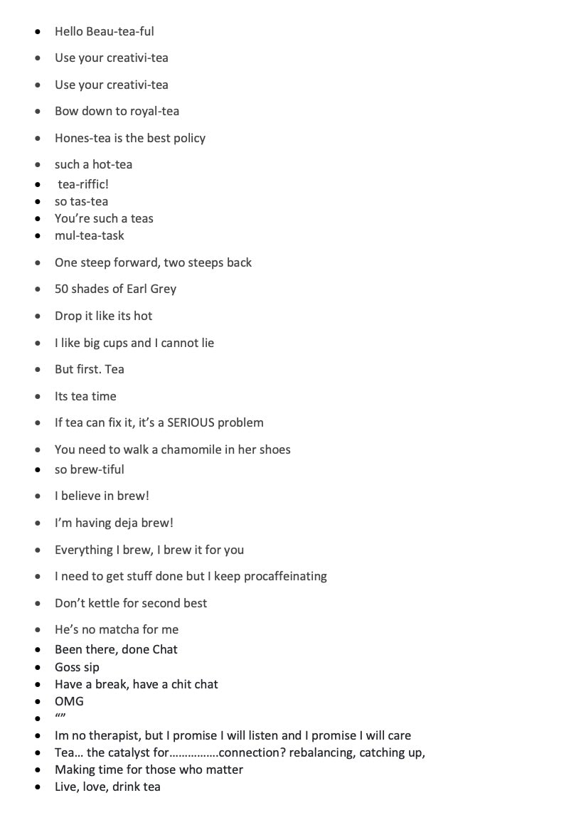
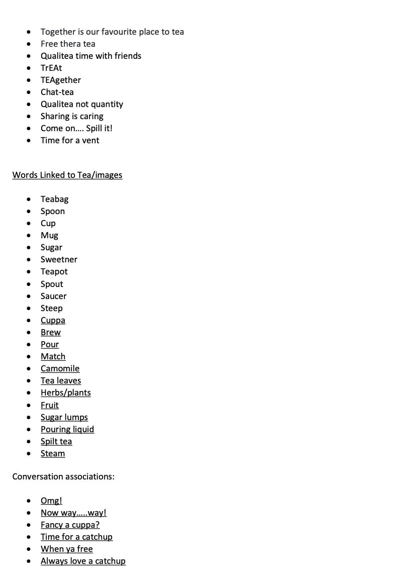
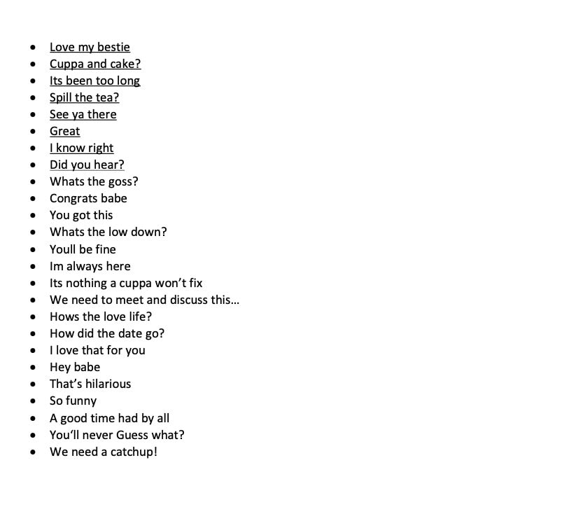
Copywriting:
I explored copywriting which will help me develop a tone of voice and maybe some ideas for packaging or advertising.
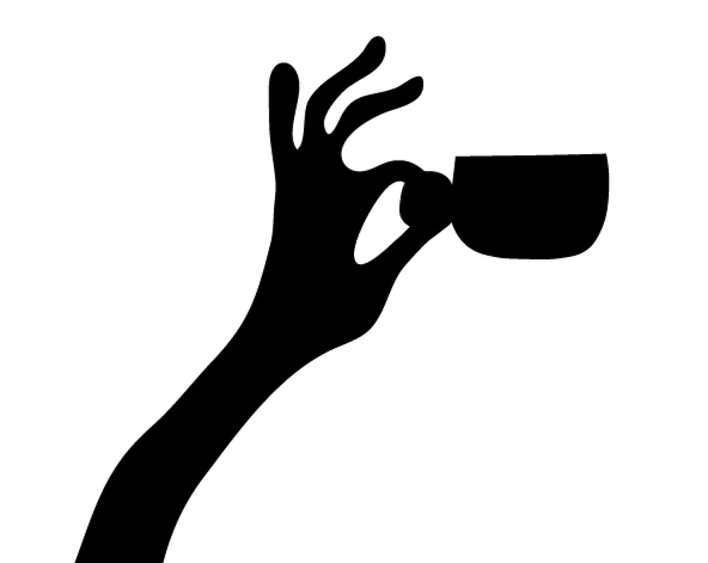
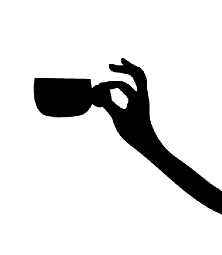
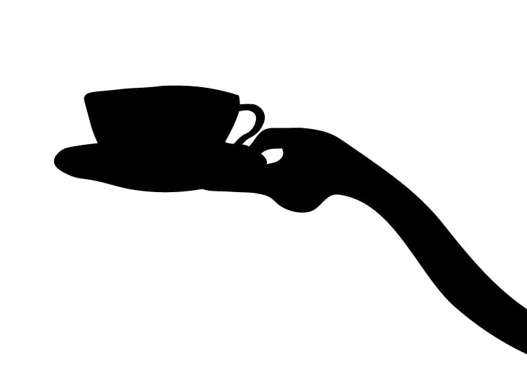
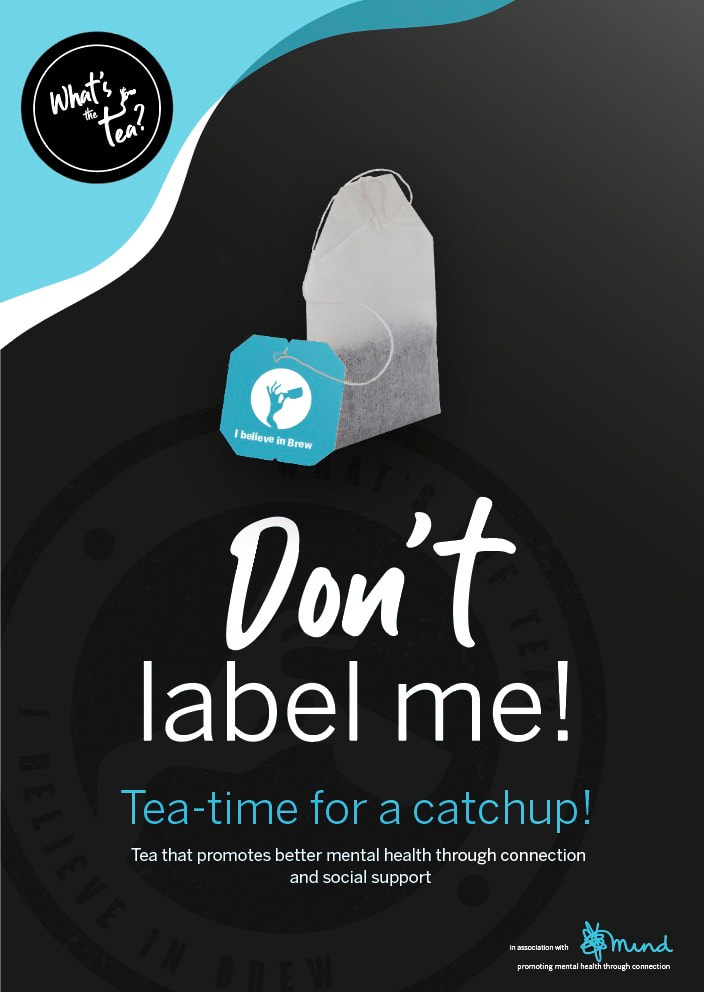
My illustration skills aren't great, but after many, many...many attempts.....I feel these quirky images work well. They convey coming together and a fun quirky link to tea drinking. They also appear strong visually and will draw the eye of potential customers.
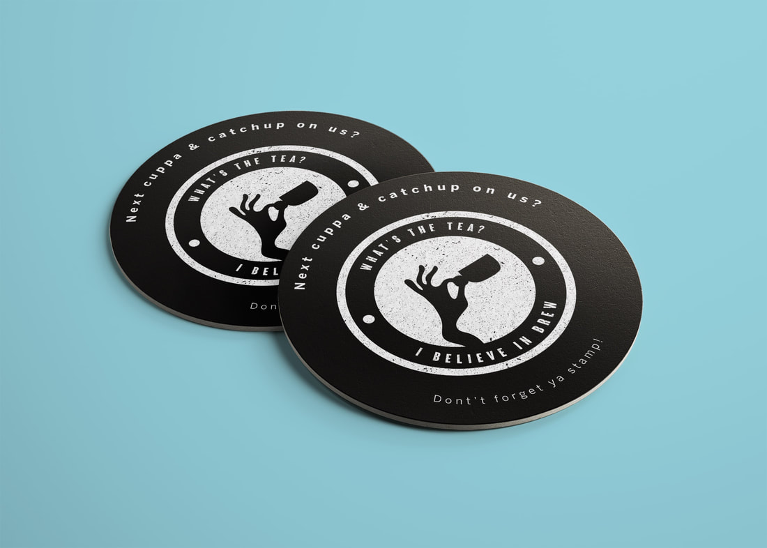
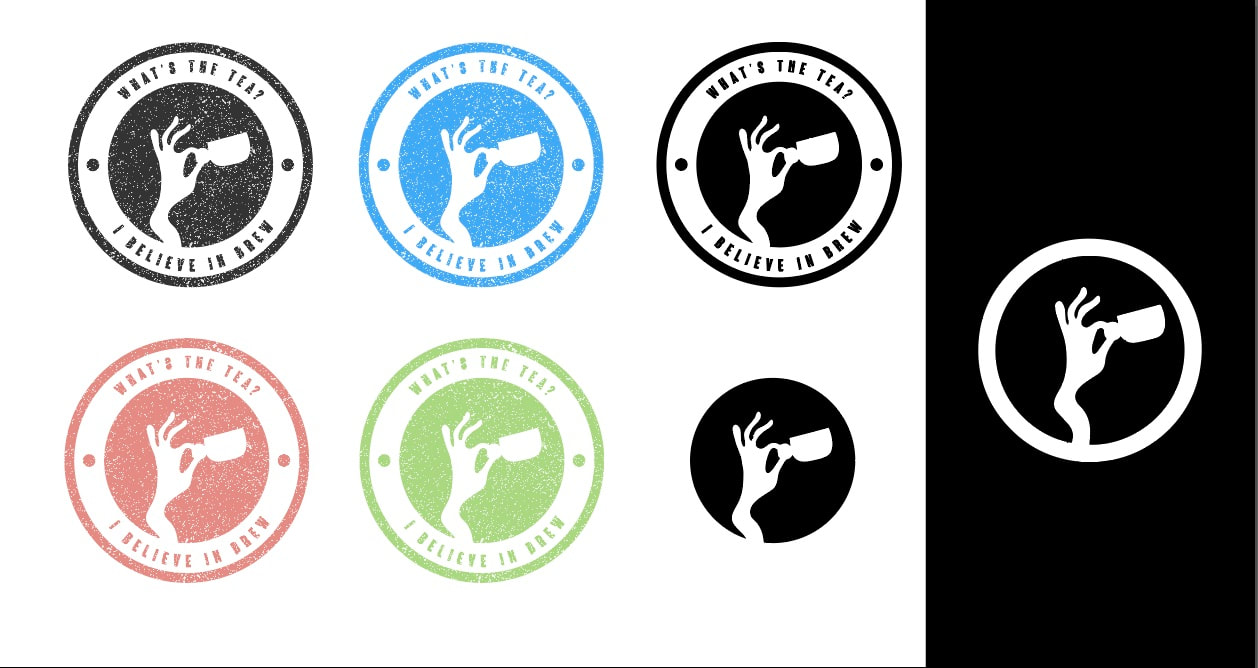
I saw some brands online with secondary marks and stamps. I wanted to have a go as thought this could communicate a punchy quote/vibe. It also could be used on a rewards card to encourage return custom.
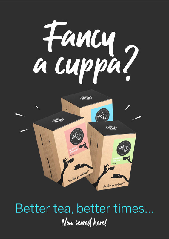
Exploring packaging:
I felt the white was very stark and a little clinical so I explored other materials.

Copywriting:
I wanted to use a fun down to earth humanised voice that would connect in a 'real' and casual manner.
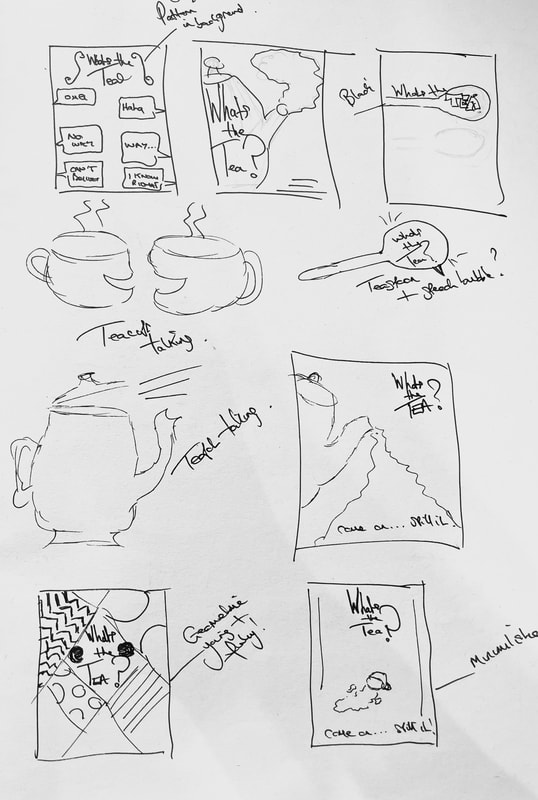
I created some patterns for packaging some with links to conversation. such as speech bubbles but feel these look a little busy. Im undecided so need to explore further.
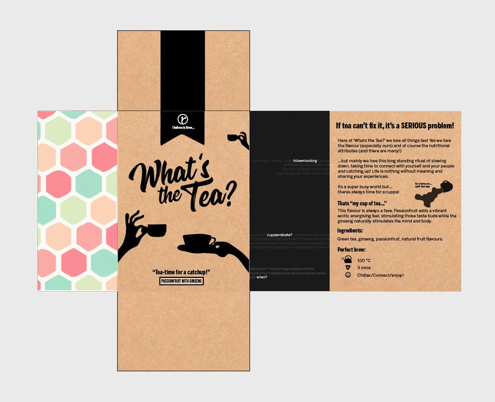

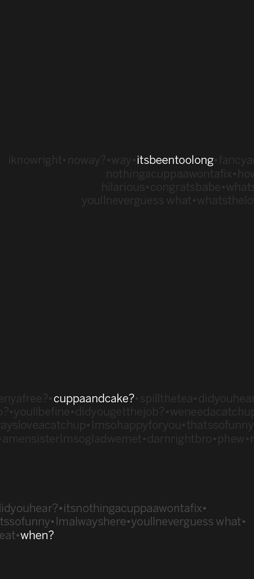
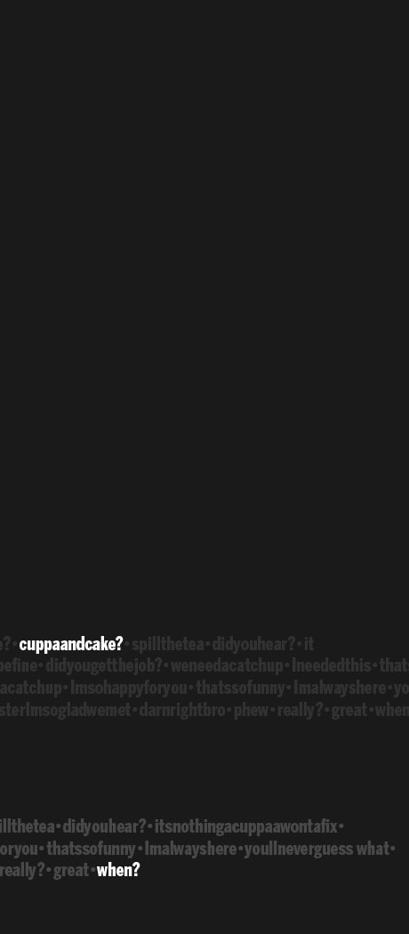
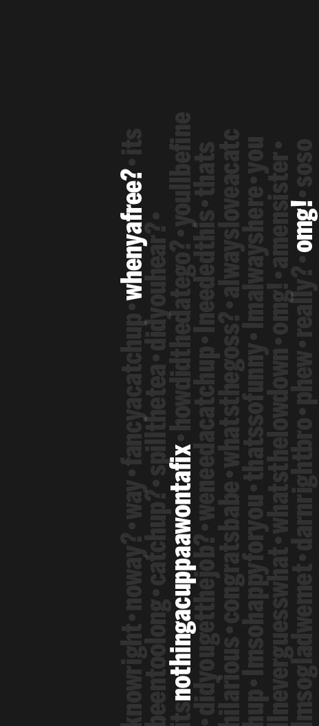
Conversation was explored with a more typographic design highlighting things commonly said while catching up or getting support. Some of which are highlighted to add interest.
Still not sure on the logo typeface. I found it a little 'American diner' so I explored other options.


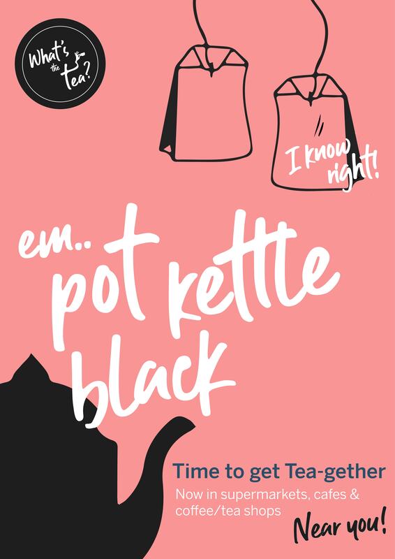
Advertising;
I looked at many images linked to tea and I couldn't help but think when you saw teabags next to each other in stock images they almost looked like the had personalities or were in conversation with each other. I may explore this further...
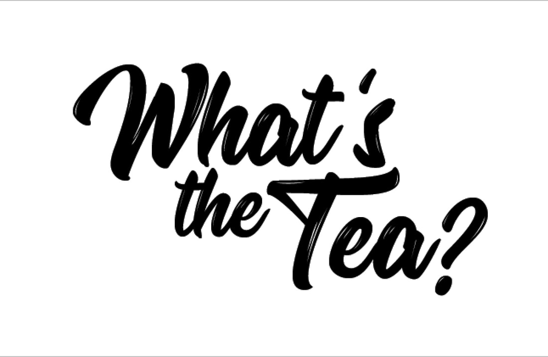
Conversations with Zoe lead to a logo tweak. It felt the proportions were a little small and looked better bigger and more proud.
I found illustration worked much better than photo images.
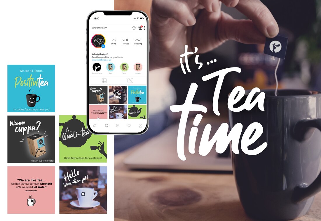
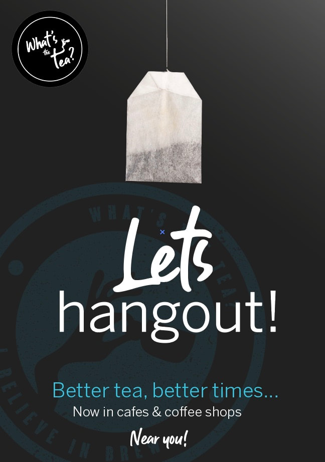
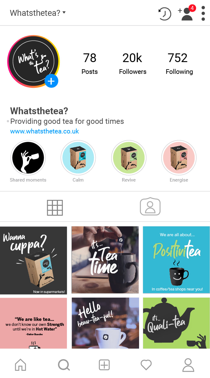
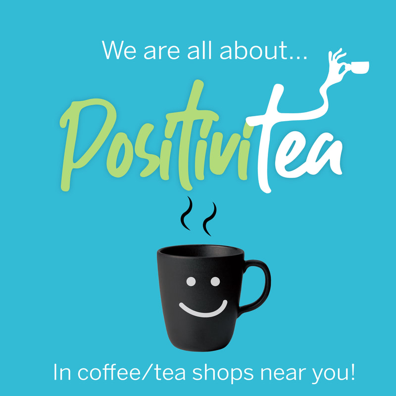
Social media has been looked at to quietly link the tone of voice and values of the brand while reminding people about the products it offers.

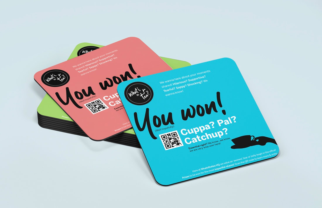
Customer Engagement/Fun interaction:
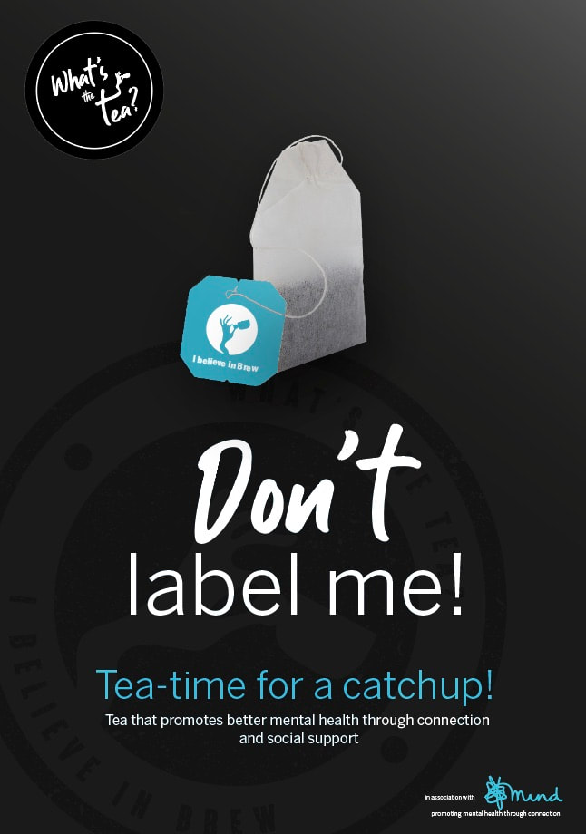
I thought customers sharing emotive stories would help set a lovely agenda and tone for the brand. It would show empathy, humour, interest in their customers and also push the concept of the 'times shared through catching up with a brew'.

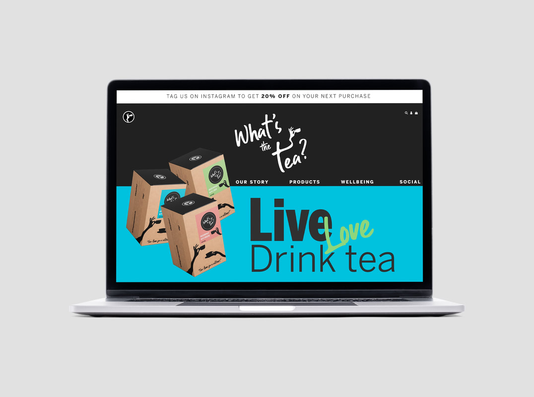
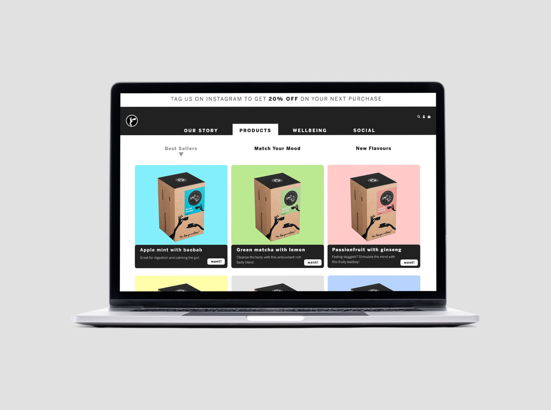
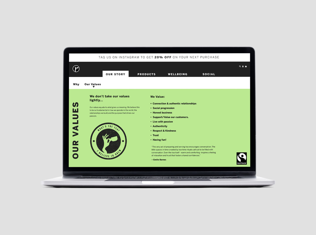
Online Presence:
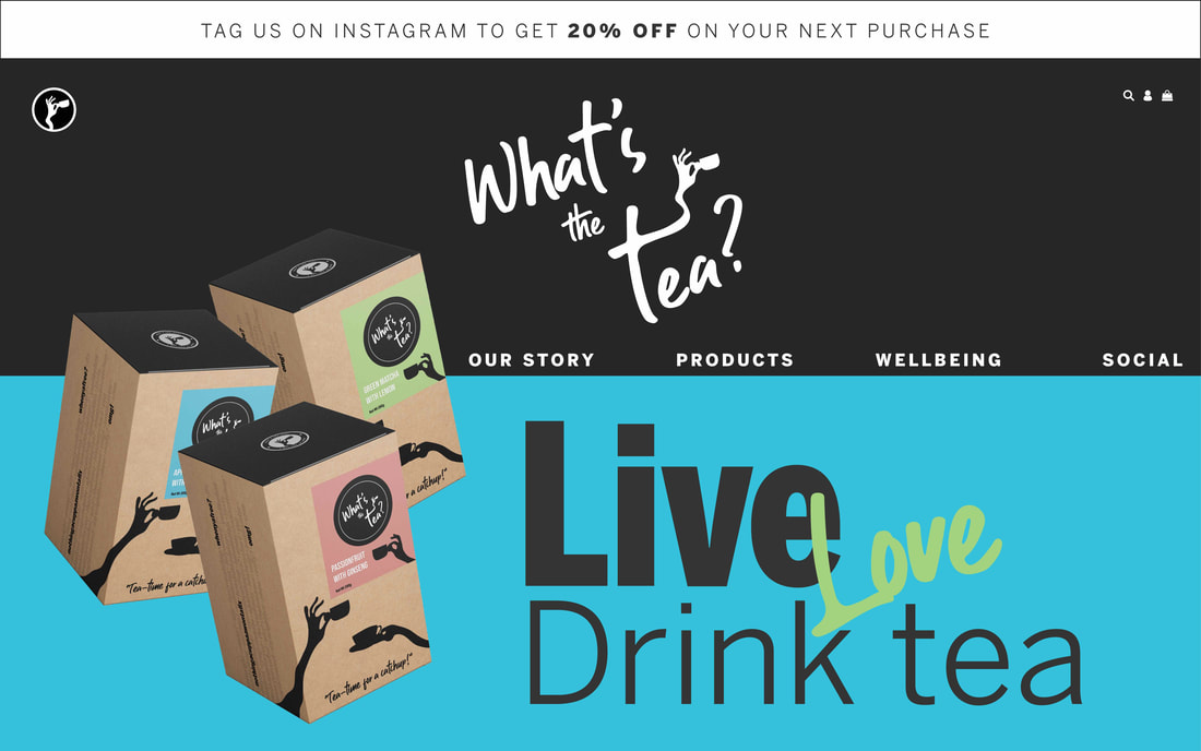
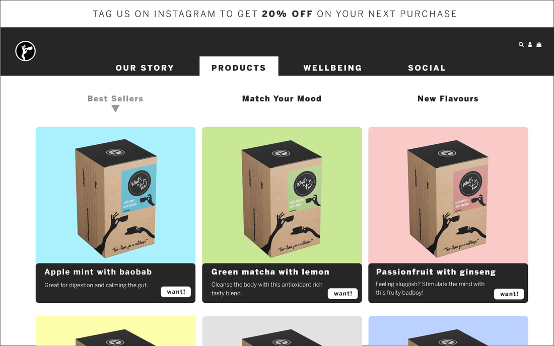
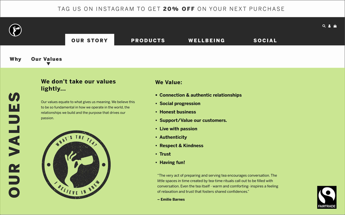
Carrying on the fun colour theme to the webpages I feel worked really well as to me they looked fun and engaging. I kept the colours, styling and tone of voice consistent with the brands styling/personality to really homogenise the brand and help display the company as a strong player with a strong identity who know who they are and what they are about.
Carrying on the fun colour theme to the webpages I feel worked really well as to me they looked fun and engaging. I kept the colours, styling and tone of voice consistent with the brands styling/personality to really homogenise the brand and help display the company as a strong player with a strong identity who know who they are and what they are about.
Finals: